What’s Happening to Wholesale Electricity Prices?
Brian Potter
Sep 18, 2025
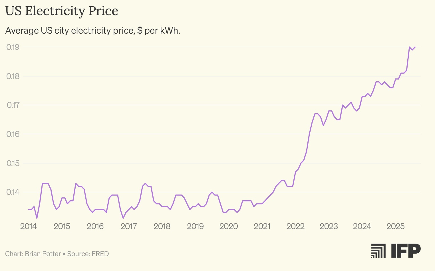
The last several years in the US have seen a dramatic increase in electricity prices. For the five years prior to 2020, electricity prices were essentially flat; since 2020, average electricity prices in the US have increased by around 35%.
This increase isn’t limited to just one part of the country. It’s virtually everywhere:
Why are electricity prices increasing so much, and so quickly? I decided to look at trends in wholesale electricity prices: the price that utilities or other load-serving entities (LSEs) pay for electricity. Looking at wholesale prices won’t tell us what’s happening with consumer electricity prices directly, since those prices include additional costs like insurance or building more distribution infrastructure. But wholesale prices can let us see trends in the costs of generating and transmitting bulk electricity. Are wholesale prices rising, and part of the explanation for why consumer electricity prices are up? Or are wholesale prices flat, suggesting the cause of rising electricity prices has more to do with other costs to utilities?
ISOs and location marginal prices
In about 60% of the country, electrical grids are managed by organizations known as Independent System Operators (ISOs) or Regional Transmission Organizations (RTOs). These organizations, such as California’s CAISO, the midwest’s MISO, and New York’s NYISO, operate transmission lines for moving power across large regions, and manage wholesale electricity markets. Power plants sell their electricity on these markets, which is purchased by utilities, large electricity consumers like data centers, and other LSEs.
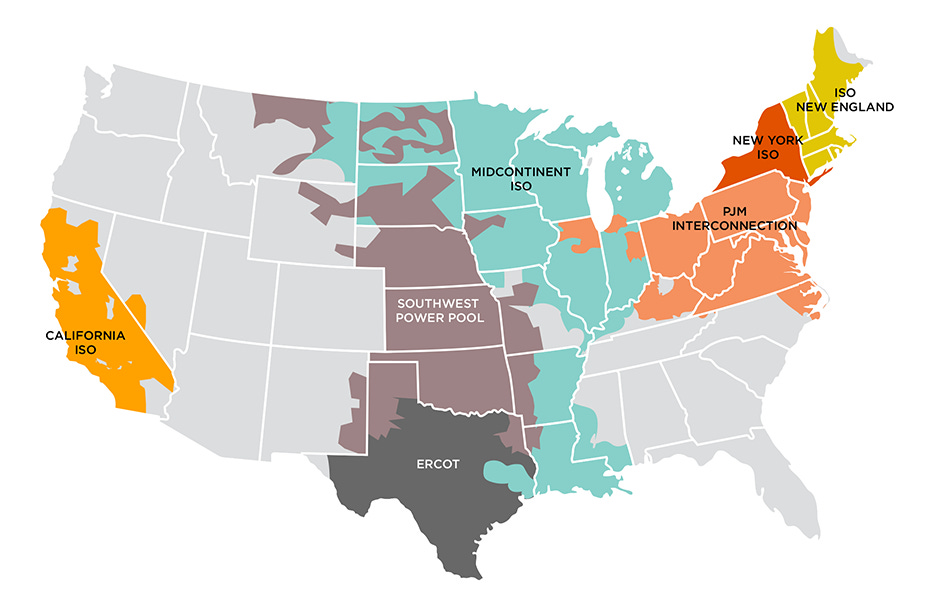
ISO/RTO map, via Sustainable FERC Project.
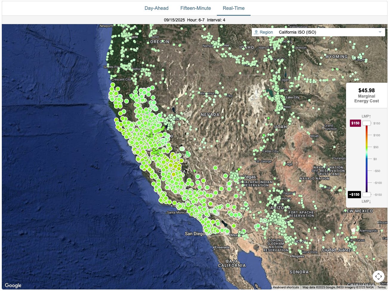
Pricing in these wholesale markets uses a mechanism called Location Marginal Pricing (LMP). With location marginal pricing, the price for a given unit of electricity (generally $ per MWh) varies by location. A given ISO/RTO will have pricing determined at hundreds of “nodes” spread across it: at each node, the location marginal price is the price paid for one additional unit of electricity provided at that exact location. LMP will be recalculated at each node every few minutes, and might vary significantly both across a region (and over time within a single node). Here, for instance, is the nodal LMP map for California’s CAISO:

The location marginal price is typically made up of three separate components: energy, congestion, and losses. (I say “typically” because ERCOT does not break down LMP this way.)
Energy is the portion of the LMP that comes from actually generating the electricity. It’s how much will be paid to add one additional megawatt-hour to the grid. The energy price will typically be uniform at every node in an ISO/RTO, and more often than not will make the largest fraction of the LMP (80-90%).
Loss is the portion of the LMP caused by losses in the transmission system. When electricity is moved along wires, some of the energy will be lost as heat; the more the electricity is moved the greater the losses will be. The loss portion of the LMP reflects the losses that would be incurred when adding one additional megawatt-hour of electricity at one particular location.
A negative loss value means that adding more electricity at a particular location will increase overall system losses, making the electricity less valuable and decreasing the overall LMP. A positive loss value means that adding more electricity at a particular location will decrease overall system losses, making that electricity more valuable and increasing the overall LMP. Losses will vary from node to node, and will generally be a small fraction of overall LMP (5% or so).
Congestion is the portion of the LMP that comes from transmission congestion. Transmission lines can only carry so much electricity, and when lines reach their capacity there may not be a path from a given source of generation to a given source of electricity demand. The congestion portion of LMP reflects the costs incurred by having to buy more expensive electricity than would be required if there were no transmission constraints. 1
As with losses, congestion can be positive or negative. A negative value indicates that adding a unit of electricity at a given location (such as at a remote power plant connected to the grid by an already overburdened transmission line) increases transmission congestion, making that electricity less valuable and decreasing LMP. A positive value indicates that adding a unit of electricity at that location (such as a power plant right next to a major load center) decreases transmission congestion making that electricity more valuable and increasing LMP. Like losses, congestion will vary from node to node. Congestion will often be a small fraction of overall LMP (on the order of 10-20%), but in some circumstances it can rise much higher.
Looking at the various factors that make up location marginal prices not only lets us understand not only whether wholesale electricity costs are rising, but how they’re rising: whether it’s due to the costs of generating the energy itself, or if it's due to things like increasing transmission bottlenecks.
Trends in location marginal prices
To look at trends in LMP, I used the website gridstatus.io, which tracks (among many other things) LMPs across every ISO/RTO in the US. For each ISO/RTO, I looked at the average daily LMP for several trading hubs, which average prices across several surrounding nodes to create a “typical” LMP at that location. (The exception was ISONE, where I used its single, system-price hub.)
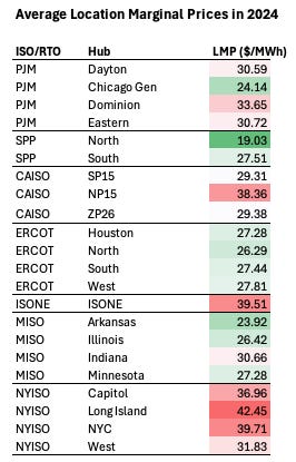
The chart below shows average LMP, in $ per MWh, for each hub in 2024:

A few different patterns are visible here. One is that wholesale electricity prices vary a great deal across ISOs/RTOs. The highest average LMP for any hub examined, Long Island in NYISO, is more than twice as high as the lowest average LMP, at the North hub in SPP.
There’s also significant price variation within regions: in most ISOs/RTOs, there’s a significant difference between the highest-priced hub and the lowest-priced hub. The average LMP in the West hub in NYISO in 2024 is around 25% cheaper than in the Long Island hub, and the Dominion hub in PJM is almost 40% more expensive than the Chicago Gen hub. In the absence of transmission constraints, these prices would be much closer to equal (though due to losses some differences would remain).
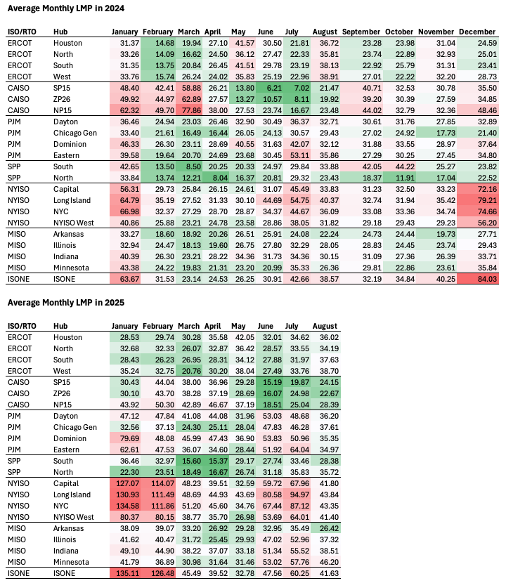
This variation also extends across time. The chart below shows the average monthly LMP for each ISO/RTO in 2024.
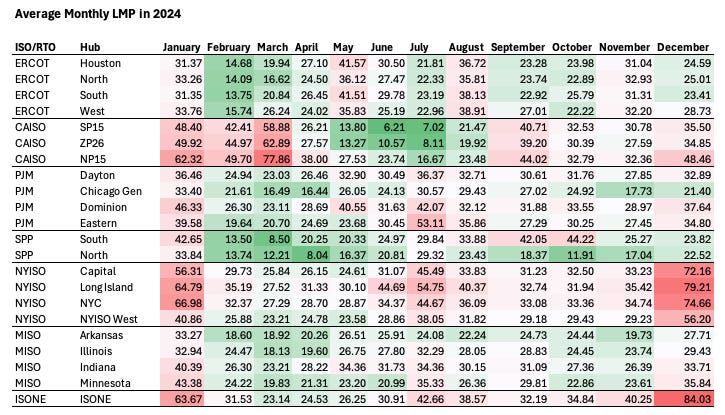
Within a single hub, wholesale electricity price varies significantly from month to month. The highest prices tend to be in December/January, while the lowest prices tend to be in the spring. It’s also common for there to be high prices in the summer, though this isn’t universal (in 2024, CAISO’s spring prices were much higher than summer prices). The difference in LMP from month to month can be significant. In 2024, the highest monthly average LMP at a given hub is typically around 2x the lowest average LMP, and for some hubs the differences are even greater (in CAISO’s SP15 hub, the highest monthly average was over 9x the lowest monthly average).
Unsurprisingly, seasonal variation in LMP roughly tracks electricity demand, which tends to be highest in the winter and summer and lowest in spring (though this is complicated by things like changes in natural gas prices, varying renewable output, and geographic location):
We continue to see significant variation in LMP if we go even more granular. Here’s the average daily LMP in CAISO’s SP15 hub for July and August of this year. Over the course of a week, wholesale prices might fluctuate by a factor of 2 or 3:
And over the course of years, amidst the normal day to day variation we can see the occasional huge spike:
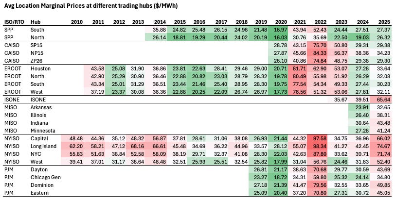
How have wholesale electricity prices been changing over time? The chart below shows the average yearly LMP for each hub, as far back as gridstatus.io has data.

Broadly, the trend in wholesale prices seems to roughly parallel the trend we see in consumer electricity prices. Between 2010 and 2020, wholesale prices in general declined. In SPP, they dropped from $26-36 in 2014 to $16-17 in 2020. In ERCOT, they dropped from $37-44 in 2011 to $17-21 in 2020. In NYISO, they dropped from $49-63 in 2010 to $18-28 in 2020.
Then, in 2021, 2022, and to some extent 2023, wholesale prices rise enormously, by a factor of 2x to 4x across every hub. By 2024, prices had come down, but have now risen again in 2025. Out of the 17 hubs where data goes back to 2020, in 14 of them wholesale costs rose faster than consumer electricity costs. (The hubs that didn’t are, interestingly, the three CAISO hubs.) On average wholesale electricity costs have nearly doubled since 2020.
The huge price spike around 2022 seems to be driven in part by an enormous rise in natural gas prices.
Looking at wholesale prices across regions, we see that the cheapest wholesale electricity tends to be in SPP (a RTO which encompasses Oklahoma, Kansas, Nebraska, and South Dakota), though until 2020 its prices weren’t much lower than other ISOs/RTOs outside of CAISO. More recently, although SPP still has the lowest average LMP, California’s CAISO has had some of the cheapest wholesale electricity. ISONE, MISO, PJM, and NYISO have all seen huge wholesale electricity price increases in 2025 compared to 2024 (40-80% increases year over year). Even ERCOT has seen prices rise 15-20% compared to 2024. In CAISO, however, prices are flat or even declining. If we look at month-by-month prices, we see that despite a natural gas price spike, winter electricity prices were much lower in CAISO this year compared to 2025.

Congestion costs
In the absence of transmission bottlenecks, location marginal price would be much closer to uniform across a region, reflecting the costs of generating the electricity along with small differences due to things like tranmission losses. (Things like the different ways ISOs/RTOs incentivize reliability by way of reliability products, and other market quirks, might also cause geographic price variation, though I don’t understand electricity markets well enough to say for sure.) To understand the variation that exists in LMP, we can look at the congestion cost portion of LMP.
To start, we can observe the price differences across hubs in an ISO/RTO over time, as most of these differences will be due to transmission bottlenecks. The chart below shows the difference between the hub with the highest average yearly LMP and the hub with the lowest average yearly LMP, divided by average LMP for all hubs in that ISO/RTO.
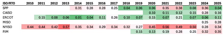
There doesn’t seem to be a single overall trend. In some ISOs (CAISO, PJM, and possibly MISO) we’re seeing increasing spread in hub prices over time — a greater difference between the highest hub price and the lowest hub price — suggesting that transmission is becoming more of a bottleneck. In others (NYISO, ERCOT, SPP), spreads are closer to steady, or even declining over time.
Looking at the congestion portion of LMP can be tricky: because prices can be either positive or negative, you have to be careful with your summary statistics (averages, for instance, might stay the same even as maximum and minimum prices are changing significantly). The charts below show monthly congestion costs quantiles for each hub within an ISO/RTO. The top solid line is the 90th percentile (ie: 10% of the congestion values for the month are greater than that value). The middle line is the 50th percentile (half the monthly values are above that point, half below it). The bottom line is the 10th percentile (10% of values are below that point). This gives us a compact presentation of the spread of congestion prices and how they’re evolving over time. I've also added a dotted line for the average LMP in that hub. Note that because ERCOT does not give separate congestion prices, we won't look at prices there. I also didn’t look at ISONE, because I believe the way congestion prices are averaged at the system hub tends to make them look artificially small.
To start, let’s look at the charts for CAISO hubs:
There's a few trends we can see at work here. One is that for each hub, the spread on congestion costs — the difference between the high values and the low values — is generally getting wider over time. This suggests transmission is becoming more and more of a bottleneck: the harder it is to move power into or out of a node, the higher the high congestion prices and the lower the low congestion prices will be.
In SP15 and ZP26, congestion prices also seem to be increasingly skewing negative, indicating power that's increasingly "trapped" and can't be moved elsewhere. And until the last several months, the reverse seemed true for NP15: positive skew, indicating an increasing inability to get the cheapest power.
One likely explanation is that this is due to increasing buildout of solar PV in California. Unlike, say, natural gas power plants (which can be built relatively close to load centers), solar PV needs to be large, flat areas of land, which will tend to drive it away from population centers to where land is cheap, increasing its reliance on transmission. In California, solar PV (which is most of the generation capacity that’s been built in the last 15 years) is largely located in the southern half of the state. The increasing negative congestion prices in southern California (SP15), and the increasing positive congestion prices in northern California (NP15) suggests that transmission limits are making it difficult to move this power from the south to the north. A 2024 CAISO market report notes that “Most south-to-north congestion occurred during mid-day solar production hours. This congestion contributed to increasing prices in the Northern California and Pacific Northwest regions relative to balancing areas in Southern California and the Desert Southwest.”
Another pattern we see in CAISO is a huge spike in congestion prices across all hubs in 2022 when there was an inability to get natural gas into the state.
Now let’s look at the charts for SPP:
Up until around 2020-2021, congestion price spreads in SPP seemed to be steady or perhaps declining. Since then, they've been widening and been increasingly volatile, suggesting increasing transmission bottlenecks. We also see that congestion price spikes in SPP North tend to be mirrored in SPP South: high positive prices in the south mostly correspond to high negative prices in the north. This suggests increasing difficulty in SPP moving power from the center of the region (where the northern hub is located) to the south. A 2024 SPP market report confirms this, and further fleshes out the picture: it notes a “northwest/southeast” price skew, and that the lowest congestion costs are in the center of the region: northwest and southeast congestion prices are higher.

Now here are the charts for PJM, the largest power grid operator in the US, with 65 million customers across the Midwest and Northeast.
With PJM we see a similar pattern to SPP: starting around 2021, spreads in congestion prices begin to increase, and prices get much more volatile. In the Dayton and Chicago Gen hubs, prices are skewing more negative, indicating “trapped” inexpensive power that can’t be moved. In the Dominion hub, prices are skewing more positive, indicating transmission bottlenecks preventing it from accessing the cheapest power. In the Eastern hub, both the highest highs and the lowest lows are increasing.
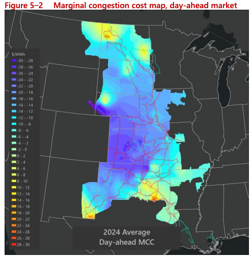
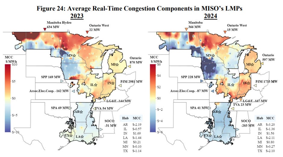
Now here are the charts for MISO, which serves 15 states in the upper midwest and the southeast:
MISO data only goes back 3 years, so it misses what was probably a huge congestion price spike in 2022. In general, MISO seems to have much less transmission congestion, and much less volatility than other ISOs/RTOs. Price spreads do seem to be increasing and getting more negatively skewed in Arkansas (indicating bottlenecks preventing cheaper power from being moved out), and positively skewed in Minnesota (bottlenecks preventing cheaper power from being moved in). A 2024 MISO market report likewise states that a map of congestion prices “shows evidence of transfer constraint between Midwest and South.”

Now here are the charts for NYISO:
Congestion prices in NYISO look very different than in every other ISO/RTO, a reflection of the very dense concentration of demand around New York City, the lower cost of electricity generated outside the city, and limited natural gas pipeline capacity. Every hub is very positively skewed, and congestion prices have been high and skewing positive as far back as 2010. New York seems to have been persistently faced transmission bottlenecks in moving power into places like New York City and Long Island. The 2024 NYISO state of the market report describes some of the causes of transmission congestion:
Long Island congestion levels remained relatively stable between 2023 and 2024, continuing to account for the second largest share of day-ahead congestion. Major transmission outages have been the primary driver over the past two years. One of the two 345 kV lines connecting upstate to Long Island was out of service for approximately 200 days in each year, greatly reducing import capability from upstate regions.
Unlike other regions, New York City facilities and West-to-Central lines experienced notable increases in day-ahead congestion in 2024. In New York City, more than 40 percent of this congestion occurred during two cold spells in mid-January and late December, driven by tight gas supply and elevated gas prices. Most of the West-to-Central congestion occurred on the Scriba-Volney 345 kV line, which frequently limited exports of gas-fired and nuclear generation from the Oswego Complex during high load conditions in the summer months.
Conclusion
At a high level, trends in wholesale electricity prices seem to mostly match trends we see in consumer prices. Until 2020, wholesale prices were flat or declining; since 2020, they’ve risen substantially, faster than consumer electricity prices. And in most places, transmission capacity appears to be an increasing bottleneck: we’re having a harder and harder time accessing the least expensive power. Probing the specific relationship between wholesale electricity and consumer electricity prices would be complex, and beyond the scope of this essay, but it seems likely to me that rising wholesale prices are a major factor. (Though interestingly, the region that has seen the lowest increase in wholesale prices, California, has seen some of the highest increases in consumer prices.)
For my essay on whether we can afford large-scale solar PV deployment, several folks (correctly) noted that it ignored transmission constraints, which are often crucial, and thus gives an incomplete picture of what large-scale solar PV deployment will cost in practice. It doesn’t matter how cheaply your solar PV electricity is if you can’t get the power to where it needs to be. It’s not amazingly clear to me how binding transmission constraints will end up being as battery deployment continues to expand, but we’re certainly currently seeing transmission constraints being increasingly important.
Thanks to James Hewett for providing feedback on a draft of this essay. All errors are my own.
1
The 2024 PJM state of the market report notes that “Congestion occurs when available, least-cost energy cannot be delivered to all load because transmission facilities are not adequate to deliver that energy to one or more areas, and higher cost units in the constrained area(s) must be dispatched to meet the load.” |