About that twitter hate map:
Tweet Hate Map: Awful, Really Awful Use Of Statistics
Posted on 31 May 2013 by Briggs
 I hate this kind of thing I hate this kind of thing
I give you “Dr” Monica Stephens from Humbolt State University and her widely dispersed Twitter “Hate Map.”
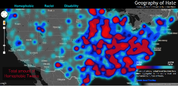
The thumbnail here doesn’t give the picture the full injustice it deserves, so you’ll have to click on the link to view the real map, which is interactive.
Most liberals who linked to this map have obviously never clicked on the link and investigated to see what it really shows. If you look at the map as shown above it shows lots of color ... lots of "hate" supposedly. But if you go to the real link and click to make it zoom in as much as possible what stands out is the absence of color. Seems none of big cities show up as hate centers - no hate of any kind in the Houston area, I note. All the hate, whether homophobic, racist, whatever shows up in a handful of isolated little blobs out in the middle of nowhere. I decided to look at a part of the country I know pretty well - southern IL. I note there's a blob of racial hatred just north of Cairo, IL. Though its not identified, I know this to be in and around the town of Mounds, which is a small majority black town. Funny, huh?
She had her students count “hate” tweets over eleven months, aggregate them at the county level, and then plot the results on a map. She called this counting an “algorithm sentiment analysis,” which is like calling the guy who collects pop cans from the trash an “aluminum reorientation environment engineer.”
First sin, and grounds for automatic disqualification: her definition of what counts as “hate.” Tweets which had “homophobic”, “racist”, or “disability” words in them (supposedly in context). Mouse over the headings on the map to see the brief list, or go to their FAQ to see all words.
These included ni**er1 and bitch, words which are not always used hatefully, at least if we understand hip hop, rap, and black popular culture. Why, take these words away and there would be no modern music!
Indian, they swear, is a hate word. So are monkey, gringo, cripple, and honky.
Actually, strike that. The list is not the list. Turns out the list was only a starting point, because, for example “honky/honkey/honkie was discarded, as most of the tweets were positive references towards honky-tonk music and not slurs”.
Bitch also had to go. Too many instances, you see, 55 million-plus, since each tweet had to be read by a student. What about other words? Here Stephens became whiny and evasive. She wanted to include more words, she really did!, but her “research funds, and thus the scope of this project, are extremely limited. It’s not like we have billions of dollars in funding lying around.”
I weep for her, I really do. But after reading all her explanations, it appears that she only used 10 words: dyke, fag, homo, queer; chink, gook, ni**er, wetback, spick;cripple.
Apparently none that were disparaging to whites, males, or females in general made the cut. That means, even if accurate, the “hate” map only pertains to animosity toward those with nonstandard sexual desires, blacks, East Asians, and Latinos. Oh, and the “differently abled”.
Her excuse for excluding most people? “If you are a disgruntled white male who feels that the persistence of hatred towards minority groups is a license to complain about how discrimination against you is being ignored, just stop.” Shut up, she explained.
Second, the ridiculous artifact caused by the mapping application she used and her sampling scheme. Look at those red blobs of hate! The entire Eastern USA is sliding into Hades.
Stephens did normalize the number of “hate” tweets by the number of total tweets in each county, but this did not help, as we’ll see.
Go to the map and zoom in the maximum extent possible. Look at Chicago and Detroit, including their suburbs. Nary a hater to be found. Can this be? Surely New York, or at least New God-Help-Us Jersey? Nope. Dallas, L.A., Indianapolis? Uh-uh. Any city where lots of people live? Sorry.
Instead, navigate up to the darkest blob in northernmost lower Michigan, north of the town Gaylord (where yours truly was bred). Looks like Cheboygan county, population 26,000.
Stephens only collected 150,000 tweets from the entire USA over eleven full months. There are 3,143 counties in the USA (Alaska and Hawaii are on the map; just zoom out to see; look how red everything now is!). Population isn’t evenly dispersed, but that’s an average of fewer than 47 “hate” tweets per county. Obviously counties with major cities will have had lots more “hate” (and normal) tweets than counties with small towns. This means small counties had to have many fewer than 47 “hate” tweets.
Now how many total tweets could have come from the mostly older not-too-tech-savvy folk in tiny Cheboygan county? A hundred? Two? A thousand? Not too many. All it would take was one lunatic with a sour mouth making just one intemperate tweet (once in eleven months) and voilà! we have a center of hate.
There are many more problems, the chip on Stephens’s shoulder not the least, but forget it: this study is so awful that I want to weep.
wmbriggs.com  |


