RtS, I like that long term chart, it give you a very good view of the long term situation. Thanks for posting.
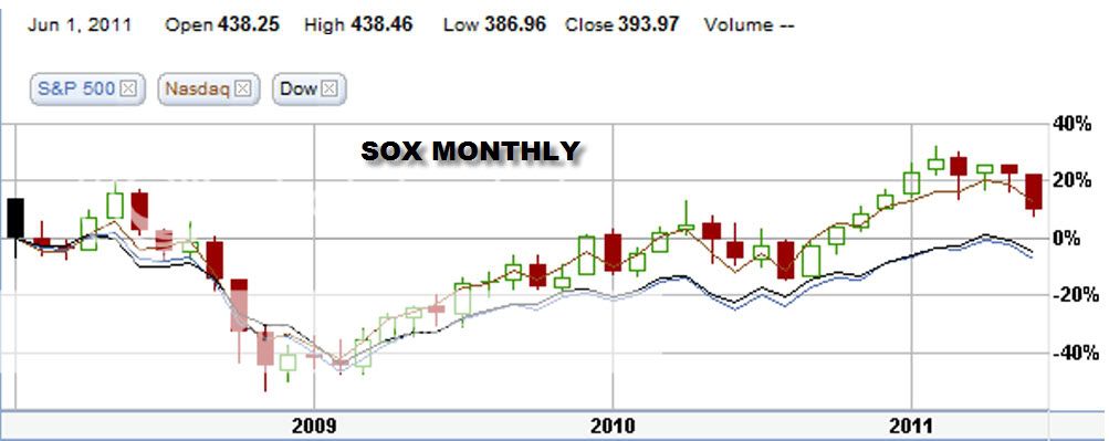
I am posting a 3+ year chart of the SOX with comparisons of the DOW, NASDAQ, and S&P-500. Over this period there are agreements and disagreements with the long term average performances.
The "bars" that fall on the year marks are for January, so we have to do a little counting to find the months from that point. Starting in 2008, the highest green bar is for the month of May. Then as we all know, the market started going down and bottomed in Nov for the SOX. The other 3 indices bottomed in early 2009. Recapping for 2008, May was the high point, Jun and July were down, Aug had a small upcheck, then Sep, Oct, Nov were all down and Dec was the start of the recovery.
In 2009, Jan and Feb faltered a bit, but then the uptrend was positive for the rest of the year finishing with a great Dec.
In 2010, Jan was down, then Feb, Mar, Apr were up, May, Jun were down, Jul was up, Aug a very down month, then Sep, Oct, Nov,Dec were all up.
In 2011 so far, Jan, Feb, were up to reach the peak so far for the year. Mar was down, Apr was up, May was down to cancel out Apr, and now Jun is down big time with today and 3 more days to go in Jun. Jun being down corresponds well with the long term chart.
So what does it all mean? Darned if I know, but whatever happens it will probably be different this year compared to 2008, 2009, 2010 and the long term averages. The U.S. and World economic situation if quite dicey right now, the situation changes on a nearly daily basis. The earnings releases by ORCL and MU last week were weaker than expected. Articles abound about a possible slowdown in the last half of this year. With the end of the June quarter on Thursday, reports will start coming out in about 2 weeks and much more will become known about the outlook for the remainder of the year. I think those reports will be key as to what the market will do over the rest of this year.
 |


