not good, eta before end of year, maybe tomorrow, heads-up just the same
just cleared from tray
From: J
Sent: Friday, July 6, 2012 5:01 AM
Subject: Re: what does this mean?
i feel ill and wish to raise cash
do not have a lot of things to sell
it is like puking for so long, empty in stomach, but needing to puke more
happy friday
cheers, j
From: H
Sent: Friday, July 6, 2012 1:04 AM
Subject: Re: what does this mean?
Hi P,
my pleasure, and I agree, it is best now to keep one's powder dry and be ready to buy when things fall apart and fear spikes (possibly later this year, in the fall?). I completely agree that junk is over-hyped and over-loved right now.
Moreover, my expectation is that the crisis in euro-land will once again flare up when it becomes clear that nothing has really changed fundamentally and that the recession will continue to play out for a good while yet (which in turn provides less room for the eurocrats to maneuver in terms of can-kicking exercises). This will eventually spread to the rest of the world, not least because euro area banks are huge providers of credit elsewhere in the world and are all busy pulling back to their home markets now.
The occasional relief such as that provided by the ECB's LTROs earlier this year can merely delay this process, but imo it cannot stop it.
best, H
On Thu, Jul 5, 2012 at 1:09 AM, P wrote:
H,
Thank you for the great explanation! Appreciate the insights. The above-ground supply buffer on silver makes sense in improving its signal use. Given the current positive hype around junk bond etfs, my contrarian side likes the early warning signs from silver and the JNK-TLT ratio. I used to use the fear based reversion to non-dicriminatory linearity in spread trading the old Brady bonds versus UST: lock in the best credits when the fear is the worst and vice versa. I will start to do some prep work into what the best vehicles might be for Jay and I to take advantage of a potential spread widening.
I think my vision has been somewhat clouded by the obvious need for the US to continue to keep rates low. Despite all my old bond vigilante views that rates should rise, they can't afford to due to the deleterious effect of rising interest costs and so I figured I can't fight the Fed. Without that rising rate scenario in place, I was having a hard time believing spreads would widen. What your early warning signals are showing me is, that despite the positive effect on corporates of telegraphed low rates, various sectors of the world economy and businesses are still slowing down and getting hurt and this will effect corporate credit quality. Let's hope that disinflation hook does not get set too deep.
kind regards,
P
On Jul 4, 2012, at 10:51 AM, H wrote:
Hi P,
Actually, the industrial and fabrication demand for silver has indeed remained fairly constant (or rather, has grown very slowly) over the past decade. The loss of demand from the photography sector was more than made up by demand growth in other sectors. Growth has mainly come from investment demand.
Now, one of the reasons why it makes more sense to use silver than e.g. copper or crude oil for this exercise, is precisely based on the fact that the large above-ground supply of silver held for investment purposes is providing a large supply cushion - this means that the silver price is as a rule not subject to unforeseen supply shocks.
For instance, in crude oil one could imagine a scenario where political tensions in the Middle East drive up its price in spite of declining economic confidence. In copper, it may happen that strikes at very large mines in Chile could prop the price up, etc. - this is not the case with silver, as for once thing, the bulk of its production is widely dispersed and mostly a by-product of base metal mining, and secondly the stock held for investment purposes will always be available to offset any disruptions from the supply side.
So I would think that platinum is also somewhat less useful for this type of indicator, as production is highly concentrated in one place (South Africa) and supply disruptions can not be buffered so easily.
Silver is in that sense uniquely qualified to reflect perceptions about future industrial commodity demand. Very occasionally there will be distortions in the price due to an unexpectedly big surge in investment demand, but these are actually quite rare (I could only name two over the entire post WW2 period, and the second one happened to coincide with increasing economic confidence anyway).
Gold's price on the other hand is almost entirely a function of investment or monetary demand (with reservation demand the biggest component thereof). Regardless of whether gold was 'fixed' against currencies during the gold standard, or whether it was free-floating as it is now, its price always rises relative to other commodities and goods when economic confidence declines.
It is not so that one could pinpoint specific spread products as being especially susceptible. Rather, the AU-Ag ratio must be seen as a more general indicator: it is highly sensitive to changes in economic perception. Often when it gives either a negative or a positive signal, we will concurrently observe some initial disturbance, respectively signs of betterment at the edges of credit markets.
Often these will be things that barely anyone notices. I attach two pertinent charts from a recent EWFF report. The first one shows the volume of junk bond issuance relative to the price performance of the DJ Industrials Average. What is important in this chart are the divergences (both at highs and lows): currently, what is notable is that as in 2007, the demand for junk bonds was receding slightly even as the stock market made new highs (you will also see that the opposite type of divergence occurred at the 2009 lows). Similarly, the spread between treasuries and industrial bonds graded B has been making a higher low. These are only very small signals, and like the Au-Ag ratio signal may yet be invalidated, if these data points change in a positive manner very quickly. But taking all of them together, they represent an early warning.
Now, as to which types of credit may come under the most pressure, I would argue that the lower the credit quality, the greater the pressure will be. Right now, junk bond prices remain extremely strong, so aside from the stress in European credit markets (sovereigns and banks), the world seems fine.
But this is always the case when the first warning signs appear: the world is still fine when they do. In the end, a general case of credit revulsion will likely make its appearance, i.e., the troubles will spread from the corner to which they now seem confined to the rest of the credit world. Consider in this context also the third chart I have attached: the price of JNK compared to the JNK-TLT ratio. Here we have another divergence that I would class as a subtle warning sign.
You can compare this with what happened in 2007 onward: in the beginning, only 'subprime' mortgage debt came under pressure. Officials and their advisors all insisted that the troubles would remain 'contained' to this sub-sector. But they rarely do remain so contained. It is in the end 'all one credit market' if you will. The differentiation between various types of credit instruments that the market makes now will increasingly disappear if the crisis intensifies and spreads.
You can see this phenomenon even by merely studying credit default swaps on European and CEE sovereigns over the past three years: whenever the market recovered, perceiving that the crisis was about to end (i.e., every time it appeared that the can had been kicked down the road successfully), the market began to treat every country differently, on its own merits and correlations declined sharply (the 'better credits' saw much bigger declines in their CDS spreads than the 'bad credits'). Whenever the crisis flared up again, correlations immediately began to become much stronger - individual merit was overruled by 'contagion fears'.
So my advice would be to keep a close eye on the Au-Ag ratio to see whether or not it falls again, and keep an eye open for all the small divergences or other small 'yellow flags' that may become noticeable in credit markets. If the 'yellow flags' begin to proliferate and the Au-Ag ratio keeps rising or refuses to decline, the probability of a major 'risk off' event sometime later this year will be very high.
On Wed, Jul 4, 2012 at 7:05 AM, P wrote:
Thank you H.
Nice indicator! Has the industrial demand component (%) of silver remained relatively constant over these periods to enable that judgement or did you have to adjust for any major industrial component % change over time? What index and tenor of credit spreads have you found works the best in this analysis ? junk, aa, aaa, Markit CDX North American Investment grade, etc. Do you think platinum will ever be a good alternative denominator due to its industrial use, or is it's price too skewed by electricity costs and South African labor unions?
Appreciate your help.
kind regards,
P
On Jul 3, 2012, at 8:26 PM, H wrote:
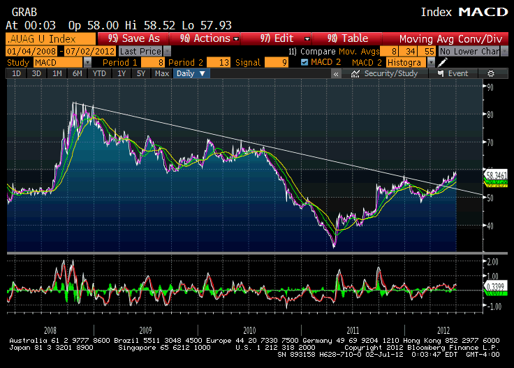
Ok, this is a long term chart of the gold-silver ratio. Traditionally it has been a leading indicator of credit spreads, as during times of declining economic confidence silver, which has a large industrial demand component, tends to fall against gold (which is what this ratio depicts, only vice versa).
Per experience, major trend changes in this ratio precede credit distress with a lead time varying from a few weeks to a few months (as always, this is more art than science). It is a heads-up that 'risk assets' of all kinds could get into trouble as the year goes on, provided the ratio does not reverse convincingly.
Since the AU-AG ratio peak during the 2008 crash, it has been in a long term downtrend - since the downtrend line has been breached, a warning signal is currently held to be operative.
On Wed, Jul 4, 2012 at 3:13 AM, J wrote:
h, please help us to understand, we are lost, and we must not be lost
p is my friend of 20 years, a bond-trading magician, moolah manager and entreprenuer
What does this mean?
Why this ratio?
What downtrend?
What evidence that this is an indicator of credit spreads?
This is from acting man..
<AU-Ag-ratio.gif>
The 'fly in the ointment' chart. In spite of the big party the markets threw on Friday, the gold-silver ratio has broken through a long term downtrend line this year. This bodes ill for the medium to long term outlook for stocks and junk bonds, as the ratio tends to work as a proxy and leading indicator for credit spreads. Note in this context that junk bond issuance has recently diverged bearishly from the stock market (namely at the early April high in the SPX). This is a phenomenon that was last observed in 2007 - click chart for better resolution.
 |


