The analysts behind the WHO rankings express the hope that their framework "will lay the basis for a shift from ideological discourse on health policy to a more empirical one." Yet the WHO rankings themselves have a strong ideological component. They include factors that are arguably unrelated to actual health performance, some of which could even improve in response to worse health performance. Even setting those concerns aside, the rankings are still highly sensitive to both measurement error and assumptions about the relative importance of the components. And finally, the WHO rankings reflect implicit value judgments and lifestyle preferences that differ among individuals and across countries.
cato.org 
The biggest problem is that their data isn't that relevant to their overall claim. They rank health care systems but the quality of health care systems is not for the most part what they are measuring. (And even if they where, quality is not an issue of hard and simple facts, there is inherently a subjective element in such determinations.)
As Lane3 said in a post on this thread - "If the report was supposed to be about fish counts and the methodology called for giving credit for sea mammals and crustaceans, you don't have to even look at the numbers to report the flaw".
WHO's report gave was 62.5% determined by issues of "fairness" (25% Health Distribution" 25% "Financial fairness", Responsiveness Distribution: 12.5 percent). If things get better for everyone, but they improve most for those with more money, than these parts of the score would drop, even though the overall quality of the system went up.
Only a bit more than a third of the report's conclusions where based on measures of quality (Health Level: 25 percent, Responsiveness: 12.5 percent). And there are problems even with those categories. Health level is determined by many things besides the health care and health insurance systems. If Americans eat too much or don't exercise enough, or are more likely to die in accidents than say the Danish, that isn't an aspect of our health care system.
Responsiveness, depending on exactly how they determine it can be a pretty good measure, but its a measure where the US should do pretty well, but its only weighted 12.5%
--
WHO is not measuring the quality of the health care system, but the quality of health care, plus the amount that the country lives up to what WHO thinks is its potential for quality health care, plus the equality of health care (and remember improving health care for some but not for others can make the equality worse, which hurts your score even though it improves your health care system). And if people in some countries have healthier habits than other countries the health care system is blamed as if it had or should have control over people's decisions in life.
---
...health level and responsiveness – are direct indicators of health outcomes. Even these are subject to some objections (such as that health level is affected by things like crime and nutrition), but they’re at least relevant. But neither health distribution nor responsiveness distribution properly belongs in an index of healthcare performance.
Why not? Because inequality (that’s what “distribution” is all about) is distinct from quality of care. You could have a system characterized by both extensive inequality and good care for everyone. Suppose, for instance, that Country A has responsiveness ranging from “good” to “excellent,” while Country B has responsiveness that is uniformly “poor.” Then Country B does better than Country A in terms of responsiveness distribution, despite Country A having better responsiveness than Country B for even the worst-off citizens. The same point applies to the distribution of health level.
To put it another way, suppose that a country currently provides everyone the same quality of healthcare. And then suppose the quality of healthcare improves for half of the population, while remaining the same (not getting any worse) for the other half. This is obviously an improvement – some people get better off, and no one gets worse off. But this change would cause the country to fall in the WHO rankings, other things equal.
[UPDATE: Clarification of the above example. As a result of the change, average health quality would rise, but inequality would rise as well. The former effect would tend to increase the country's WHO ranking, while the latter effect would tend to decrease it. The overall effect is ambiguous, even though common sense says the effect should be unambiguously positive.]
Now, it’s not silly to consider the quality of care received by the worst-off or poorest citizens. But distribution statistics emphatically don’t do that! They measure relative differences in quality, without regard to the absolute level of quality. A better approach would include in the index a factor for the health quality of the worst-off individuals. Or you could construct a separate health performance index for (say) the bottom 20% of the income distribution. These approaches would surely have problems of their own, but they would at least be focusing on the real concern. WHO’s current approach, sadly, doesn’t even do that much.
agoraphilia.blogspot.com
...The WHO rankings, by purporting to measure the efficacy of healthcare systems, implicitly takes all differences in health outcomes not explained by spending or literacy and attributes them entirely to healthcare system performance. Nothing else, from tobacco use to nutrition to sheer luck, is taken into account.
To some extent, the exclusion of other variables is simply the result of inadequacies in the data. It is difficult to get information on all relevant factors, and even more difficult to account for their expected effects on health. But some factors are deliberately excluded by the WHO analysis, on the basis of paternalistic assumptions about the proper role of health systems. An earlier paper laying out the WHO methodological framework asserts, “Problems such as tobacco consumption, diet, and unsafe sexual activity must be included in an assessment of health system performance.”
In other words, the WHO approach holds health systems responsible not just for treating lung cancer, but for preventing smoking in the first place; not just for treating heart disease, but for getting people to exercise and lay off the fatty foods.
This approach is problematic for two primary reasons. First, it does not adequately account for factors that are simply beyond the control of a health system. If the culture has a predilection for unhealthy foods, there may be little healthcare providers can do about it; and if the culture has a pre-existing preference for healthy foods, the healthcare system hardly deserves the credit. (Notice the strong ranking of Japan, known for its healthy national diet.) And it hardly makes sense to hold the health system accountable for the homicide rate. Is it reasonable to consider the police force a branch of the health system?
Second, the WHO approach fails to consider people’s willingness to trade off health against other values. Some people are happy to give up a few potential months or even years of life in exchange for the pleasures of smoking, eating, having sex, playing sports, and so on. The WHO approach, rather than taking the public’s preferences as given, deems some preferences better than others (and then praises or blames the health system for them). By doing so, it abandons its claim to objectivity.
agoraphilia.blogspot.com
-----
Health Care System Rankings
N Engl J Med 2010; 362:1546-1547April 22, 2010
Article
To the Editor:
In their Perspective article (Jan. 14 issue),1 Murray and Frenk review a number of indicators of the relatively poor state of the population's health in the United States. Most, if not all, of this information is well known to readers of the Journal, and the authors' use of it is not objectionable. However, Murray and Frenk begin their discussion by referring to the World Health Report 2000, Health Systems: Improving Performance, from the World Health Organization (WHO), which ranked the U.S. health care system 37th in the world, and this is objectionable. (I was editor-in-chief of the World Health Report 2000 but had no control over the rankings of health systems.) Fully 61% of the numbers that went into that ranking exercise were not observed but simply imputed from regressions based on as few as 30 actual estimates from among the 191 WHO member countries. Where the United States is concerned, data were available only for life expectancy and child survival, which together account for only 50% of the attainment measure. Moreover, the “responsiveness” component of attainment cannot be compared across countries, and the estimates of responsiveness for some countries were manipulated. This is not simply a problem of incomplete, inaccurate, or noncomparable data; there are also sound reasons to mistrust the conceptual framework behind the estimates, since it presupposes a production function for health system outcomes that depends only on a country's expenditure on health and its level of schooling, ignoring all cultural, geographic, and historical factors.2
The number 37 is meaningless, but it continues to be cited, for four reasons. First, people would like to trust the WHO and presume that the organization must know what it is talking about. Second, very few people are aware of the reason why in this case that trust is misplaced, partly because the explanation was published 3 years after the report containing the ranking. Third, numbers confer a spurious precision, appealing even to people who have no idea where the numbers came from. Finally, those persons responsible for the number continue to peddle it anyway. To quote Wolfgang Pauli's dismissal of a theory opposed to quantum mechanics, “Not only is it not right, it's not even wrong!” Analyzing the failings of health systems can be valuable; making up rankings among them is not. It is long past time for this zombie number to disappear from circulation.
Philip Musgrove, Ph.D.
, Bethesda, MD
nejm.org
...WHO rates the US health care system as a whole as being only 37th, which isn't all that good an outcome for spending the most money.
We need to go behind those numbers though and have a look at how they are calculated. It's not all that unusual for international statistics of these kinds to contain some, well, how to put this, odd assumptions. The answers to that are here. This is what the WHO uses to calculate those numbers and the weightings they put upon them.
1. Health Level: 25%
2. Health Distribution: 25%
3. Responsiveness: 12.5%
4. Responsiveness Distribution: 12.5%
5. Financial Fairness: 25%
As you can see, there's a great deal of assuming going on there about what makes a decent health care system. In fact, only 37.5% of the weighting is actually about health care itself: the other 62.5% is about distribution and fairness, how equal or unequal it all is.
These may be fair things to worry about, of course, but it does seem a little odd to assume that we must judge health care by equity. Judging it more (rather than only very much in part) by how good the actual health care is might seem more sensible.
What happens if we take a step further and look at the numbers for each of those five measurements that make up the total system ranking?
In terms of the health level, the US is 24th, distribution 32 nd, responsiveness 1st, responsiveness distribution joint 3-38th and financial fairness, joint 54- 55th.
I take it from that that what the (yes, hugely expensive) US health care system actually offers is responsiveness. That when we desire to be looked at, we get looked at. When we need or desire treatment then we get it faster than any place else on the planet. That's simply an extremely expensive thing to provide...
examiner.com
So 62.5% is about fairness or distribution rather than actual health or quality of health care.
--
The Doctor Is In: Infant Mortality Comparisons a Statistical Miscarriage
Babies don't do better in countries with socialized medicine.
by
Dr. Linda Halderman
Q: If socialized medicine is so bad, why are infant mortality rates higher in the U.S. than in other developed nations with government or single-payer health care?
A: U.S. infant mortality rates (deaths of infants <1 year of age per 1,000 live births) are sometimes cited as evidence of the failings of the U.S. system of health care delivery. Universal health care, it’s argued, is why babies do better in countries with socialized medicine.
But in fact, the main factors affecting early infant survival are birth weight and prematurity. The way that these factors are reported — and how such babies are treated statistically — tells a different story than what the numbers reveal.
Low birth weight infants are not counted against the “live birth” statistics for many countries reporting low infant mortality rates.
According to the way statistics are calculated in Canada, Germany, and Austria, a premature baby weighing <500g is not considered a living child.
But in the U.S., such very low birth weight babies are considered live births. The mortality rate of such babies — considered “unsalvageable” outside of the U.S. and therefore never alive — is extraordinarily high; up to 869 per 1,000 in the first month of life alone. This skews U.S. infant mortality statistics.
When Canada briefly registered an increased number of low weight babies previously omitted from statistical reporting, the infant mortality rose from 6.1 per 1,000 to 6.4 per thousand in just one year.
According to research done by Canada’s Bureau of Reproductive and Child Health, “Comparisons of infant mortality rates by place and time should be adjusted for the proportion of such live births, especially if the comparisons involve recent years.”
Norway boasts one of the lowest infant mortality rates in the world. But when the main determinant of mortality — weight at birth — is factored in, Norway has no better survival rates than the United States.
pjmedia.com
Abstract
Life expectancy in the United States fares poorly in international comparisons, primarily
because of high mortality rates above age 50. Its low ranking is often blamed on a poor
performance by the health care system rather than on behavioral or social factors. This paper
presents evidence on the relative performance of the US health care system using death
avoidance as the sole criterion. We find that, by standards of OECD countries, the US does well
in terms of screening for cancer, survival rates from cancer, survival rates after heart attacks and
strokes, and medication of individuals with high levels of blood pressure or cholesterol. We
consider in greater depth mortality from prostate cancer and breast cancer, diseases for which
effective methods of identification and treatment have been developed and where behavioral
factors do not play a dominant role. We show that the US has had significantly faster declines in
mortality from these two diseases than comparison countries. We conclude that the low longevity
ranking of the United States is not likely to be a result of a poorly functioning health care system.
Full paper at
repository.upenn.edu
marginalrevolution.com
Excerpt from the paper --
The health care system could be performing exceptionally well in identifying and administering
treatment for various diseases, but a country could still have poor measured health if personal
health care practices were unusually deleterious. This is not a remote possibility in the United
States, which had the highest level of cigarette consumption per capita in the developed world
over a 50-year period ending in the mid-80’s (Forey et al. 2002). Smoking in early life has left an
imprint on mortality patterns that remains visible as cohorts age (Preston and Wang 2006;
Haldorsen and Grimsrud 1999). One recent study estimated that, if deaths attributable to
smoking were eliminated, the ranking of US men in life expectancy at age 50 among 20 OECD
2
countries would improve from 14th to 9th, while US women would move from 18th to 7th (Preston,
Glei, and Wilmoth 2009). Recent trends in obesity are also more adverse in the United States
than in other developed countries (OECD 2008; Cutler, Glaeser, and Shapiro 2003).
This paper begins with a review of previous international studies of the comparative
performance of health care systems. The review is focused on the major diseases of adulthood,
cancer and cardiovascular disease, in the belief that disease-level analyses are more likely to
reveal the forces at work than more highly aggregated studies (Garber 2003). In 2005, cancer and
major cardiovascular diseases were responsible for 61.0% of deaths in the US at ages 45+ (US
National Center for Health Statistics 2008). Because our concern is with mortality per se, the
criterion we employ is effectiveness at preventing death, rather than cost-effectiveness or
efficiency of resource deployment. These latter criteria have been used in several other recent
comparative studies with a financial focus (Garber and Skinner 2008; McKinsey Global Institute
2008).
...
...
Summary
We have demonstrated that mortality reductions from prostate cancer and breast cancer
have been exceptionally rapid in the United States relative to a set of peer countries. We have
argued that these unusually rapid declines are attributable to wider screening and more
aggressive treatment of these diseases in the US. It appears that the US medical care system has
worked effectively to reduce mortality from these important causes of death.
This conclusion is consistent with other evidence that we have reviewed on the
performance of the US health care system: screening for other cancers also appears unusually
extensive; 5-year survival rates from all of the major cancers are very favorable; survival rates
following heart attack and stroke are also favorable (although one-year survival rates following
stroke are not above average); the proportion of people with elevated blood pressure or
cholesterol levels who are receiving medication is well above European standards.
These performance indicators pertain primarily to what happens after a disease has
developed. It is possible that the US health care system performs poorly in preventing disease in
26
the first place. Unfortunately, there are no satisfactory international comparisons of disease
incidence. Individuals report a higher prevalence of cancer and cardiovascular disease in the
United States than in Europe, and biomarkers confirm the higher prevalence of many disease
syndromes in the US compared to England and Wales. Higher disease prevalence is prima facie
evidence of higher disease incidence, although it could also be produced by better identification
(e.g., through screening programs) or better survival. The history of exceptionally heavy
smoking in the US, and the more recent massive increase in obesity, suggest that a high disease
incidence in the US could not be laid entirely at the feet of the health care system.
Evidence that the major diseases are effectively diagnosed and treated in the US
does not mean that there may not be great inefficiencies in the US health care system. A list of
prominent charges include fragmentation, duplication, inaccessibility of records, the practice of
defensive medicine, misalignment of physician and patient incentives, limitations of access for a
large fraction of the population, and excessively fast adoption of unproven technologies (Garber
and Skinner, 2008; Cebul et al. 2008; Commonwealth Fund 2008). Some of these inefficiencies
have been identified by comparing performance across regions of the United States. Of course,
the fact that certain regions do poorly relative to others does not imply that the US does poorly
relative to other countries. And many of the documented inefficiencies of the US health care
system add to its costs rather than harm patients.
Just as we are not addressing issues of efficiency on the production side, we are not
treating patient welfare as the main outcome. Practices that produce greater longevity do not
necessarily enhance well-being. This potential disparity is central to the controversy involving
PSA testing, which uncovers many cancers that would never kill patients but whose treatment
often produces adverse side effects.
The question that we have posed is much simpler: does a poor performance by the US
health care system account for the low international ranking of longevity in the US? Our answer
is, “no”.
repository.upenn.edu
Alternate (gated) link
papers.nber.org
--
the United States, which had the highest level of cigarette consumption per capita in the developed world
over a 50-year period ending in the mid-80’s (Forey et al. 2002). Smoking in early life has left an
imprint on mortality patterns that remains visible as cohorts age (Preston and Wang 2006;
Haldorsen and Grimsrud 1999).
repository.upenn.edu
---
WHO's Healthcare Rankings, Part 3
Posted by Glen Whitman at 1:32 PM
This is probably my last post on this topic, but no promises. I want to draw attention to the margins of error associated with WHO’s healthcare rankings, which media reports on the rankings typically neglect to mention.
If you look at the study that produced the rankings for “overall health system attainment” (this is the one that ranked France, Canada, and the U.S. 6th, 7th, and 14th, respectively), an 80% confidence interval puts the U.S. rank anywhere from 7th to 24th. France is anywhere from 3rd to 11th, Canada from 4th to 14th. Here is a blown-up section of the study’s Figure 2, which shows the intervals graphically:
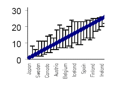
The U.S. is not named specifically on the horizontal axis, but it is the country just to the left of Iceland. Notably, its interval is a good bit wider than those around it. Obviously, there is considerable overlap among these intervals, and we cannot say with great confidence that the U.S. doesn't rank better than both France and Canada.
But these intervals result only from errors associated with random sampling in the construction of the statistics. They do not consider differences that could result from different weightings of the factors that compose the attainment index. As I argued in the two previous posts, there is good reason to think the proper weight for three of these factors is, in fact, zero. The authors of the study did not calculate rankings based on that weighting, but they did consider some other possible factor weights. Here is a blown-up section of the relevant graph (the study’s Figure 5):
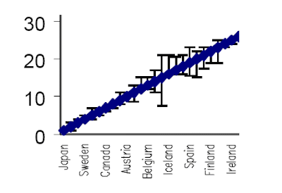
According to the study, this figure shows that “for only a small number of countries was there any substantive change in rank” as a result of different factor weights. But looking at the section above, one country stands out as having an especially wide interval. That country is the one just to the left of Iceland – once again, the U.S. In other words, the ranking of the U.S. healthcare system is especially sensitive to the choice of weights in the index.
And, it should be noted, the rank resulting from any given factor weighting will itself have a margin of error resulting from random sampling. That means the two different sorts of intervals shown above ought to be considered jointly, resulting in yet even wider ranking intervals. More reason, I think, to regard the WHO healthcare rankings as unreliable at best.
agoraphilia.blogspot.com
-----
We're No. 37? Maybe Not ...
By MERRILL GOOZNER
Goozner
Phil Musgrove, now at Health Affairs, was an editor at the World Health Organization when it compiled its international comparison of nations' health status that ranked the U.S. 37th in the world, largely because of its poor performance on infant mortality and longevity. In a letter to the editor in today's New England Journal of Medicine, he points out that the U.S. had no statistics for nearly half the measurements used in the rankings and that most of the national rankings were inputed from data from 30 of 191 countries in the survey who fully reported their health outcomes.
He concludes:
The number 37 is meaningless . . . Analyzing the failings of health systems can be valuable; making up rankings among them is not. It is long past time for this zombie number to disappear from circulation.
Fair enough. But the U.S. ranking in infant mortality and its lagging longevity are cause for alarm because they show that the U.S. lags in health status. There's many factors well beyond the quality of the health care system that contribute to these lagging indicators: persistent poverty in certain parts of the country and among certain subpopulations; chronic un- and underemployment; high levels of income and status inequality; and high levels of social stress and insecurity, for instance.
Someone should update the rankings and stress that they measure health status, not the quality of health care systems. If not WHO, who?
thehealthcareblog.com
------------
Health Care System Rankings
To the Editor: In their Perspective article (Jan. 14 issue),1 Murray and Frenk review a number of indicators of the relatively poor state of the population's health in the United States. Most, if not all, of this information is well known to readers of the Journal, and the authors' use of it is not objectionable. However, Murray and Frenk begin their discussion by referring to the World Health Report 2000, Health Systems: Improving Performance, from the World Health Organization (WHO), which ranked the U.S. health care system 37th in the world, and this is objectionable. (I was editor-in-chief of the World Health Report 2000 but had no control over the rankings of health systems.) Fully 61% of the numbers that went into that ranking exercise were not observed but simply imputed from regressions based on as few as 30 actual estimates from among the 191 WHO member countries. Where the United States is concerned, data were available only for life expectancy and child survival, which together account for only 50% of the attainment measure. Moreover, the "responsiveness" component of attainment cannot be compared across countries, and the estimates of responsiveness for some countries were manipulated. This is not simply a problem of incomplete, inaccurate, or noncomparable data; there are also sound reasons to mistrust the conceptual framework behind the estimates, since it presupposes a production function for health system outcomes that depends only on a country's expenditure on health and its level of schooling, ignoring all cultural, geographic, and historical factors.2
The number 37 is meaningless, but it continues to be cited, for four reasons. First, people would like to trust the WHO and presume that the organization must know what it is talking about. Second, very few people are aware of the reason why in this case that trust is misplaced, partly because the explanation was published 3 years after the report containing the ranking. Third, numbers confer a spurious precision, appealing even to people who have no idea where the numbers came from. Finally, those persons responsible for the number continue to peddle it anyway. To quote Wolfgang Pauli's dismissal of a theory opposed to quantum mechanics, "Not only is it not right, it's not even wrong!" Analyzing the failings of health systems can be valuable; making up rankings among them is not. It is long past time for this zombie number to disappear from circulation.
Philip Musgrove, Ph.D.
Health Affairs
Bethesda, MD
No potential conflict of interest relevant to this letter was reported.
References
1. Murray CJL, Frenk J. Ranking 37th -- measuring the performance of the U.S. health care system. N Engl J Med 2010;362:98-99. [Free Full Text]
2. Musgrove P. Judging health systems: reflections on WHO's methods. Lancet 2003;361:1817-1820. [CrossRef][Web of Science][Medline]
content.nejm.org
Message 26481427
---
Also see
agoraphilia.blogspot.com |


