Roy Spencer's latest deceit and deception
Sou | 7:39 AM Tuesday, February 11, 2014
Update: Today Roy Spencer responded below. I've now written another article explaining his deception a slightly different way.
Sou 21 May 2014
Sheesh! How's this for unadulterated chart fudging. Roy Spencer has put up a chart and proclaimed ( archived here):
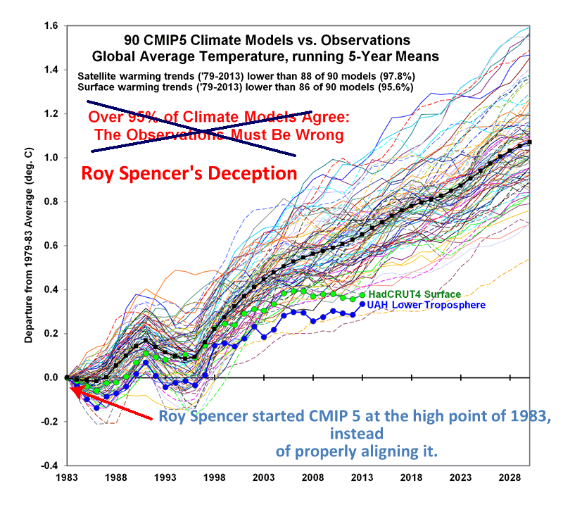
...the climate models that governments base policy decisions on have failed miserably. I’ve updated our comparison of 90 climate models versus observations for global average surface temperatures through 2013, and we still see that >95% of the models have over-forecast the warming trend since 1979, whether we use their own surface temperature dataset (HadCRUT4), or our satellite dataset of lower tropospheric temperatures (UAH):
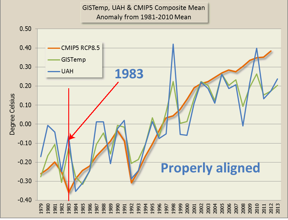
Let's look at how he's conned his denier fans. Below I've plotted the CMIP5 composite mean against UAH and GISTemp using a 1981-2010 baseline, which is what UAH normally uses, and then I'll discuss what Roy Spencer has effectively done:
What he's effectively done is shifted the CMIP5 charts up by around 0.3 degrees. In case you find it hard to credit that even a contrarian scientist would stoop so low, here is Roy Spencer's chart, with my annotations:
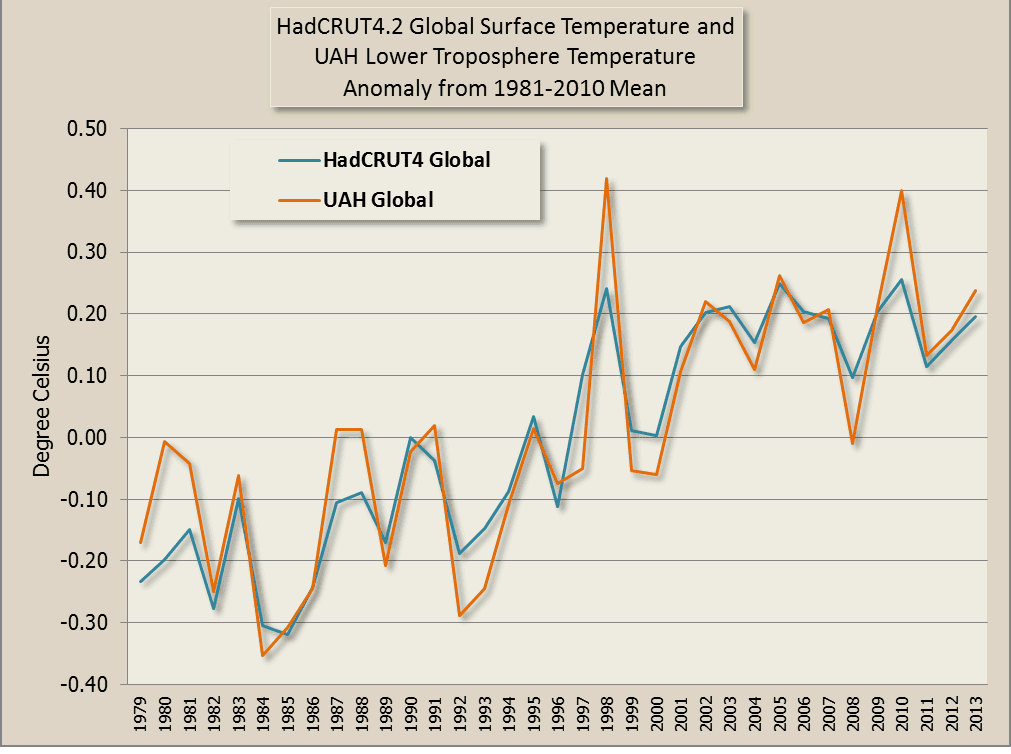
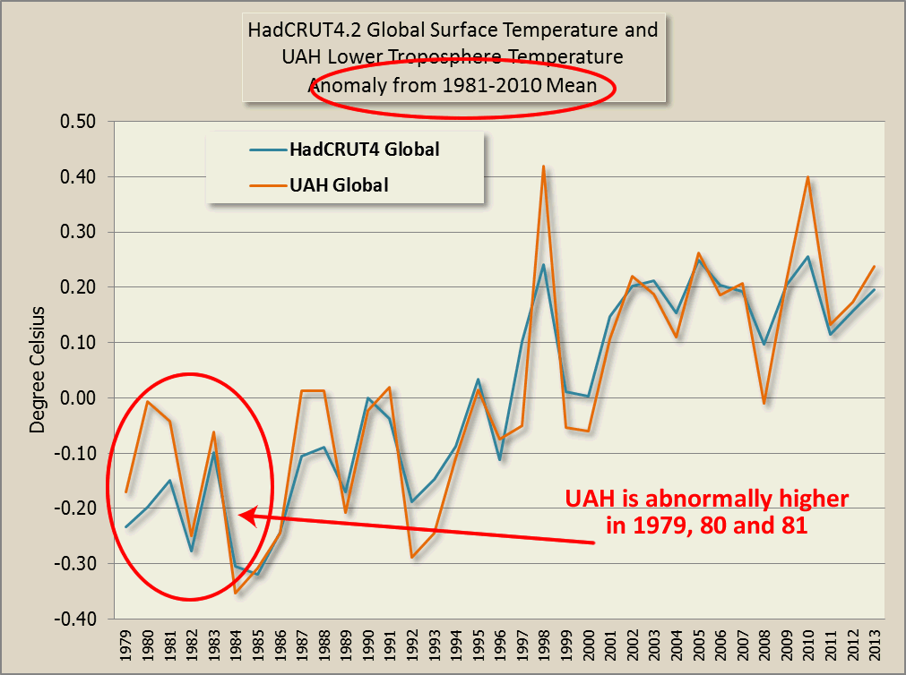
Not only did Roy effectively shift up the CMIP5 data, Roy Spencer effectively shifted down the UAH data in comparison with HadCRUT4. This is the chart of UAH and HadCRUT4 using the 1981-2010 30 year baseline - compare that to Roy Spencer's deceptive fudge:
How did he fudge? What Roy Spencer has done is he's used a five year average - 1979-1983 to plot his data instead of the normal 30 year baseline. Why did he pick 1979 to 1983 as the baseline? The answer can only be that he wanted to deceive his readers. Here is a comparison of UAH and HadCRUT4 using his shonky five year baseline compared to his normal 30-year 1981-2010 baseline.
That's not all that he's done. If you compare the five year baseline chart I plotted with Roy's chart - his chart shows UAH lower than HadCRUT4 in every year. That's not what my chart above shows, even using his shonky 5-year baseline. Roy said he's using "running five year means" - which only shows the elaborate lengths he felt he had to go to in order to deceive people.
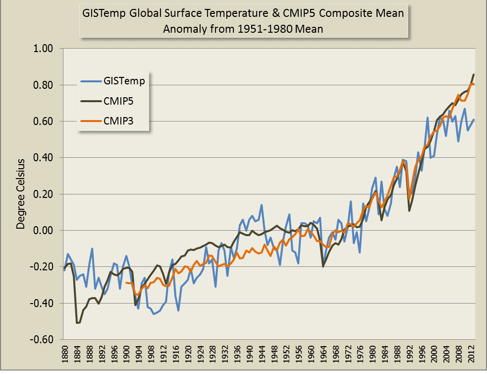
Anyway, to further illustrate Roy's shonkiness, here is the longer term CMIP5 and CMIP3 means vs GISTemp using the normal 30 year baseline:
The divergence only becomes apparent from around 2005. Going by Roy's past behaviour, I shouldn't be surprised at him fudging the data to this extent, but I am.
blog.hotwhopper.com |