LMAO.
Nope.Goddard is a liar. Even Watts knows that; see the Goddard spike.
Monckton and Goddard - O Lord!
Viscount Monckton of Brenchley has produced yet another in his series of the "Great Pause" - now 18 years 3 months. He uses only the troposphere average RSS - to quote Roy Spencer on how RSS is differing from his UAH index:
"But, until the discrepancy is resolved to everyone’s satisfaction, those of you who REALLY REALLY need the global temperature record to show as little warming as possible might want to consider jumping ship, and switch from the UAH to RSS dataset."
Lord M heard. But in his latest post he is defensive about it. He says:
"But is the RSS satellite dataset “cherry-picked”? No. There are good reasons to consider it the best of the five principal global-temperature datasets."
There is an interesting disagreement there. Carl Mears, the man behind RSS, says
"A similar, but stronger case can be made using surface temperature datasets, which I consider to be more reliable than satellite datasets (they certainly agree with each other better than the various satellite datasets do!)."
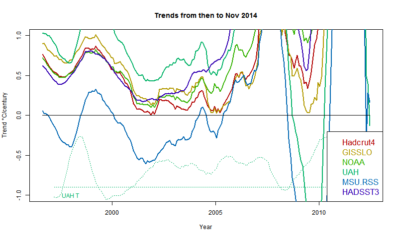
You can see in this plot how much an outlier RSS is. The plot shows the trend from the date on the x-axis to present. You can see the blue RSS crossing the axis on the left, around 1996. That is Lord M's Pause. No other indices cross at all until UAH in 2008. In the earlier years, UAH often has the highest trend.
Anyway, Lord M cites in his defence "The indefatigable “Steven Goddard” demonstrated in the autumn of 2014 that the RSS dataset – at least as far as the Historical Climate Network is concerned – shows less warm bias than the GISS [3] or UAH [2] records."
He shows this graph:
No details on how HCN is done, but certainly there is no TOBS adjustment, which for USHCN is essential. That is the main problem, but the clearly wrong averaging contributes. In the past, Goddard has vigorously defended his rights as a citizen to just average all the raw data in each month (eschewing anything "fabricated"), and I'm sure that is what we see here.
So what is wrong with it? We saw the effects in the Goddard spike. . The problem is that in each month, a different set of stations report. SG is averaging the raw temperatures, so what kind of stations are included can have big differences in average temp, without any actual change in temp. If a station in Florida drops out, the US average (SG-style) goes down. Nothing to do with the weather.
NZ Prime Minister Muldoon understood this. When the NZ economy hit a rough patch, he was scornful of locals leaving for Australia. But he took consolation. He said that this would improve the average IQ of both countries. It helped me - I can now figure out what he meant.
I wrote at some length about the Goddard spike issues here. But this example gives a simple case of the problem and an easy refutation of the method.
Every month, a different group of stations reports. Suppose we switch to a world in which temperatures do not change from year to year. Each reporting station reports the long term average for that month. So there is no change of actual weather (except seasonal). But the population of stations reporting varies in the same way as before.
For a fixed subset of stations, the average would be constant, as it should. But here it isn't. In fact, over time, the average goes down. That is because the stations dropping out (as they have, recently) tend to be warmer than most. I don't know why, but that is what the graph shows. It covers the period from 1979 to 2013, and shows the Goddard average raw in blue and the average of averages in red. It also shows the trends over this time, with slope on the legend in °C/century.
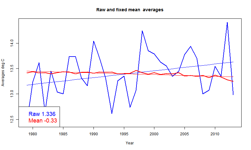
And that is the key. The cooling (in long term average) of the set of reporting stations induces a spurious cooling trend of 0.33°C/cen. That isn't large relative to the actual warming trend, but it makes a significant difference to the plots that Lord M showed. And it is simple error.
moyhu.blogspot.com |


