Christopher Monckton's trend of disinformation continues at WUWT - without pause
Sou | 6:34 PM
Christopher Monckton has written an article (archived here) signalling that his wavering pause is probably about to come to a dead stop. There's about to be a halt in the pause. The cold air above us has been getting hotter than ever recorded these past few months. For both RSS and UAH, November was the hottest ever November, December the hottest ever December and January the hottest ever January ever reported in the satellite record. That's looking back 35 years, since 1979.
Christopher wrote a lot of nonsense in his article as usual. Here are some examples:
Christopher Monckton builds a 19 year straw man
Science deniers like to make up stuff so that they can shoot it down. Here is one of Christopher's strawmen:
Schmidt and Karl, like the Met Office this side of the pond, say there has been rapid surface warming over the past 19 years. If so, where on Earth did it come from? Christopher Monckton just made that up. That's because he wants you to think that global warming stopped when it didn't. Scientists haven't been talking about "rapid" warming of the past 19 years. They've been warning of rapid warming since industrialisation. They've been warning us about the particularly rapid warming since the early 1970s. What they havesaid is that warming slowed for a short spell in the early part of this century at the surface (but not in the oceans), but that the longer term trend hasn't changed. It could even be speeding up again. We'll have to wait a few years to see. However the medium term trend hasn't changed so far, and it's high, at around 0.17 C/decade.
The past 19 years is from 1997 to 2015 inclusive. Let's compare it with the last 46 years, since 1970. This was around the last time the trend changed, as shown by analysis of the long term trend. Here is an animated chart comparing the two periods:
For the shorter period (19 years), there is a difference between data sets, because there are some differences in the underlying data as well as they way they estimate global mean surface temperature. However these differences largely disappear as you extend the time frame. The longer term trend, from 1970 to 2015 inclusive at the surface is almost identical for the four record sets listed below:
(In previous versions of the above table, I showed HadCRUT4 trend as 0.165 C/decade. That was a mistake. It is 0.169 C/decade as shown above.)
Christopher Monckton's data switcheroo
Christopher tried to brush the warming away by switching from the surface to the upper air, writing:
Significantly, the two satellite datasets continued to show a steadily-lengthening Pause till last month, but over the past year or two, long before the present el Niño set in, the three terrestrial datasets had already succeeded in ingeniously airbrushing it away.How does reporting the global mean surface temperature constitute air-brushing? It's Christopher who wants to "airbrush" away the warming. He wants to ignore every single independent data set of global mean surface temperature, despite the fact, no because of the fact that they all show the same thing. He wants his readers to ignore the surface warming and look at the air up above.
Christopher Monckton's trend switcheroo
Christopher isn't an honest chappie and accuses leading scientists of being unreliable. He demonstrated his conspiratorially-infected mind-frame, writing:
The not necessarily reliable Tom Karl of NOAA and the relentlessly campaigning Gavin Schmidt of NASA held a joint press conference to celebrate the grants their rent-seeking organizations can milk out of their assertion that 2015 was the warmest year since 1880.
Nothing about the rent-seeking, grant-celebrating, sucking at the government teat of the denier duo Roy Spencer and John Christy, you'll notice.
Then he complains that the scientists omitted trend lines, presumably referring to these slides they prepared. Christopher claims to have "added it back".
But they carefully omitted the trend-line from their graph, so I have added it back. It shows the world warming since 1880 at an unexciting two-thirds of a degree per century:Thing is, all of a sudden he wants to slash a single linear trend line, not just through the past nineteen years, but through the entire record. Here is a chart showing how the trend has changed over time, from Cahill15:
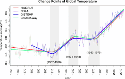 | | Figure 2 | Overlaid on the raw data are the mean curves predicted by the three CP model. The grey time intervals display the total range of the 95% confidence limits for each CP. The average rates of rise per decade for the three latter periods are 0.13 ± 0.04 °C, -0.03 ± 0.04 °C and 0.17 ± 0.03 °C for HadCRUT, 0.14 ± 0.03 °C, -0.01 ± 0.04 °C and 0.15 ± 0.02 °C for NOAA, 0.15 ± 0.05 °C, -0.03 ± 0.04 °C and 0.18 ± 0.03 °C for Cowtan and Way and 0.14 ± 0.04 °C, -0.01 ± 0.04 °C and 0.16 ± 0.02 °C for GISTEMP.Source: Cahill15 |
The Cahill15 analysis was before ERSST was updated to version 4. The table below compares the trends as estimated by Cahill15with the linear trend from 1970 to 2015:
As you can see, the odd ones out before the ERSST version update were NOAA and GISTemp. Now the data sets are more closely aligned. The only surprise is that deniers like Christopher Monckton didn't pick up on the lower NOAA trend and tout the NOAA data set as the perfect one. I suppose he didn't want to highlight the fact that the world has been warming. The trend line wasn't zero before any more than it is now.
Now look at what Christopher Monckton drew, and how he tried to con his readers. I've added annotations to his original chart to highlight what he did.
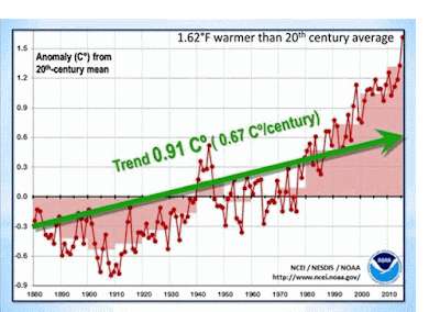 | | Figure 3 | Christopher Monckton's shonky trend line. The chart also shows the different trends over different periods as derived in Cahill15. Source: WUWT - with my annotations. |
What's more incredible is that no-one at WUWT seems to have noticed that the temperatures to the right of his chart have beenabove his trendline for the past 25 years! By using a linear trend through the entire period, Christopher Monckton has tried to "disappear" the warming since 1989.
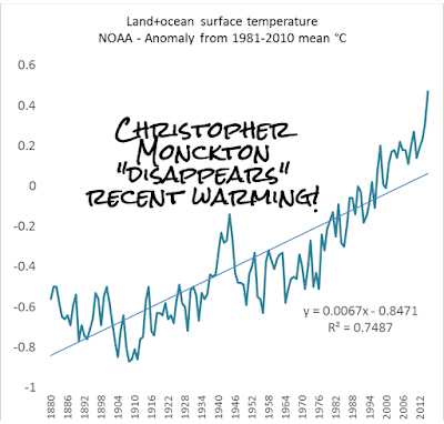 | | Figure 4 | Global mean surface temperature for different periods. The chart illustrates what Christopher Monckton wants to hide from his readers. Data source: NOAA |
Has the satellite temperature record "gone more than somewhat agley"?
At one point Christopher asks a not unreasonable question in a rather unreasonable manner. He wrote:
So here’s the Houston problem, the 13th chime, the dog that didn’t bark in the night-time, the fly in the ointment, the poop in the puree, the jumbo in the Jacuzzi – the $64,000 question that would once have alerted true scientists to the possibility that somewhere their pet theory might have gone more than somewhat agley.Since the satellites of both UAH and RSS show there has been very little global warming of the lower troposphere over the past decade or two, perhaps ...Let me replace how he finished his sentence with "perhaps there is something awry with the satellite data". As Peter Sinclair observed recently, in his article about John Christy trying to explain all the problems with his data to Lamar Smith:
Especially entertaining for me – Dr. Christy spent a good part of his time responding to stinging and long overdue critiques of his science, and his much ballyhooed satellite measures of global temperature.......In a series of egregious errors in the 1990s and 2000s, Dr. Christy and his partner Roy Spencer, actually managed to read their satellite data as showing the planet cooling, a 180 wrongway boneheaded analysis, let’s call it “Freedom Science” – that they defended stubbornly for more than a decade, until the overwhelming weight of evidence forced them to admit they were wrong.......Certainly, if not for a rich history of bungling, error, and accompanying arrogance, no one would ever have heard of Dr. Christy. But in these confusing times, for a science-challenged and ideologically blindered audience, Dr. Christy is science denial’s enthusiastic go-to guy, and a hero to intellectual titans like Ted Cruz, Rush Limbaugh, and Lamar Smith.
Christopher Monckton's unreliables: Roy Spencer and John Christy
Christopher claimed that:
When the first temperature-monitoring satellites began to deliver data, NASA said the satellite temperature record would be more reliable than the surface record because the coverage was more complete, the method of measurement standardized and the coverage and coverage-bias uncertainties that plague the terrestrial record were absent.He's wrong. It wasn't NASA who claimed that the satellite data would be more reliable, it was John Christy and Roy Spencer who claimed that. The very same people who are responsible for reporting satellite data. Think Dracula and blood banks, foxes and hen houses.
This denier meme seems to have originated with "Steve Goddard", who plucked an article from the Canberra Times, dated ironically, 1 April 1990. The article said how "the report's authors said that their satellite analysis of the upper atmosphere is more accurate, and should be adopted as the standard way to monitor global temperature change."
And who were the report's authors? None other than John Christy and Roy Spencer.
This is the only press release from NASA that I could find, which could be related (archived here). It's about a paper John and Roy had published in Science in March 1990. Since then they've had to make lots of corrections. The first people to sound the warning were Gary and Kiehm, again in Science, back in January 1991, to which Roy and John replied. One of the problems all agreed was the contamination of troposphere temperatures with the cooling stratosphere.
What happened in the intervening years? Christy and Spencer had to correct errors in their data, multiple times.
And they are still making adjustments to their record. Look at how many changes they've made to the pristine, perfect record just recently. UAH is now on version 6 beta. Just in the past few months when NOAA had one update to ERSST (from v3b to v4), UAH has had five updates - from v6.01 beta to v6.05 beta.
Christopher Monckton should be outraged
Why isn't Christopher jumping up and down asking how such a perfect reliable dataset could possible go through so many different iterations in such a short space of time?
Why isn't he jumping up and down asking how there can be such a huge difference between version 5.6 and version 6 beta? Christopher is particularly interested in the period since 1997, so how does he explain the huge difference between UAH versions, his "more reliable" data, for the period from 1997?
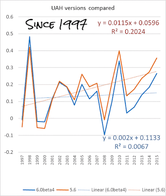 | | Figure 5 | Upper air temperature (lower troposphere) for different versions of UAH. Data source: UAH |
UAH has changed the trend since 1997 from 0.12C/decade to 0.02C/decade. How does Christopher Monckton explain how a "more reliable" data set can shift so much?
He doesn't try. He doesn't even tell his readers that there's been a big change in the perfect UAH record.
How does Christopher Monckton explain the discrepancy between radiosonde data for the upper air and satellite data, as shown by Tamino:
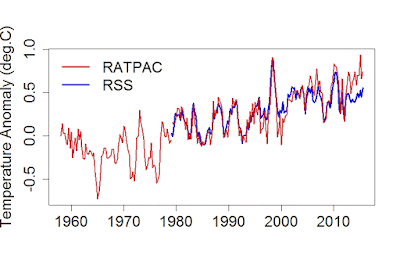 | | Figure 6 | RSS satellite data vs RATPAC radiosonde data for the upper air. Source: Tamino |
He doesn't. He doesn't even tell his readers that there is a discrepancy.
Christopher Monckton thinks the oceans are warming by magic
Christopher says some other really dumb and wrong things. He suggests that the ocean is warming from below, not from above. He's wrong. The ocean is warming from above. It's warmed by the sun. Despite what Christopher seems to think, there are no leprechaunsin the bottom of the ocean magically heating it up from below. The deep ocean is very cold, as shown in this image from NOAA.
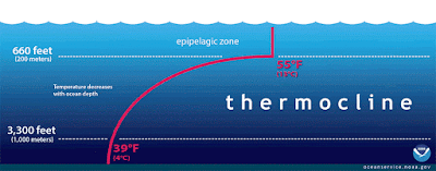 | | Figure 7 | The red line in this illustration shows a typical seawater temperature profile. In the thermocline, temperature decreases rapidly from the mixed upper layer of the ocean (called the epipelagic zone) to much colder deep water in the thermocline (mesopelagic zone). Below 3,300 feet to a depth of about 13,100 feet, water temperature remains constant. At depths below 13,100 feet, the temperature ranges from near freezing to just above the freezing point of water as depth increases. Source: NOAA |
Christopher Monckton is questioning the wrong people
I'd say he's posing his question to the wrong people. As he pointed out:
The laws of thermodynamics are not up for repeal. The official theory is that CO2 warms the atmosphere and the atmosphere warms the surface. But for almost 19 years the satellites show that the lower atmosphere has barely warmed. Even if there had been CO2-driven warming higher up, for the official theory says we should expect a faster warming rate in the mid-troposphere than at the surface, how could that higher-altitude warming have magically reached the surface through a lower troposphere that has not warmed at all?Is there something wrong with the estimates of mid-atmosphere temperature? Is there something wrong with the record of the lower troposphere temperature? Or is it just that the atmosphere has been warming at a lower rate than the surface?
Is Christopher Monckton going to ask Roy Spencer, John Christy and Carl Mears to redo their calculations? Is he going to ask them why the satellite record seems to be different to the records from radiosonde data? Is he going to ask them if the mid-troposphere temperature record also includes some of the cooling stratosphere?
I guess not.
Christopher's also over-simplifying things when he writes: "CO2 warms the atmosphere and the atmosphere warms the surface". It's more complicated than that. As I expect you know, it's to do with how greenhouse gases absorb and emit longwave radiation. So the surface is getting hotter, the oceans are warming up and the air itself is getting warmer. The amount of energy coming into the system isn't balanced by the amount going out. There's more energy being retained, so Earth as a whole is getting hotter.
The answer to Christopher's question
Remember how Christopher asked the question:
Schmidt and Karl would care to answer the following key question, which I have highlighted in red:
Where has the warming of the past 19 years come from?
Well, as the scientists have been telling the general public for the past century and more, the warming has come from the increase in greenhouse gases. It's primarily come from the same source that John Tyndall showed back in the 1850's is responsible for the planet not being an ice block. From the same source that Albert K Varley said to the people of Mount Gambier, way back in 1884, would cause the planet to "become like a vast orchid house". It comes from an increase in greenhouse gases, primarily the waste CO2 that we're pumping into the air.
How could Christopher Monckton not know that? This isn't 1885. He can't complain that he didn't get that edition of the Border Watchso he missed it. Scientists have been pointing this out since the early 1800s. That's more than 200 years ago. And it was proved by experiment in the 1850s. That's more than 150 years ago.
So although Christopher's question is not unreasonable, a better question is, in dark red:
How is it that Christopher Monckton has missed out on centuries of scientific knowledge?
Christopher Monckton denies internal variability
Christopher effectively claims that there is no internal variability, writing:
For their own theory dictates that, all other things being equal, an initial direct warming should occur instantaneously in response to radiative forcings such as that from CO2He's wrong. The heat shifts about in the system. Think ENSO events. Sometimes more of the extra heat goes into the ocean, and sometimes it goes to the surface or the air above.
Christopher Monckton tells a big fat lie
Christopher tells a big fat lie, falsely claiming that:
In 1990, at page xxiv of the First Assessment Report, IPCC predicted near-linear global warming of 1.0 [0.7, 1.5] K over the 36 years to 2025, a rate equivalent to 2.78 [1.94, 4.17] K/century.He didn't quote from the 1990 IPCC report, because it would have revealed his lie. The only estimate on page xxiv of the first assessment report was: "best estimate of global mean warming of l.8°C by 2030". On page xxii, the report stated:
Under the IPCC Business-as-Usual (Scenario A) emissions of greenhouse gases, the average rate of increase of global mean temperature during the next century is estimated to be about 0 3 C per decade (with an uncertainty range of 0.2C to 0.5C) This will result in a likely increase in global mean temperature of about 1C above the present value (about 2C above that in the pre-industrial period) by 2025 and 3C above today's (about 4'C above pre-industrial) before the end of the next century.Why Christopher is harking back to a report published twenty five years ago, I cannot say. However I can point out:
the report does not claim that "warming will be near linear"global mean surface temperature is already more than one degree higher than pre-industrialthere was a wide uncertainty range in the first IPCC assessment report.
In regard to point 1, if Christopher had turned the page to page xxvii, he would have seen a discussion of uncertainty as well as clear statements about internal variability, such as:
Because of long-period coupling between different components of the climate system, for example between ocean and atmosphere, the Earth’s climate would still vary without being perturbed by any external influence. This natural variability could act to add to, or subtract from, any human-made warming, on a century time scale. This would be less than changes expected from greenhouse gas increases.
So all the parts where Christopher yells "discrepancy" are wrong. From the outset, scientists have been predicting that the extra greenhouse gases we're pouring into the air will heat up the world, quickly. And they are:
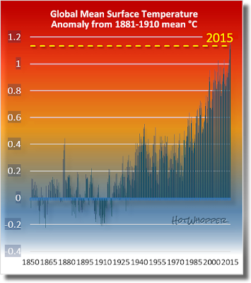 | | Figure 8 | Global mean surface temperature from 1880 to 2015. Data source: GISS NASA |
blog.hotwhopper.com |


