| | | Lets see what Martin Pring has too say regarding equities...... and a review of the 75 year US 30 Bond Yield
Martin Pring's Market Roundup
Equities Are Rolling Over Into Corrective Mode
Martin Pring | April 07, 2016 at 11:46 PM
Headlines:
?
The Coppock Curve tells us the market is at a significant juncture point
Those pesky credit spreads are deteriorating again
The US credit markets are close to some important signals
The Coppock Curve tells us the market is at a significant juncture point
Chart 1 features a long-term smoothed momentum indicator called the “Coppock Curve”. It was designed by the late Mr. E.S. Coppock of Texas, to identify major lows. The signal he developed was to wait for the indicator to fall below zero and then turn up. Other than that, he concluded that the indicator was of little use. On the other hand, the Coppock Curve has in the last 100 years or so, been quite successful and very consistent in calling major turns. This is not only for US equities but for other markets as well. In this respect, Chart 1 flags its track record since the 1960’s with the green vertical lines. No technical indicator is perfect of course, and the red line in 2002 shows a premature buy signal. What is intriguing right now is that the curve has gone flat, thereby pointing up the very fine balance that currently exists. If it turns up we get a buy signal and if it turns down, look for lower prices.

Chart 1
Short-term equity picture
Obviously, the short-term technical picture is going to provide a clue as to which way things are likely headed. The last time I wrote about the equity markets, a couple of weeks ago, I pointed out that several indicators were overstretched and starting to turn over. Prices have not moved a lot since then, but the rolling over effect is definitely more evident.
Chart 2 compares the relationship between price and volume during the course of the rally. The rising MACD in the bottom panel indicates the obvious, that prices have been rising. The Price Volume Oscillator (PVO) just above it has been shrinking, and that reflects a trend of contracting activity. Now it is oversold, which means the next move in volume is likely to be up. As a rule of thumb, rallies that develop on declining activity are suspect. Since the MACD is overbought, prices are quite vulnerable. When declining prices are associated with rising volume that implies motivated sellers and therefore a nastier decline. Previous examples of this combination can be seen at points A, B, and C; only it’s worse now. That’s because the MACD is at a more overstretched level. To make matters worse it also looks as though price action in the last week or so will turn out to be a false breakout above the 200-day MA and declining green trendline. This negative break hasn’t quite been confirmed yet because the $NYA is only slightly below its green down trendline. However, the oversold volume/overstretched price characteristic argues that it soon will. Remember false breakouts tempt buyers into long positions. When prices move against them, these losing positions place downward pressure on the market.

Chart 2
Chart 3 compares a (black) 10-day EMA of the McClellan Volume Oscillator to a (red) 20-day one. Buy and sell signals are triggered when the 10-day crosses above its red counterpart and vice versa. The red arrows highlight periods when the 10-day series has touched or exceeded its overbought zone and subsequently gone bearish. As you can, see this technique is already in a negative mode, which adds further weight to the view that the break above the declining 200-day MA and green trendline will turn out to be false.

Chart 3
Chart 4 expands our view to the whole world as it features the MSCI World Stock ETF, the ACWI. The center panel displays my Global A/D Line, which, between 2013 and half of 2014, was in gear with the price. However, between mid-2014 and 2015 the two series diverged in a negative way, which told us that under the surface things were not going so well as the advance was limited to a few countries such as the US. Since then the ACWI and the breadth indicator have been confined below two green declining trendlines. The price briefly rallied above its line in March but is now back below it. On Thursday, it tentatively violated the red February/April recovery line. Since the KST in the bottom panel has also triggered a sell signal and is overbought, the line of least resistance is to be a downward one.

Chart 4
Those pesky credit spreads are deteriorating again
For many months we have talked about credit spreads and their importance for equities. As you can see from Chart 5 the ratio between junk bonds and treasuries (HYG/TLT) has been diverging negatively for some time. This points out that bond investors have been in a cautious mood as they have not been willing to take advantage of those tempting juicy high yields in preference for much safer treasuries. History tells us that sooner or later confidence problems in the bond market typically spill into equities in an adverse way, which means that the failure of the ratio to experience a meaningful rally represents a red flag. In effect, if this deteriorating trend in the ratio extends, equity market confidence will, at some point, snap.
I believe a break above the green trend line, say to .70-.72, would signal the all-clear. Such action would also push it back above its 65-week EMA. Unfortunately, the ratio currently appears to be reverting to the downside again. As a result, it’s now just a tad above the horizontal red trendline at the 2009 low. A drop below the line would clearly be bearish for bond confidence and equity prices.
If you want to follow the ratio remember to plot both components using the underscore key. That enables a pure price comparison, whereas the straight HYG/TLT plot would distort the results by including dividend payouts.

Chart 5
The US credit markets are close to some important signals
When many of the US treasury maturities included in the StockCharts database are reviewed, it’s difficult not to come away with the view that the US credit market is at a very critical short-term juncture point. For example, Chart 6 shows the 2-year maturity. It’s been in a rising trend channel for a long time and has now fallen back to the lower part. Since KST action is universally bearish it seems a short leap to expect that line to be penetrated and the trend of lower yields extend.

Chart 6
When we move out to the 5-year maturity, we also see the yield just above a 3-year support trendline. Again the KSTs are in a negative mode, which suggests that 5-year yields are also headed much lower.

Chart 7
Finally, the 30-year yield is right at the neckline of a potential head and shoulders top. Again KST action suggests that the pattern will be completed.

Chart 8
Good luck and good charting,
Martin J. Pring
--------
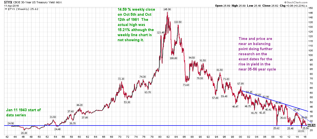
(editorial note by JJP.... looking at chart 7 the 30 year yield. yield here is a weekly chart going back 16 years
I am inclined to toss out the 2.25% low in yield and construct a descending triangle which is typically a quite reliable pattern that results in breakdown in the pattern. In this case we would have yield going down and bond prices going up.
This is a weekly chart and thus we could be looking at a period of time for this to play out, then again maybe sooner. Key supports on the 30 year yield would be 2.49% a break below that would auger a retest of the 2.25% and the possibility of even lower treasury yields. We'll see what the Central Banks do.

Here is a 75 year 30 year US Bond yield that I believe goes to the inception of the US 30 year bond.

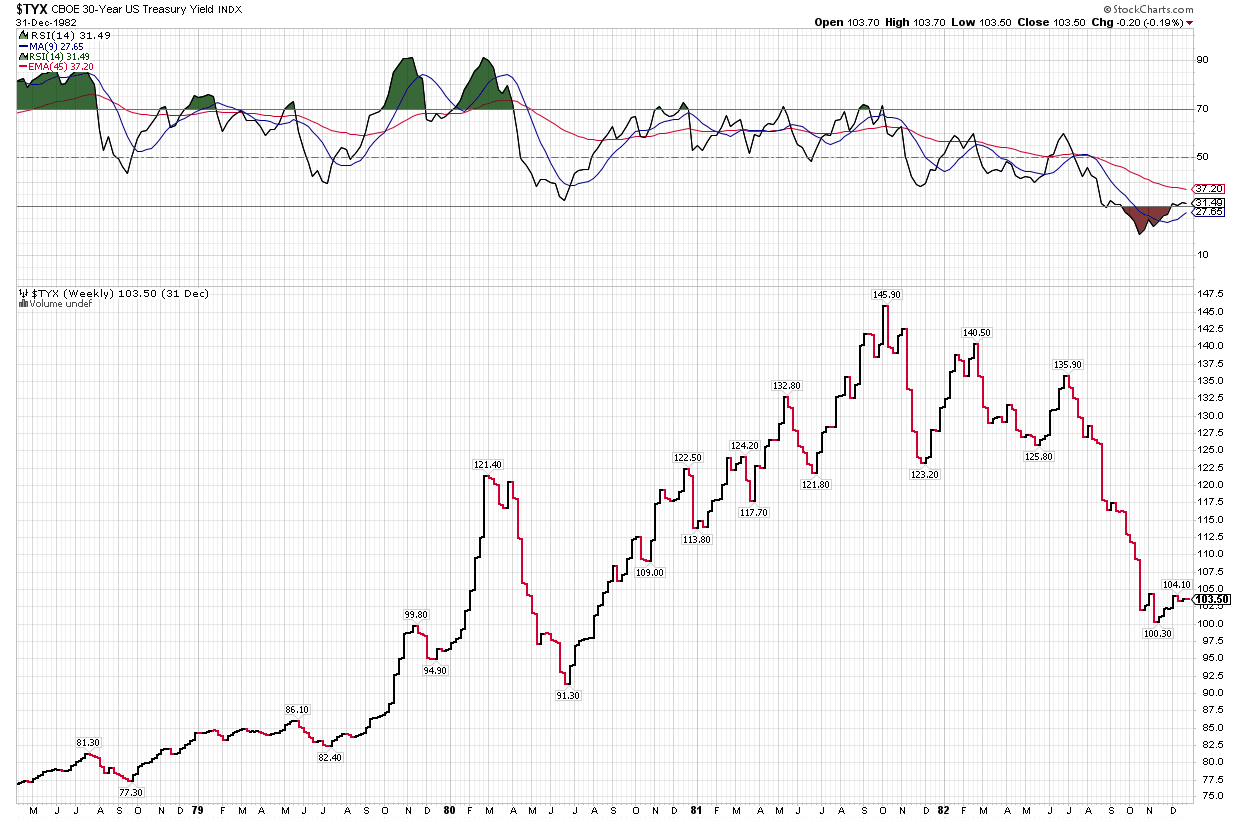
here is the chart from April 1978 until Jan 1983.

interesting time we are living in.)
JP |
|


