It's still hot! Second hottest November in the NASA GISTemp record
Sou | 11:35 AM

According to GISS NASA, the average global surface temperature anomaly for November was 0.95 °C, which is the second hottest November on record, and only 0.07 °C lower than the hottest November during the El Niño in 2015.
The average for the eleven months to the end of November is 1.01 °C, which is 0.17 °C higher than the previous hottest January to November period in 2015, which with the latest data had an anomaly of 0.84 °C.
Here is a chart of the average of 12 months to November each year. The 12 months to November 2016 averaged 1.02 °C above the 1951-1980 mean and was 0.14 °C hotter than the 12 months to November 2015:
Figure 1 | Global mean surface temperature anomaly for the 12 months to November each year. The base period is 1951-1980. Data source: GISS NASA
Below is a chart of the month of November only. Hover over the chart to see the anomaly in any November:
Figure 2 | Global mean surface temperature anomaly for the the month of November only. The base period is 1951-1980. Data source: GISS NASA
The La Niña didn't emerge
You can see the global mean temperature trend by month in the chart below, for the strongest El Niño years since 1950, which were followed by a La Nina. I've included the 2015/16 period for comparison. NOAA announced a La Nina advisory. The BoM ENSO update says there will not be a La Nina - and has taken the watch notice away.
Including 2015/16, of the eight very strong, strong and strong to moderate El Ninos since 1950, there were only three that were followed by a La Nina. The chart spans a three year period. That is, for the 2015-16 El Niño and subsequent, it goes from January 2015 to December 2017, or would if the data allowed. (For a more detailed explanation see the HW articles: El Niño to La Niña years with more detail here.)
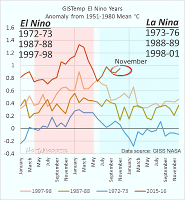 | | Figure 3 | Global mean surface temperature for strong or moderate/strong El Nino years that were followed by a La Nina. 2015/16 is shown for comparison, but there has not been a La Nina this year. Data source: GISS NASA |
Where was it hot?
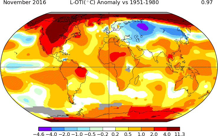
Last month it was very hot in the Arctic, over North America and down in Antarctica. As with last month, there was a part of Russia that was rather cool.
 | | Figure 4 | Map showing mean surface temperature, anomalies for November, from the 1951-1980 mean. Source: GISS NASA |
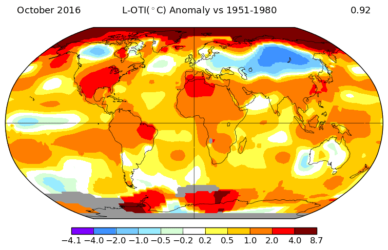
Below is October for comparison:
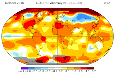 | | Figure 5 | Map showing mean surface temperature, anomalies for October, from the 1951-1980 mean. Source: GISS NASA |
Next is a chart showing the anomalies for November by latitude, which highlights the extraordinary temperatures in the high north. Right up top it averaged more than 11 °C above the 1951-1980 mean.
Figure 6 | Global mean surface temperature anomaly for November 2016 by latitude. The base period is 1951-1980. Data source: GISS NASA
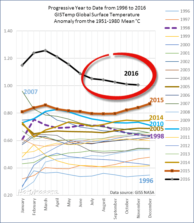
Year to date average surface temperature
The chart below tracks the year to date. Each point on the plot is the average of the year to that month. For 2016, the last point is the average of all months to date including November. This year is tracking well above 2015, partly because of the El Niño and partly because of the extraordinary warmth in the Arctic. To drop below the average for 2015, the average anomaly for December would need to be lower than minus 0.75 °C.:
 | | Figure 7 | Global mean surface temperature, progressive year to date to November 2016. Data source. GISS NASA |
December would have to be as cold as the coldest month on record...
For 2016 to be colder than 2015, the December average would need to be below minus 0.75 °C. The only month with an average less than minus 0.75 °C was in December 1916! That's out of all months of the year, not just for December. Below is a chart showing the average temperature for December for the entire record: 1880 to 2015. (The blue line down the bottom is minus 0.75°C. The black line up the top is the average year to date, January to November 2016.)
Figure 8 | Global mean surface temperature anomaly for December. The base period is 1951-1980. The blue line down the bottom is what December would need to be for 2016 to be the same average annual temperature as 2015. The black line up top is the average year to date for 2016. Data source: GISS NASA
blog.hotwhopper.com |