Like i said, the data goes through an orgy of mathematical masturbation and cums out splashing everywhere.
MEGA CLIMATE GATE 2.0
And  is not around to pervert the course of Justice. is not around to pervert the course of Justice.
That is why this is how  is so so so so depresed. have a nice day. is so so so so depresed. have a nice day.
More on the Bombshell David Rose Article: Instability in the Global Historical Climate Network
Anthony Watts / 28 mins ago February 7, 2017
There has been a visceral reaction by the defenders of the climate faith to the Mail on Sunday article by David Rose…

…where the Karl et al. 2015 “pausebuster” was not just called into question by a NOAA whistleblower, who saus procedures weren’t followed, and that the authors “played fast and loose” with the figure, but basically called fraudulent on the face of it becuase it appears to have been done for political gain. In my opinion The lead authors, Thomas Karl and Thomas Petersen both retired from NOAA in the last two years, so they didn’t fear any retribution.
Having met both of these people, and seen their zealotry, none of the shenanigans brought out by the David Rose article surprised me.
The faithful have been claiming that there’s no difference between the NOAA and HadCRUT temperature datasets depicted in the Rose article, saying it’s a baseline error that gives the offset. I’ll give them that, and that may have simply been a mistake by the Mail on Sunday graphics department, I don’t know.

When the baselines for anomalies are matched, the offset goes away:
<img data-attachment-id="25761" data-permalink="https://wattsupwiththat.com/?p=25761" data-orig-file="" data-orig-size="" data-comments-opened="1" data-image-meta="[]" data-image-title="Watts Up Nuuk?" data-image-description="As regular readers know, I have more photographs and charts of weather stations on my computer than I have pictures of my family. A sad commentary to be sure, but necessary for what I do here.
Steve Goddard points out this NASA GISS graph of the Annual Mean Temperature data at Godthab Nuuk Lufthavn (Nuuk Airport) in Greenland. It has an odd discontinuity:

Source data is here
The interesting thing about that end discontinuity is that is is an artifact of incomplete data. In the link to source data above, GISS provides the Annual Mean Temperature (metANN) in the data, before the year 2010 is even complete:

Yet, GISS plots it here and displays it to the public anyway. You can’t plot an annual value before the year is finished. This is flat wrong.
But even more interesting is what you get when you plot and compare the GISS “ raw” and “ homogenized” data sets for Nuuk, my plot is below:

Looking at the data from 1900 to 2008, where there are no missing years of data, we see no trend whatsoever. When we plot the homogenized data, we see a positive artificial trend of 0.74°C from 1900 to 2007, about 0.7°C per century.
When you look at the GISS ploted map of trends with 250KM smoothing, using that homogenized data and GISS standard 1951-1980 baseline, you can see Nuuk is assigned an orange block of 0.5 to 1C trend.

Source for map here
So, it seems clear, that at least for Nuuk, Greenland, their GISS assigned temperature trend is artificial in the scheme of things. Given that Nuuk is at an airport, and that it has gone through steady growth, the adjustment applied by GISS is in my opinion, inverted.
The Wikipedia entry for Nuuk states:
With 15,469 inhabitants as of 2010, Nuuk is the fastest-growing town in Greenland, with migrants from the smaller towns and settlements reinforcing the trend. Together with Tasiilaq, it is the only town in the Sermersooq municipality exhibiting stable growth patterns over the last two decades. The population increased by over a quarter relative to the 1990 levels, and by nearly 16 percent relative to the 2000 levels.

Nuuk population growth dynamics in the last two decades. Source: Statistics Greenland
Instead of adjusting the past downwards, as we see GISS do with this station, the population increase would suggest that if adjustments must be applied, they logically should cool the present. After all, with the addition of modern aviation and additional population, the expenditure of energy in the region and the changing of natural surface cover increases.
The Nuuk airport is small, but modern, here’s a view on approach:
[caption id="attachment_25748" align="alignnone" width="640" caption="Nuuk Airport, Aug 11, 2007, photo by Lars Perkins via Picasa web album"]  [/caption] [/caption]
Closer views reveal what very well could be the Stevenson Screen of the GHCN weather station:
[caption id="attachment_25749" align="alignnone" width="640" caption="Nuuk Airport looking Southwest Image: Panaramio via Google Earth"]  [/caption] [/caption]
Here’s another view:
[caption id="attachment_25750" align="alignnone" width="640" caption="Nuuk Airport looking Northwest Image: Panaramio via Google Earth"]  [/caption] [/caption]
The Stevenson Screen appears to be elevated so that it does not get covered with snow, which of course is a big problem in places like this. I’m hoping readers can help crowdsource additional photos and/or verification of the weather station placement.
Back to the data. One of the curiousities I noted in the GISS record here, was that in recent times, there are a fair number of months of data missing.

I picked one month to look at, January 2008, at Weather Underground, to see if it had data. I was surprised to find just a short patch of it graphed around January 20th, 2008.

But even more surprising, was that when I looked at the data for that period, all the other data for the month, wind speed, wind direction, and barometric pressure, were intact and plotted for the entire month:

I checked the next missing month on WU, Feb 2008, and noticed a similar curiosity; a speck of temperature and dew point data for one day:

But like January 2008, the other values for other sensors were intact and plotted for the whole month:

This is odd, especially for an airport where aviation safety is of prime importance. I just couldn’t imagine they’d leave a faulty sensor in place for two months.
When I switched the Weather Underground page to display days, rather than the month summary, I was surprised to find that there was apparently no faulty temperature sensor at all, and that the temperature data and METAR reports were fully intact. Here’s January 2nd, 2008 from Weather Underground, which showed up as having missing temperature in the monthly WU report for January, but as you can see there’s daily data:

But like we saw on the monthly presentation, the temperature data was not plotted for that day, but the other sensors were:

Strange.
I did spot checks of other dates in January and February of 2008, and found the same thing: the daily METAR reports were there, but the data was not plotted on graphs in Weather Underground.
Since WU makes these web page reports “on the fly” from stored METAR reports in a database, to me this implies some sort of data formatting problem that prevents the graph from plotting it.
" data-medium-file="" data-large-file="" class="wp-image-25761" src="https://www.carbonbrief.org/wp-content/uploads/2017/02/noaa-hadley-common-baseline-1-1024x819.png" alt="Comparison of HadCRUT4 and NOAA global land/ocean monthly temperature anomalies put on a common 1961-1990 baseline." width="670" height="535">Comparison of HadCRUT4 and NOAA global land/ocean monthly temperature anomalies put on a common 1961-1990 baseline. h/t The CarbonBrief
BUT….there’s other serious problems in global climate data.
Despite what you might think, NOAA and HadCRUT data are not entirely “independent”. They both use Global Historical Climate Network (GHCN) data, and the GHCN was administered by ….drum roll… Thomas Peterson of NOAA, one of the co-authors of the Karl et al. 2015 “pausebuster” paper.
It’s the fox guarding the henhouse, and as you can see below, the data is seriously shonky.
PAUL MATTHEWS writes at the website CliScep:
The purpose of this post is to confirm one detail of Bates’s complaint. The Mail article says that “The land temperature dataset used by the study was afflicted by devastating bugs in its software that rendered its findings ‘unstable’.” and later on in the article, “Moreover, the GHCN software was afflicted by serious bugs. They caused it to become so ‘unstable’ that every time the raw temperature readings were run through the computer, it gave different results.”
Bates is quite correct about this. I first noticed the instability of the GHCN (Global Historical Climatology Network) adjustment algorithm in 2012. Paul Homewood at his blog has been querying the adjustments for many years, particularly in Iceland, see here, here, here and here for example. Often, these adjustments cool the past to make warming appear greater than it is in the raw data. When looking at the adjustments made for Alice Springs in Australia, I noticed (see my comment in this post in 2012) that the adjustments made to past temperatures changed, often quite dramatically, every few weeks. I think Paul Homewood also commented on this himself somewhere at his blog. When we first observed these changes, we thought that perhaps the algorithm itself had been changed. But it became clear that the adjustments were changing so often, that this couldn’t be the case, and it was the algorithm itself that was unstable. In other words, when new data was added to the system every week or so and the algorithm was re-run, the resulting past temperatures came out quite differently each time.
Here is a graph that I produced at the time, using data that can be downloaded from the GHCN ftp site (the unadjusted and adjusted files are ghcnm.tavg.latest.qcu.tar.gz and ghcnm.tavg.latest.qca.tar.gz respectively) illustrating the instability of the adjustment algorithm:
The dark blue line shows the raw, unadjusted temperature record for Alice Springs. The green line shows the adjusted data as reported by GHCN in January 2012. You can see that the adjustments are quite small. The red line shows the adjusted temperature after being put the through the GHCN algorithm, as reported by GHCN in March 2012. In this case, past temperatures have been cooled by about 2 degrees. In May, the adjustment algorithm actually warmed the past, leading to adjusted past temperatures that were about three degrees warmer than what they had reported in March! Note that all the graphs converge together at the right hand end, since the adjustment algorithm starts from the present and works backwards. The divergence of the lines as they go back in time illustrates the instability.
There is a blog post by Peter O’Neill, Wanderings of a Marseille January 1978 temperature, according to GHCN-M, showing the same instability of the algorithm. He looks at adjusted temperatures in Marseille, that illustrate the same apparently random jumping around, although the amplitude of the instability is a bit lower than the Alice Springs case shown here. His post also shows that more recent versions of the GHCN code have not resolved the problem, as his graphs go up to 2016. You can find several similar posts at his blog.
There is a lot more to be said about the temperature adjustments, but I’ll keep this post fixed on this one point. The GHCN adjustment algorithm is unstable, as stated by Bates, and produces virtually meaningless adjusted past temperature data. The graphs shown here and by Peter O’Neill show this. No serious scientist should make use of such an unstable algorithm. Note that this spurious adjusted data is then used as the input for widely reported data sets such as GISTEMP. Even more absurdly, GISS carry out a further adjustment themselves on the already adjusted GHCN data. It is inconceivable that the climate scientists at GHCN and GISS are unaware of this serious problem with their methods.
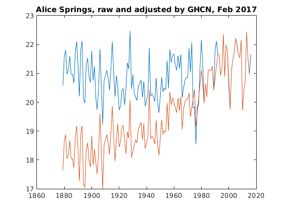
Finally, I just downloaded the latest raw and adjusted temperature datasets from GHCN as of Feb 5 2017. Here are the plots for Alice Springs. There are no prizes for guessing which is raw and which is adjusted. You can see a very similar graph at GISS.
Full post: cliscep.com |


