Complete Analysis of Two P&F Charts
Ok, I posted two on my last education post and marked them up with important features....let's discuss them in detail.
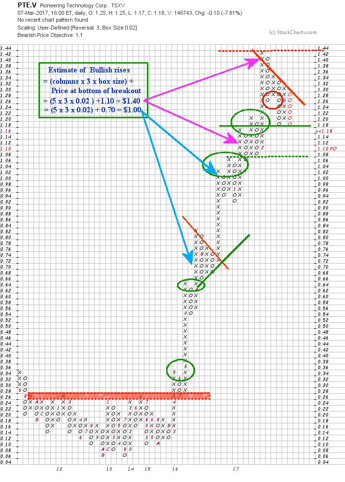
this is an example of a stock with a bullish rise for about a year now.
We shall start at the bottom and work our way up.
Look at that red dotted line band. Could that be a stronger resistance back in 2015!!!???
Why did I draw this as a band instead of a single line?? Well if you look closely you will see the top of the band with the tops of 3 columns of X's.... and the bottom line is formed on the tops of 6 more X columns!!!!
First the band is a strong resistance in 2015 because the number of "X" columns forming the resistance band at between $0.26 to $0.28. Next it has withstood 3 + 6 = 9 attempts to breach this share price over 5 year period!!! Awesome!! (at least it was when the breach was finally made in mid April 2016 ( by the 4 in the 16 column... up to that point it must have been frustrating to investors.)
Yes, a very strong resistance, indeed...that became a very strong support later after it was breached.
Three months later in July (7) the support band held firm and the price took off and never looked back.
Remember: Ceilings become floors when you rise above them.
Now look at the green circles as the share price rises... Each of them is an example of a bullish pattern.
NOW look at what happens around $0.70.... a triangle forms... a very symmetrical and horizontal triangle... this is an exciting time if you own the stock... Should you sell, buy or hold?
Well you don't know it will be a triangle at first... you could hardly be faulted for grabbing a profit if you were in it from the beginning though I would not consider it until I saw 4 or 5 "O" boxes filled because it could have turned around like before.
So we sell and watch... or brave ones would set a limit stop loss at $0.64 which is one X box lower than the top of the X column two columns over... It is a weak support at $0.66 and you hope it might hold..... And Lo and Behold it falls to $0.68 and starts to rise again...
For those that sold... do you buy in again RFN (right now)? If I sold I would NOT do it. You don't know how this will play out yet.
So it rises to just short of $0.82 and falls back again... now begins the fight between buyer and seller... You can draw 45 deg resistance/support lines and watch the action as the sellers dig in for higher bottom line prices and buyers refuse to pay as much as the high of the previous run up.
this fight ran to the bitter end... it did not have to but it did.... eventually the buyers blinked and the price renewed its bullish run.... when you see the breakout from such a trail and it is positive like that...you could buy back in if you sold earlier and were still interested...or CHEER and perhaps add to your holdings or simply hold to what you have.
Now you are in uncharted territory again and you wonder how high will this run go??? Well there was a fare bit of congestion in that triangle fight... you can try a calculation and see what happens.
The lower calculation is in the box and you can see the result was pretty good. In fact it rose 2 cents more than predicted.
Ignore that dotted green line for now.... that is for later.
Again you could sell at this point and no one would fault you.... or you can decide to hold (I would usually hold for a four O pull back... setting a Limit stop loss just below that to protect myself).... and you are blessed with another bullish sign.
Again the question arises... how high can we go??? Well the congestion was 4 columns... so we can do another calculation (shown in the box) and this turns out to be within 2 cents as well!!!
Again you could take profits then if you were in at $0.30 at first you would be a fool not too and it is also nice profits for the other decision times.... or you could say... "I am playing with house money... I will wait for a clear sell sign"....well I admire your gambling spirit ... I would put a Limit stop loss at 2 rows above that solid green line... to be prudent.
The stock rises before the price reaches your limit stop loss order.... Then it happens... your first truly BEAR signal (shown in the circle)... okay ... out of the pool... sell your stock!!!
But you keep watching.... see how that diagonal red resistance still holds....now you can draw a Green support line based on the bottom of the "O" column and the top of the "X" column... you can draw a secondary support line at the dotted green line.
This chart was created 2 days ago.... today the green support line is breached... another bear signal... time to move on :)
How is that for a blow by blow account of a nice Canadian sub dollar penny done good.
--------------------------------------------------------------------------------------------------------------------------------------------------
OK... let us look at a real bearish stock, Halcon Resources, HR...... or
How far can a stock that was over $140/share fall in less than 2 years???
the answer is: A hell of a long way!!!!
I had to chop this stock a lot or we'd be talking all night :) We start at $17.50ish for this example
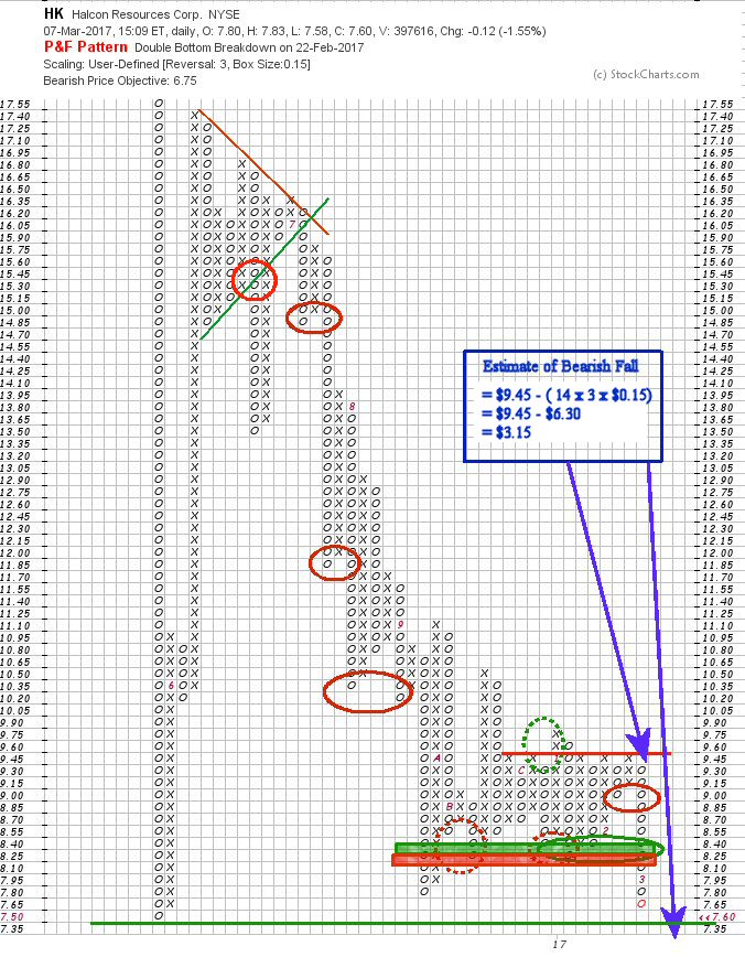
We start at that long plunge to $7.50 and it starts to recover I draw a green line there of support as this is the lowest ever reading I could find.... there is nothing in the chart to predict the rise from that point... ther may be a fundamental reason... but this is a charting discussion :)
it rises and I hope you recognize the bullish sign at $11.10.... I can hear the pumpers now!!! Halcon's problems are over... we are going to go back to $144/share again...right? well maybe but I am from Missouri (well no, I'm from Calgary, AB) show me.
And it rises and rises, well maybe they are right {shrug}... it pulls back and shows bullish at $11.10 as I pointed out. Note: looking at those numbers in the boxes. The fall/rise and that congestion at the top all happened in about a month and a half... whew!!! I'd be dizzy if I were in.... Hell 'va day trader stock, I imagine.
Anyway the wheels fall off at $17.55 though you don't know that at the time... the pumpers are still shouting.
It falls back, then rises again, falls and rises... on the third time this happens you see the potential for a Triangle pattern again and draw in the resistance and support lines as I have shown.
But unlike the other chart, you get a bullish signal (red circle) as it breaches the green support. Then it seems to be fine as it rises again into that triangle again but DOES NOT breach the resistance line and you see the triangle fill in and FINALLY break down as it leaves the apex of the triangle (I forgot to red circle that one)
Then you get a series of additional bear signals (red circles) until you reach $7.80... approaching that solid green line of support.
Now you see a great congestion that Green/Red band represents a support that turns resistance... Several bear signals dotted red circles are rebuffed and there is a head fake of a bull signal in the dotted green line
THEN THE SUPPORT IS BREACHED!!!! Creating a strong resistance now... It is approaching that final support... will it Hold???? One wonders, doesn't one?
But wait a minute... this has a great congestion period... can we guess where this bear run will ultimately end
Yes we can... count the columns at $9.30... wow...14 in a row.
Now we take our formula for bear runs
price = $9.45 (start of the O column fall) - [14 (rows) x 3(reversal) x $0.15(box size)]
the calculation is shown in that box....WOW.... that support line should be breached and what a fall will follow if this calculation is true. ... $3.15 ouch!!
Currently the share price is $7.46.... butt up against that support... it doesn't look good, does it?
Conclusion
Well I hope you enjoyed this discussion and see how useful this type of chart can be. I don't use it exclusively as you will see in the educational discussions to come. Though in fact I have just come to realize how useful that calculation, bear or bull, can be and will use it routinely as much as possible.
This ends the theory of P&F charts that I have prepared.... but I welcome your questions or tickers to test this chart... As you can see this is not a cookie cutter perfect chart.... it does take some insight and practice before you can give it a quick read.
Like Dr. Ruth always said.... "Practice.... Practice..... Practice !!!" lol
Good trading
_____________________________________________________________________________________________________________________________________________
Disclaimer:
I am not a registered broker. I am retired and use Technical Analysis as the main tool in my investment decisions. Accept or reject my comments as you will, but do your own Due Diligence (DD) before making any decisions based on the information I provide.
Underexposed |


