Fooled by Noise
Posted on January 7, 2019 |
I keep hearing the strangest things from strange quarters.
I know global warming didn’t take a “hiatus,” it didn’t “pause,” but some folks keep saying it did. I know Arctic sea ice hasn’t merely declined (dramatically in fact), it’s declining still, but some folks just can’t stop saying that the decline is over and/or that it’s actually in “recovery.”
I know wildfires in the western U.S. are getting worse and a big part (of course not all) of the reason is climate change, but some say that had nothing to do with it, it’s all due to something else. I know heat waves are getting worse and more frequent, but the usual suspects can’t help but deny it. I know sea level rise is accelerating but they insist it isn’t and that we shouldn’t even plan for the possibility.
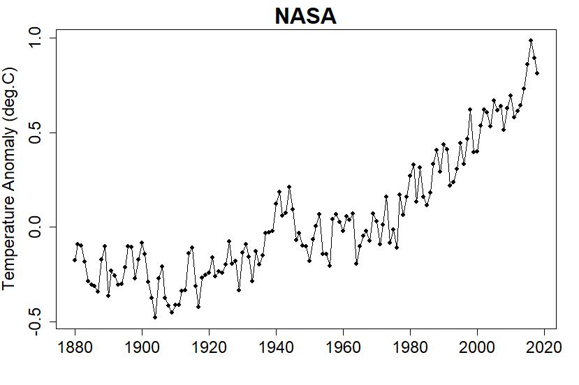
To understand how they get away with shenanigans like that, one need only look at the global temperature data. I usually use the data from NASA, consisting of the average global temprature anomaly for each month from January 1880 to the present (they haven’t yet posted the December 2018 value, so far it’s through November 2018):

It sure does fluctuate a lot! It’s actually more common to show, not the individual monthly averages, but the yearly averages of the same data:

The value for 2018 is year-to-date, but 2018 will end up 4th-hottest year on record, not as hot as 2017 or 2016 or even 2015. This is only natural, because global temperature shows both a man-made warming trend and natural fluctuations — noise — inherent in the climate system. While the temperature trend climbs inexorably higher and higher, each year’s average jitters up and down.
Putting the science of statistics to work, we can get a handle on what the trend is doing, apart from the noise, those never-ending fluctuations. In particular we can test the idea: has the trend rate (how fast the trend is going up or down) changed? We can also separate the evidence based on “sure looks like it when I view the graph” from that based on applying rigorous tests. After all, if there’s one thing you learn from statistics it’s how easily “sure looks like it” can go wrong.
I’ve done it, and I’ve posted about it, and I’ve mentioned the fancy math like changepoint analysis and continuous piecewise linear models and autocorrelation and Monte Carlo simulations and the multiple testing/selection bias effect etc. etc. etc.
It comes down to this: we can’t know the details of how the trend has really behaved — the randomness of the noise makes that impossible — but we do know what there’s evidence for. We have genuine, hard and fast evidence for three changes in the warming rate during this time span, yielding a statistical model like this one:

That’s all well and good, but is there a way to get it that’s more likely to get the point across? Where did those lines come from anyway?
Compare the first two graphs in this post, of monthly averages, and of yearly averages, you’ll notice that the amount of fluctuation — the noise level — is much lower in the yearly data. It’s a basic fact of statistics that when you average, you reduce the noise level (there are esoteric exceptions we won’t worry about), and since yearly data are the averages of monthly data, we expect them to have a lower noise level. Indeed they do.
Averaging can also alter the trend, the signal part of the data, so it can reduce the signal level too. That’s unfortunate, but in many cases (global temperature data is one) has only a minor effect as long as the time scale on which we average isn’t too big — so big that it swallows up the trend along with the noise.
If we get that much noise reduction by going from 1-month to 1-year averages, can we get even more with longer time spans? Can we do it with out smearing away the signal and losing the trend changes? Let’s try averaging, not over single years, but over 5-year periods:

It certainly has cleared up the noise! The trend is now even more plainly visible, and the unceasing rise since 1970 can’t be ignored. This isn’t mathematical proof — that comes from the “fancy math” with all the ten-dollar words — but the five-year averages have two virtues. First, they give a much clearer visual impression (I know I constantly warn against drawing conclusions based on visual impression, but don’t forget that I also urge getting ideas from visual impressions). Second, it’s so simple! Yes it’s math … but … computing the average over each 5-year period? You don’t need to be Einstein to understand what it means.
If you do the fancy math (which I most enjoy) you’ll find that when it comes to global temperature, those 5-year averages can reverse direction temporarily even if the trend doesn’t change. They can do it because they still have noise, noise that can randomly make one lower than the previous despite an upward trend.
Heck, it happens with 1-year averages all the time. Sure they too are trending up, but the fluctuations are such that it’s oh so easy for one year to be cooler than the one before. Roll the dice, you can still get a low number even if the dice have been weighted against you. That’s what random is about.
Five-year averages have far fewer “false alarm” reversals than 1-year averages. Compare the 1-year data since 1970 with its constant ups and downs, to the 5-year averages since 1970, which are up and up and only up.
Maybe we can do even better with ten year long averaging periods? Here are the averages over each decade (I define a “decade” as the years having the same first three digits, like 2000 through 2009 and 2010 through 2019):

From the 1950s onward, each decade has been hotter than the one before. The last four have been substantially so. With a graph like this, it’s easy to see where we’re headed.
When it comes to claims of a “pause” in global warming, if you want the gory details of why it’s a sham, you can find it in published scientific literature. If you want a graphical view that reduces the noise level enough to put such claims in perspective, try looking at 10-year averages or 5-year averages. The view can be quite interesting.
Another fine example is that Arctic sea ice that climate change deniers keep saying is in “recovery.” Here’s the monthly sea ice extent anomaly for the Arctic (data from the National Snow and Ice Data Center):

A downward trend is plainly visible, but there’s a lot of fluctuation and lately it seems to have gone crazy. This spurs deniers to claim that the decline has stopped, mainly by ignoring everything prior to 2007 and ignoring most of the year, using only each year’s minimum value, then declaring “no trend” and saying it has been going nowhere for over 10 years.
Again I could do some fancy math (like, why does it go up and down so much since 2007?), and I have in the past, but what if I just take the sea ice extent anomaly values and average them over each 5-year period? I get this:

All of a sudden, talk of 10 years of going nowhere seems rather silly.
The moral of the story is: when data include noise (and they always do), that can make things seem to be going one way when the actual trend is going another way. This is regularly exploited by climate change deniers, to give readers the wrong impression.
Declaration of a “pause” in global warming started (as near as I can tell) way back in 2006 when Australian geologist Bob Carter published an opinion piece titled “There is a problem with global warming… it stopped in 1998.” Here’s the NASA data from 1970 through 2005, with a box around the time span Bob Carter is talking about:

Think about it: on the basis of nothing more than what happened in a brief few years, Bob Carter concludes that global warming has stopped. He’s exploiting the noise to give a wrong impression, and in this case, not doing a particularly good job of it either.
If you want a better picture of reality, one way to reduce noise but (we hope!) not interfere with signal very much, is to average over longer time spans. I recommend trying 5-year intervals, or 10-year intervals, heck if you like doing that sort of thing try things out yourself.
Why does any of this matter? Because deniers have been claiming for over ten years that global warming has “stopped” or “paused” or is on “hiatus” or even reversed direction. They have a decade of telling us that either global warming is going nowhere, or that we’re headed for imminent (or have already begun!) global cooling. All the while, temperatures have continued to rise, the inexorable fluctuations dancing around a relentlessly increasing trend.
Get used to that relentlessly increasing trend; it’s not going away any time soon. And get used to those who live in denial of the danger of climate change, clogging up the halls of congress. They’re not going anywhere but a fund-raiser, until we kick them out of office.
Don’t get fooled by the noise. It usually comes from the noisiest people.
tamino.wordpress.com |