| | | "What the hell is going on with Global Waming? Please come back fast, we need you!"
Australian Heat Waves: Ode to Adelaide
Posted on January 28, 2019 |
What with Australia’s record-breaking multiple-heat-waves January, amidst talk of frying eggs on the sidewalk and melting asphalt and bats dropping dead because their brains cooked in the afternoon heat, we’ve looked at temperatures down under. We’ve noted overall warming, and the increase in the number of hot days. But we haven’t specifically looked at heat waves, which require multiple hot days in a row — usually, 3 or more, which is what we’ll go with.
The city of Adelaide, capitol of South Australia, has been in the news for setting a new record: hottest temperature in Australia ever recorded in a major city, at 46.6°C (115.9°F). It sounds a bit iffy to say “in a major city,” but I’ll let Adelaide have its day and look at its past heat waves.
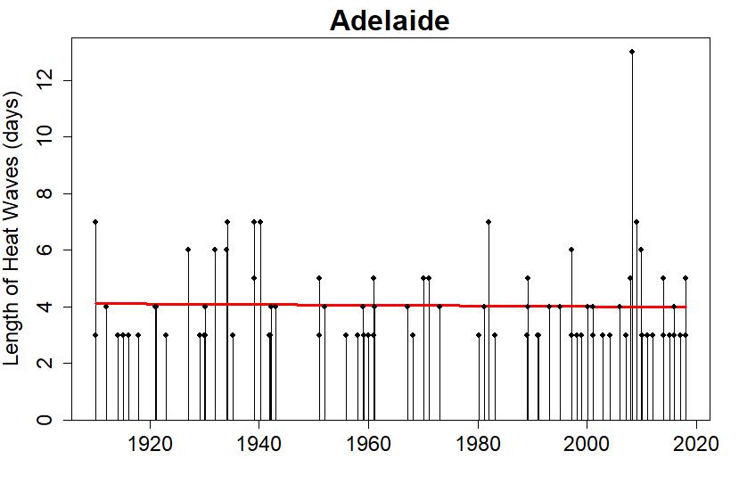
I defined a “hot day” as one with high temperature in the top 2.5% of all days. For Adelaide, that turned out to be days reaching 37.6°C (99.7°F). I then defined a “heat wave” as any string of 3 or more consecutive hot days. That made it straightforward to count the number of heat waves each year, where I defined the year as starting in July and ending the following June, so the summer season (Dec-Jan-Feb in the southern hemisphere) won’t be split between years.
For Adelaide we get this (using ACORN data from Australia’s Bureau of Meteorology):

The blue line is actually a quasipoisson fit, and is used to test whether or not there’s some statistically significant change happening (in this case, yes). The red line is a lowess smooth, which helps visualize what’s likely changing and when.
I can use that blue-line test fit on all the stations in Australia’s ACORN data set, and map the trends with red “x”s for more heat waves, blue circles for fewer heat waves, thus:

Most of Australia shows an overall increase in the number of heat waves. Clearly, Adelaide is no exception.
Despite occurring more often, when they do happen, the heat waves in Adelaide don’t seem to be getting longer.

There is that very long heat wave in 2008, but there are also more short heat waves than before, and the estimated trend (the red line) is just flat.
Heat stress comes not just when daily temperatures get too high, but when overnight lows don’t get low enough to cool off. I decided to form a quick, rough-and-ready estimate of heat stress, based on intuition and a few experiments. Don’t expect too much from this, but let’s have some fun.
First I transformed daily high and low temperatures into daytime and nighttime “raw” heat stress, using logistic functions (with, I think, well-chosen parameters). Here’s what I got, daytime heat stress in red, overnight in blue:

Some events, such as the heat waves in 2009 and 1939, are notable for showing high hazard levels from both daytime and overnight temperatures.
Then I modified the raw hazard levels, to increase them when hot days/nights came in groups; after all, two hot days in a row, is worse than twice as bad as a hot day. This gave me a “base” hazard level for both daytime and overnight temperatures:

Finally, I averaged the daily-high and overnight-low hazards to get the estimated daily heat hazard:

Now, we can estimate the total accumulated heat hazard throughout the year (July through the following). I got this:

These data include the 2017-2018 summer but not the most recent (2018-2019) because it’s still ongoing, not finished yet. But we’ve already seen enough of this summer to know, that however you choose to quantify how bad heat stress is, there’s going to be a new worst year in Adelaide, and over Australia as a whole. Australian heat waves are entering new territory.
tamino.wordpress.com |
|