| | | Is There a Housing Shortage or Not?
Brian Potter
May 11
The housing shortage in the US is a perennially popular topic of conversation for the urbanist crowd (which online includes basically everyone.) The basic argument is that housing starts collapsed after the financial crisis and have never truly recovered. This, combined with restrictions on building that limit the supply of housing in many cities (San Francisco and New York are almost always the culprits here), has left America with a housing deficit that's driving up housing costs.
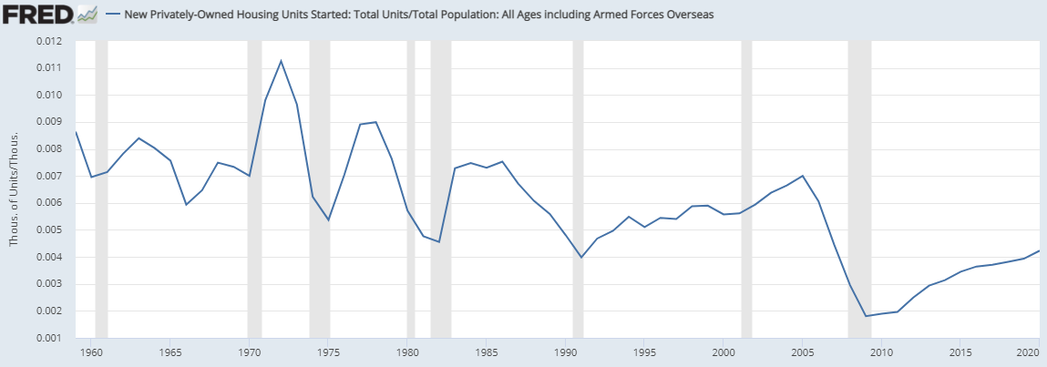
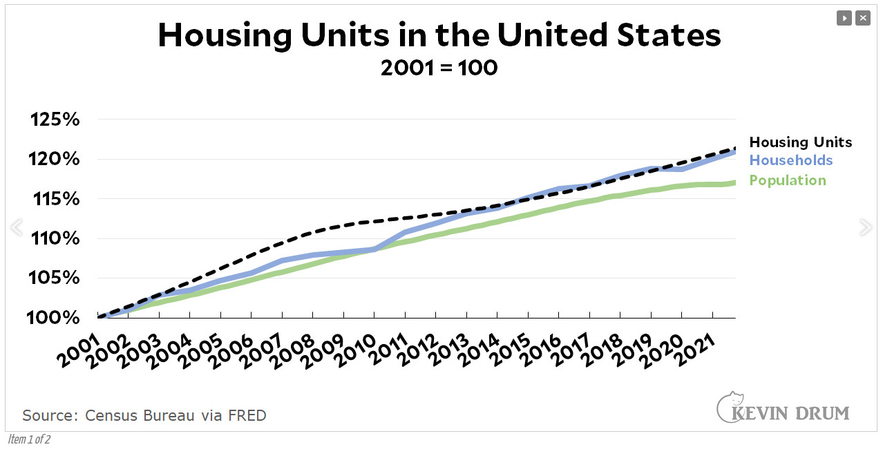
But this argument isn’t convincing to everyone - folks like Kevin Drum point out that, barring a blip between 2010 and 2013, housing units seem to have consistently tracked population and household growth for the last 20 years:
How do we square this with the claim that the US has been consistently underbuilding for the past decade, and now has a huge housing deficit? Let’s take a look inside the housing and homebuilding numbers and see if we can unpack this issue a bit.
Housing in context
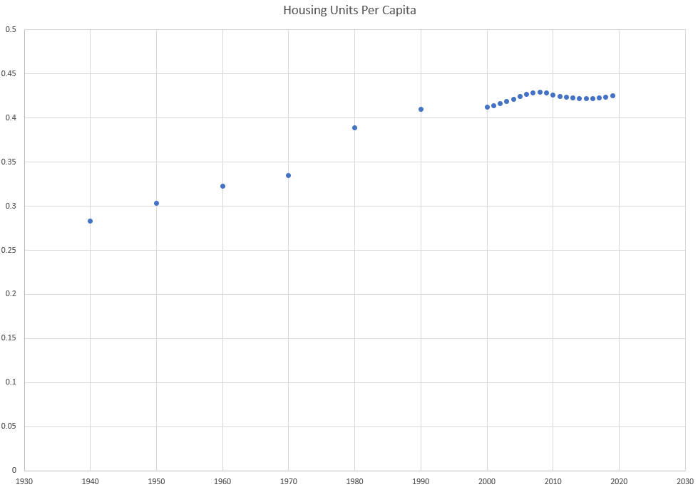
We’ll start with some context - the US has roughly 330 million people living in roughly 141 million homes, or about 0.42 homes per person. This puts the US slightly below the OECD average of homes per capita [0]:

Those 330 million people are divided into 126 million households, where a household is simply a group of people sharing a house. The other 15 million houses are for 2nd homes, and for vacancies (more on this later.)
Over time, homes per person in the US has steadily trended up:
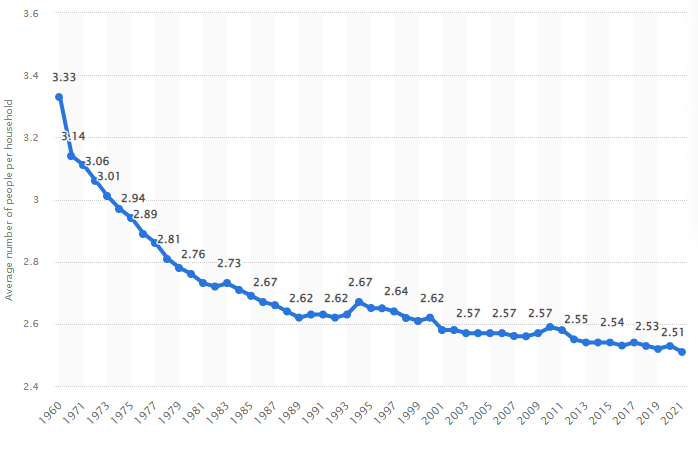
And household size has steadily trended down:

Partly this is due to wealth, cultural, and demographic changes that caused/allowed people to live in smaller households - more young people and seniors living on their own instead of with family, etc. And partly it’s due to the fact that Americans are having fewer children over time.
One thing worth noting about this is that previous rates of homebuilding in the US were partly driven by falling average household size. But there’s a limit to how much average household size can fall - you can only add so many new households to a given population size. At the extreme end, you can’t have more households than there are people (average household size can’t be less than 1.) And a world where a) children live with their parents until they’re 18, b) most people live with a romantic partner, and c) the population isn’t declining, is a world with a higher floor on how small the average household size can get.
For instance, consider a simplified model where every family has two kids that live with them until they’re 18. The kids then leave and live on their own until they’re 35, when they get married and have their own kids. Couples stay married and live with each other until 70, and then live separately until they die at 80. This world has an average household size of ~2.53, very similar to the current average household size in the US.
Obviously, the real world isn’t quite so simple (not everyone gets married and has kids, for one) - it’s not obvious what the “floor” of household size is, though it doesn’t seem like it could be that much lower than it is now. But the general point remains - there’s only so much that average household size can decrease. Levels of building in the US prior to about 1990 were drawing on a “stock” of potential households that largely no longer exists. This affects homebuilding rates.
An example to illustrate - consider a world that starts out with 400 people and 100 houses, with a household size of 4. If 4 people are added to the population every year, you must build 1 house per year.
What happens if this world changes to one where the average household size is 2? In the final condition, you’ll be building twice as many houses - if you add 4 people to the population, you’re now building 2 homes instead of 1.
But to get to that second world, you need to build 100 additional houses. Even if this process takes 50 years, that’s an extra 2 houses per year on top of the ones you’re already building, which will temporarily juice your building rate (in our model, it will gradually rise from 1+2=3 units per year to 2+2=4 units per year.) But once you work through that backlog, your building rate will drop off.
Turning back to the real world, in 1960 the US had a population of 180 million with an average household size of 3.33. By 1980, average household size had dropped to 2.76. This means that between 1960 and 1980, over 550,000 homes per year were needed just to keep up with changes in household size. By contrast, from 2001 to 2021 average household size only went from 2.56 to 2.51.
We thus can’t infer much from the fact that US homebuilding rates per capita are lower than they were in the past, because we would expect that to happen at some point soon regardless.
On top of this, there are many other relevant differences between the modern and 20th century US that impinge on housing demand. Population growth and immigration rates are much lower, and fewer homes are being removed from the housing stock each year (driving the average age of homes up.)
If there’s one thing to take away from this essay, it's that you can’t infer a housing shortage by looking at housing construction rates in isolation. Economists and urbanists, stop doing this.
The shortage: by the numbers
Now that we’ve exhaustively established that context, let’s take a closer look at housing demand and supply, and see if we see a shortage.
The best bottom-up calculation I’m aware of here comes from Freddie Mac. They start by breaking demand for housing down into several different categories:
- Demand from new households - This demand comes from population growth/immigration, as well as “pent up demand” from people that would form their own households if they were able to (children living with their parents because they can’t afford their own home, people finding roommates that otherwise might live alone, etc.)
- Stock replacement - Homes needed to replace units that leave the housing stock
- Vacancies - A well-functioning housing market needs a supply of vacant homes that are for sale/for rent (a world where there’s no cars available on dealership lots is one where it’s very hard to buy a car, even if there are hundreds of millions of them in the US.) Too few vacancies in effect reduces available supply, and tends to drive prices up and makes it harder for buyers to find a home. Vacancies in turn are broken into several subcategories - homes for sale/rent, homes off-market (owned as investments, for instance), and homes that are sold/rented but not yet occupied.
- Demand for 2nd/3rd/nth homes - Technically these are considered “seasonally vacant” homes, which are another type of vacancy.
Some of these numbers are easier to get than others. Stock replacement, demand for 2nd homes, and vacancy rate can all be estimated by looking at recent historical data (though Freddie Mac uses a more-optimistic total vacancy rate of 13% rather than the historical average of 12.3%.)
Demand from new households is harder. For this, as best I can tell, Freddie Mac first looks at current and historical headship rates (the likelihood someone is to form the head of a household.) They then construct a statistical model that takes into account factors like income, age, education, and housing cost to try to predict the changes in headship rates. They then use this model to estimate how many households WOULD be formed in the absence of constraints like high housing costs. (Other calculations of household demand, such as this one for California, use a similar methodology.)
When added together, these combine (as of 2018) into a required annual building rate of 1.62 million homes per year. Note that, post 2008, it’s only in the last 6 months has this rate been exceeded:

They also estimate the backlog of demand that needs to be worked through, due to years of under-building and pent-up demand for new households. When they calculated this in 2018, the estimated backlog was 2.5 million homes - half from pent up demand from households that would form in better circumstances, and half from too few vacancies.
When they re-ran this calculation in 2020, the backlog had increased substantially to 3.8 million homes. Interestingly, though, the composition had changed. The pent-up demand from households had actually decreased substantially to just 0.4 million. The rest of the 3.4 million deficit was due to too few vacancies.
A calculation from the Counselors of Real Estate yields similar numbers (though they get fewer total missing units since they use the historical vacancy rate of 12.3% rather than Freddie Mac’s “optimistic” rate.)
So, historical evidence suggests that the US is short at least several million housing units. This shortage largely shows up as too few vacancies, which we would expect to drive up housing prices and make it harder to find a home (which of course has been the story of the last 2 years of the housing market.) A shortage of vacancies also helps explain why simple eyeballing of building rates and population growth rates doesn’t seem to reveal much of a problem - since there’s only a small fraction of homes on the market at any given time, a small percentage point change in total housing units vacant can make a big difference.
Getting granular
Of course, homes aren’t fungible. The US isn’t one large housing market, but many loosely connected ones, each one with its own levels of supply and demand. Can we drill down more and understand exactly where we’re missing homes?
It’s tempting to just look at everywhere that has high housing costs and declare them the result of a housing shortage. While this is perhaps true in some sense, it doesn’t give us a good, predictive understanding of the mechanism by which housing prices rise. Ideally, we’d be able to find a metric that links reduced home availability with increased housing costs.
This turns out to be somewhat harder than you’d think.
Vacancy rate does pretty well at predicting housing cost increases within a metro area, for both rentals and purchases. Here’s Vancouver’s change in rent vs vacancy rate:
And here’s a similar graph for Vancouver for home purchases:
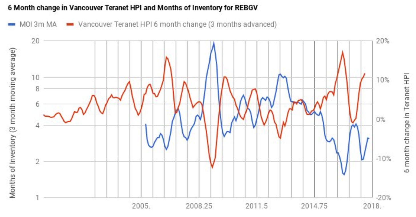
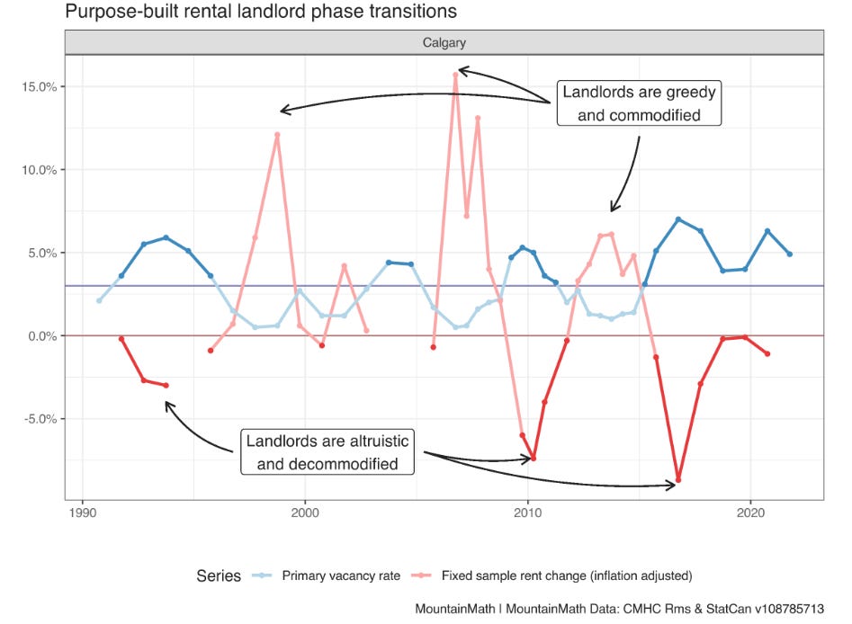
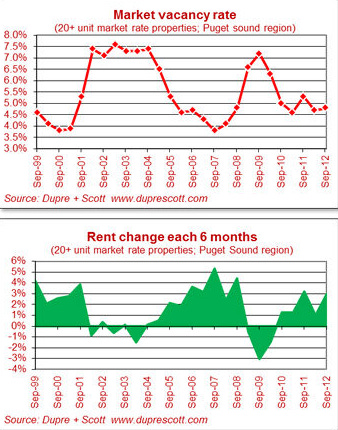
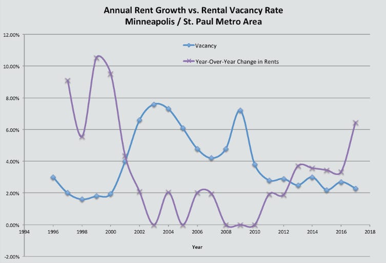
And here’s similar graphs for Seattle and Minneapolis:
But vacancy rate seems to do less well as a metric when trying to compare between metro areas. Below is the change in rental rate for a 40th percentile 1 bedroom apartment (as measured by HUD) vs the average rental vacancy rate for the 69 largest US metros from 2011 to 2019:
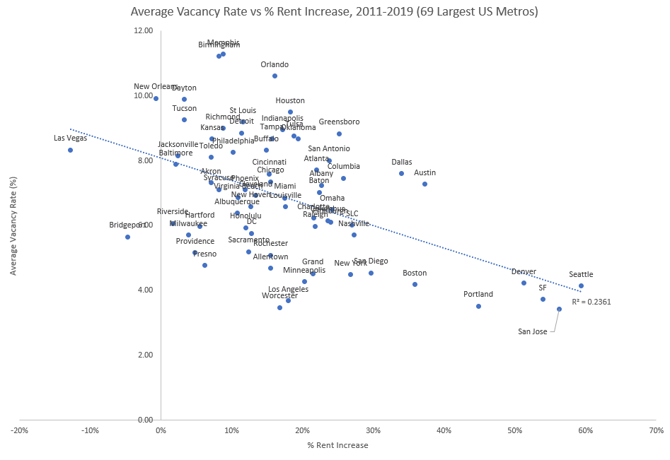
We see a correlation, but it’s not all that strong - plenty of low-vacancy rate metro areas had low rent increases (though we see basically no HIGH vacancy rates with large rent increases.) And the correlation is mostly driven by just a few outliers - remove the 5 metros with the largest rent increases, and the correlation drops substantially.
(If there’s a second thing to take away from this essay, it’s that many correlations in housing are driven by a few outlier metros, which almost always means “the Bay Area”. If your analysis of housing trends involves looking at a small number of metros, one of which is in the Bay Area, you’ll almost always find a much stronger relationship than actually exists.)
Of course, the vacancy rate is just a symptom of the problem of mismatched demand and supply. Can we perhaps measure the mismatch in a different way?
The most straightforward way of thinking about a housing shortage is of too many people chasing too few homes. Housing cost increases, then, seem like they would at least in part be driven by a failure of homebuilding to keep pace with regional population growth. As population growth outpaces new construction, the supply of available homes shrinks, and prices increase.
This sort of analysis of the gap between population increase and housing increase is fairly common. Here’s McKinsey using it to diagnose the degree of California’s housing shortage, and here’s a similar analysis by Brookings.
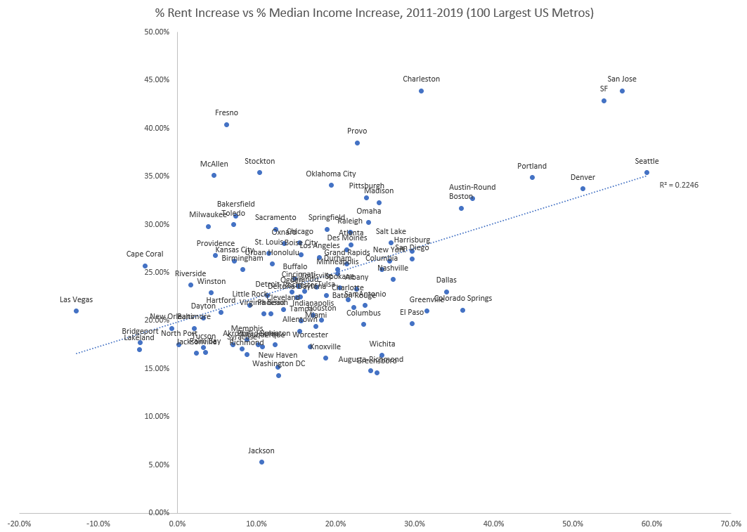
Unfortunately, in practice this metric seems to be hilariously non-predictive. Below is the ratio of rent increase (once again for 40th percentile 1 bedroom apartments) vs the ratio of population increase to housing increase between 2011 and 2019 for the 100 largest US metros:
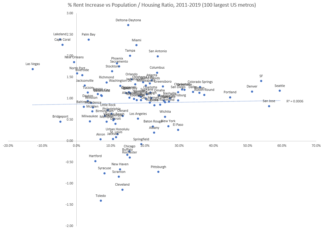
(Population / housing ratio is simply added population divided by added housing - if you added 2000 people but only built 1000 new housing units, that gets you a ratio of 2.)
There is essentially zero correlation - the metros with the largest rent increases had added population / added housing ratios no different than metros with smaller rent increases. For instance, between 2011 and 2019 the San Francisco Bay area added around 336,000 people but only built 94,000 new housing units. This gives an added population / added housing ratio of about 3.54, much higher than both the national and regional average household size. This seems like it would indicate many more households than homes got added, which we’d expect to push prices up. And indeed, San Francisco saw a rent increase of over 53% during this period, one of the highest in the country.
The problem? The Atlanta metro area saw almost the exact same added population / added housing ratio, but had a much lower rent increase. Atlanta added 653,000 people over the same time period, and only built 186,000 homes, for an added population / added housing ratio of 3.51. And Miami added almost 500,000 people but only 98,000 homes, for an added population / housing ratio of over 5! But Atlanta and Miami saw rent increases of just 22% and 17%, respectively.
This lack of correlation seems to remain no matter how you slice the numbers. For instance, this metric doesn’t take into account the size of the metro, which might matter if a metro area grows wildly out of proportion to its existing population (adding 100,000 households is a lot easier in a city of 5 million than a city of 1 million.) But including metro size (by say, comparing change in rent vs change in average household size) is similarly non-correlated.
One confounder here is that if a metro has a lot of existing available housing, it would need to build less. Both Atlanta and Miami had very high vacancy rates post-financial crisis (an average of 16.6% and 13.2% rental vacancy rate in 2009, compared to SF Bay’s 6.2%) . Can we do better by incorporating 2011 vacancy rates into our measurement of building rates?
It’s not obvious the best way to construct this sort of metric, but one way would be to add a sort of “housing overhang” to the denominator in the population / housing ratio - the extra housing units implied by 2011 vacancy rates. When I tried do this, we get a slightly improved relationship, but it’s very marginal (and is once again largely driven by just a few outlier metros):
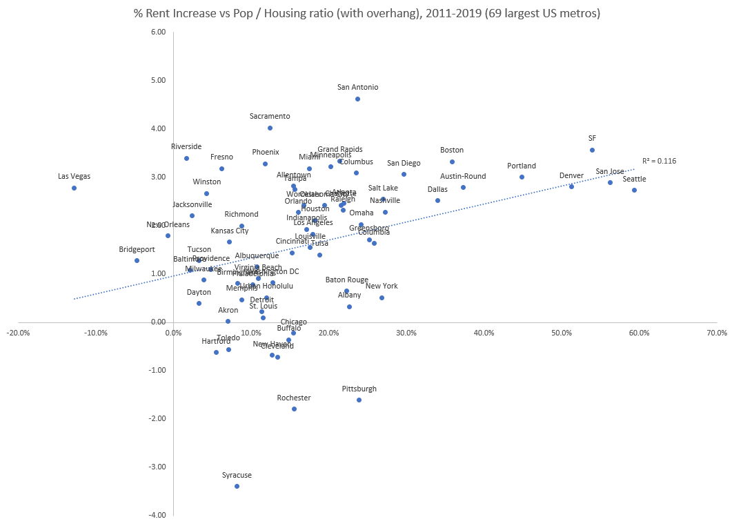
One reason this may not be that predictive is that in addition to a housing overhang, the financial crisis may have also caused a household overhang - instead of moving away to another city, people simply moved in with friends or family in the same city. As economic conditions improved, folks then moved back into separate homes. One indicator that this might be the case is that we see an uptick in average household size at a national level at about this time.
There are many other epicycles we could try to add here to salvage this model:
- My estimate of the housing overhang was quite crude, so we could try to construct a more accurate one based on the actual number of single family and multifamily units.
- This doesn’t include proper demographic weighting - the Bay Area, for instance, has many fewer young children than Atlanta, which will affect the number of housing units needed for a given population - if you add, say 100,000 young children to a city, that would increase the population but not the number of housing units needed. (I looked at this briefly, and it doesn’t appear to be enough of a difference to change the results substantially.)
- This doesn’t include the impact of the price-rent ratio, or variations on the price-rent ratio between metro areas, which can be substantial.
- In general, the post-financial crisis housing market was somewhat strange, and we may be looking at a non-representative slice of time (of course, you could make the same argument for the COVID housing market - in general every time period will have its own particular brand of “weird housing shit.”)
Part of what’s screwing with our correlations here is likely spillover demand, where the lack of availability of housing in one metro causes people to instead move somewhere else, who would (presumably) move back if prices were lower. This has the unfortunate property of being very hard to properly account for (“You wouldn’t know my girlfriend housing demand, she lives in Texas”), but it’s probably impacting things to some extent.
Other indicators
Let’s instead see if there are any other indicators that do better.
One obvious place to look is at measurements of supply restrictions - if shortages are caused by inability to build enough units, we should see a correlation between average rents and restrictions on housing supply. And in fact, we see an extremely strong correlation here - here’s rents (40th percentile 1 bedroom once again) versus the Wharton Land Use Regulation Index, a measure of restrictions on land use, for 2019:
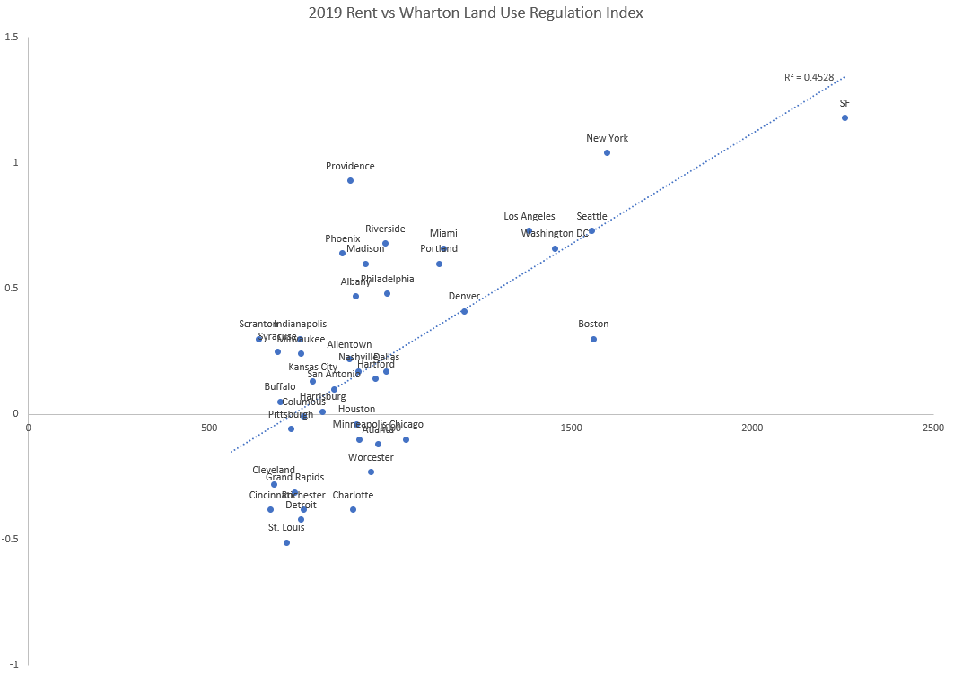
The more restrictions on land use, the higher rents you see. And this correlation remains somewhat strong even after removing outliers (though it’s once again reduced by quite a bit.) One tricky thing here is that this is a much smaller sample - this correlation might drop once we included more metro areas.
Are there any other indicators worth looking at?
Intuitions about housing prices tend to be driven by basic economic relationships, one of which is “when supply is reduced, prices should rise”. We can think of this as shifting the supply curve to the left, or of changing its slope so supply becomes less elastic (in practice, housing supply restrictions probably do both of these things.)
But there are other economic relationships that might have similar effects. One of these is income level - as incomes rise, demand curves shift to the right, which (all else being equal) should also cause an increase in prices. So we should expect an increase in housing prices to be partly driven by rising incomes, especially when the supply is fairly inelastic (as it is for housing.)
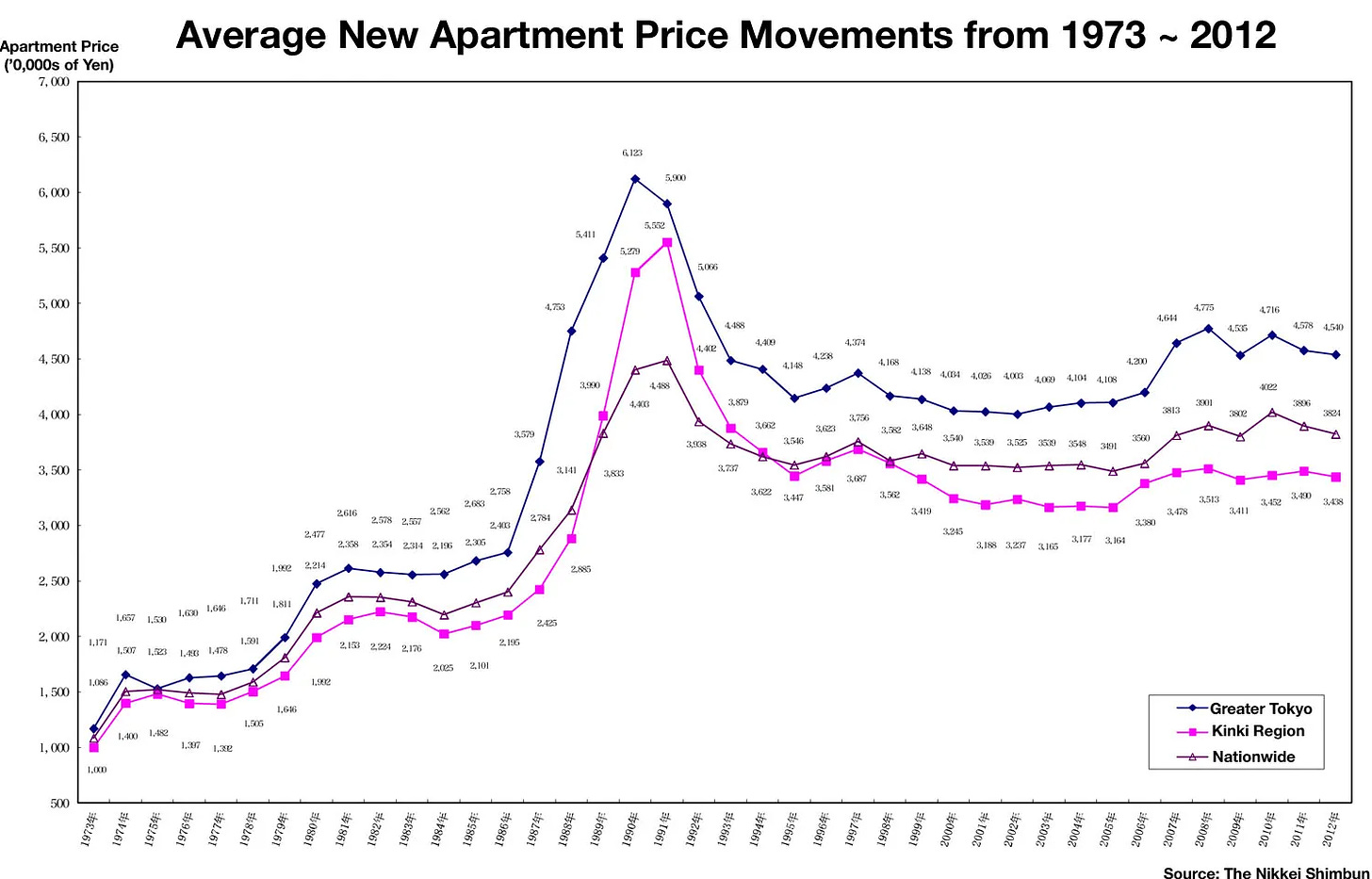
This is a neat little theory - it makes sense theoretically, and it seems to align with what we see, where the highest rent metros are places with high average incomes. It explains why places with low or negative population growth (New York City, Chicago, Seoul) nevertheless see rising rents. It also roughly aligns with the pattern we see with Tokyo/Japan, where housing prices rose substantially until the early 1990s and then declined/flattened:
But how well does it fit the US data?
If we look at the US as a whole, we see some correlation, but not an enormous one (and that once again is driven by a few outliers):
Interestingly, however, we have seen the correlation between income and rent become much tighter over time:
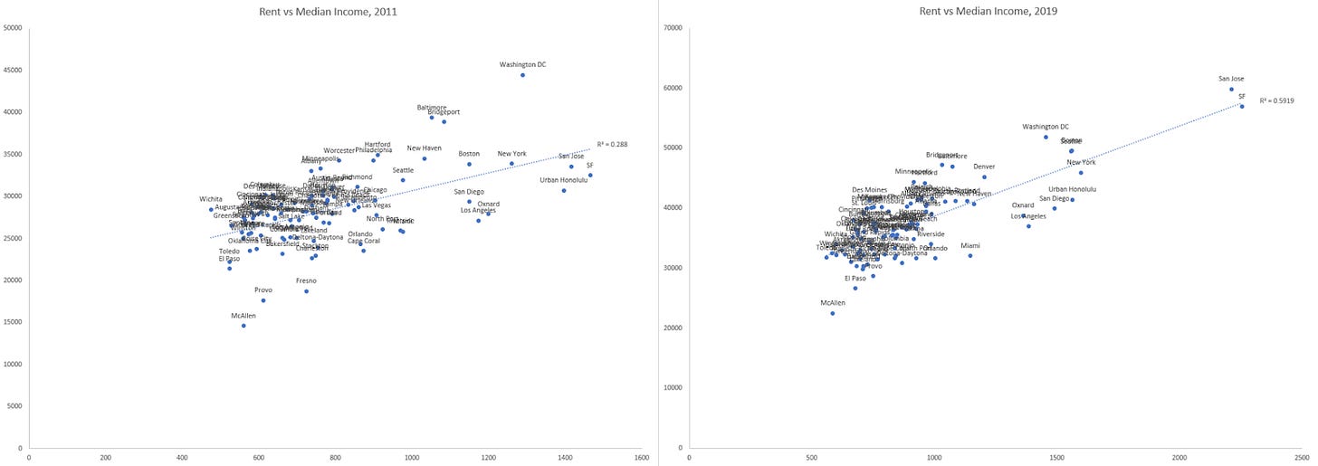
The variance in change in rent is much higher than the variance in change in income, which suggests to me that rents adjusted themselves to more closely match incomes. Of course, this just raises more questions (for instance, why did incomes and rents become so uncorrelated in 2011?)
Conclusion:
So, to sum up:
- Evidence suggests the US is short several million housing units. This shortage currently shows up as a historically low vacancy rate, which makes it harder to find a home to rent/purchase and drives housing prices up.
- Changes in vacancy rate is reasonably predictive of changes in housing prices within a metro area. Average vacancy rate is less good at predicting price changes between metro areas (though it’s still better than most other metrics.)
- We don’t see much evidence that a mismatch between population growth and housing construction is responsible for housing price increases, though we’re very far from being able to rule this out.
- We see a very strong correlation between land use restrictions and rental rates, at least as of 2019.
- There’s a reasonable amount of evidence that housing prices tend to adjust to match regional incomes.
- In general, housing trends are largely driven by a small number of outlier metros. In particular, Bay Area metros are housing trend outliers, and will give the appearance of stronger trends than actually exist if you just look at a small number of metro areas that includes them.
- Because of changing trends (lower immigration and population growth, homes being kept in service for longer, a slowing of the rate of change of average household size) current rates of homebuilding can’t be compared to historic rates of homebuilding.
[0] - If you look at living space per capita, however, the US is far and away the leader. This suggests that folks here generally prefer buying a larger home instead of additional, smaller homes.
constructionphysics.substack.com |
|


