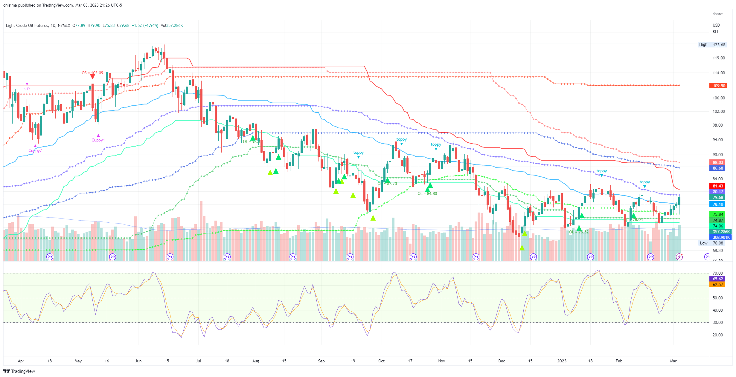
I am going to show you the oil pattern. Look at the chart below. Each line color represents a different force and therefore constitutes a different type of behavior. Green lines are buying force and therefore act as support. Red lines are selling force and act as resistance resistance. Blue lines are the swing trades and add/retard speed of the movement. Different line patterns (solid, cross, rounds) represent different bar sizes and timeframes.
Without exception, every time a group of lines converges together, when they finally act, they bring about a big move because multiple forces are combined to act together. You can see this on the upper left side ~June 15 when all the selling forces converged and when oil fell through them, it tanked. You see it again around November 15 where all the green support forces converged and then when they failed, oil tanked.
What is happening now is rare. Multiple *types* of forces are converging to the same area. At the bottom you have all 3 timeframes of buying. On the top you have 2 blue/swing trade forces. And now you are seeing the selling forces (red) also converging down to the same region. As I said, the more forces that are concentrated in the same are, the stronger the reaction. But what happens if all the buying, selling, and swing trade forces concentrate in the same small area? One way or another, one side will end up winning and when it does, it will be big.
This situation is analogous to having a very narrow and pinched horizontal bollinger band for a few weeks. When the stock breaks out of the pinched band, it goes far.
So that's the patter for oil - getting pinched between all the opposing forces. I don't know how long it will take for all the forces to gather together. I'm guessing under 2 weeks. One of them will win and then the swing trades will give the winning side extra umph...not that they will need given that multiple timeframes are gathering together.
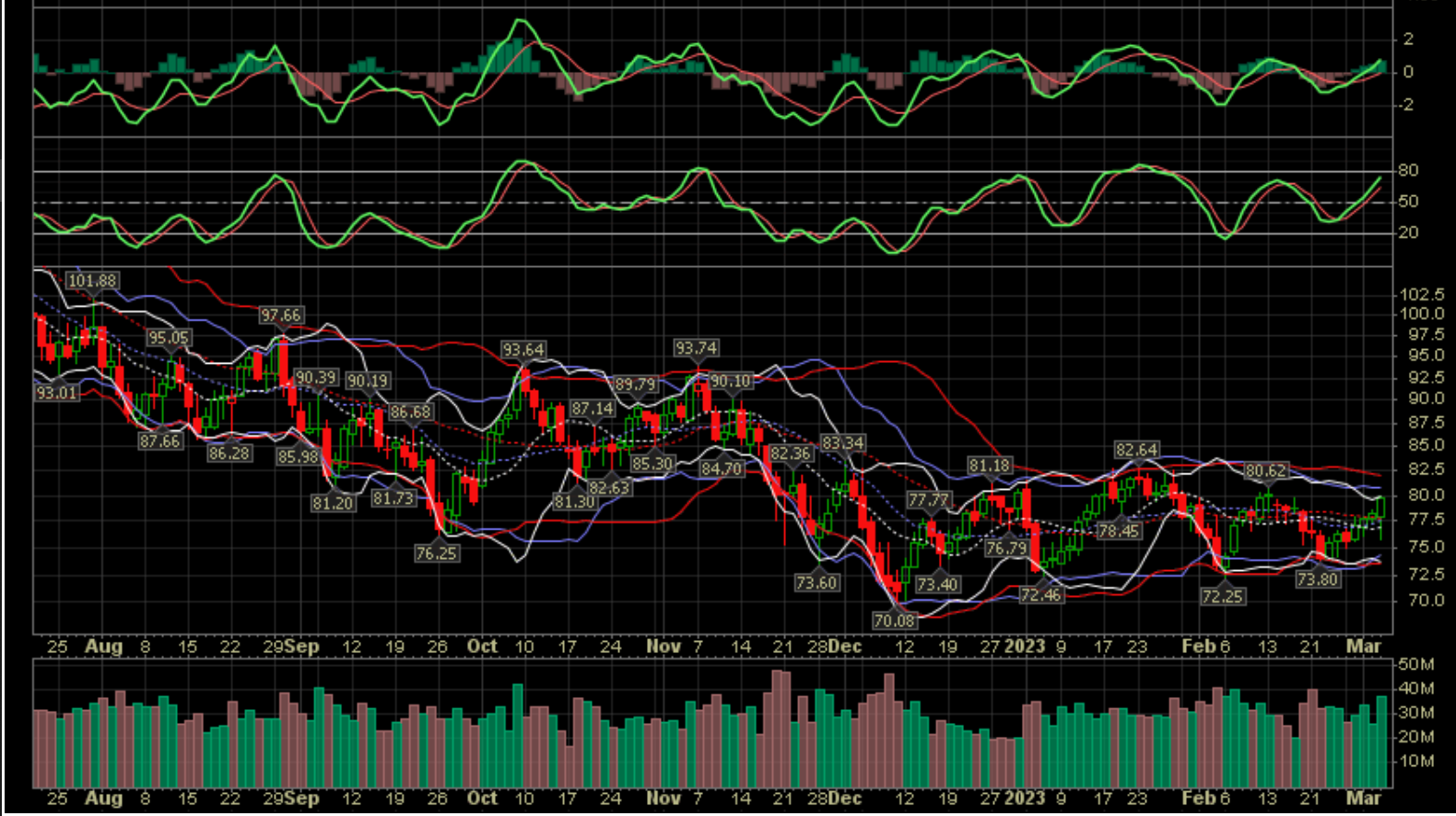
EDIT After I wrote the above, I decided to demonstrate the point using tools that everyone is familiar with. Here's the chart of WTIC with 3 different bollinger bands with each timeframe ~62% longer than the next. They are all look the same.
 |


