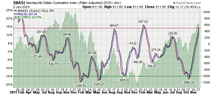
Going forward to improve my swing trading while still keeping things as simple as possible I will be using the $NASI to help solidify real changes in market direction for the NASDAQ. Even using this it is impossible to 100% nail trend changes. Sometimes I will be early even following this chart as I was with my September entries. That worked out fine but boy did I ever sell too soon. The $NYSI turned today. The $NASI has not yet. Disussion from StockCharts below my own chart:
Introduction
Developed by Sherman and Marian McClellan, the McClellan Summation Index is a breadth indicator derived from the McClellan Oscillator, which is a breadth indicator based on Net Advances (advancing issues less declining issues). The Summation Index is simply a running total of the McClellan Oscillator values. Even though it is called a Summation Index, the indicator is really an oscillator that fluctuates above and below the zero line. As such, signals can be derived from bullish/bearish divergences, directional movement and centerline crossovers. A moving average can also be applied to identify upturns and downturns.
Calculation
Previous day's Summation Index* + current day McClellan Oscillator * The very first Summation Index is simply the value of the McClellan Oscillator. 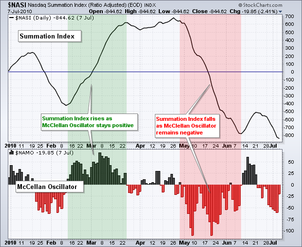
StockCharts.com provides two options for the McClellan Summation Index: unadjusted and ratio-adjusted. Net Advances is the base indicator used to calculate the McClellan Oscillator (and, by extension, the Summation Index); it is derived from the number of advancing issues less the number of declining issues. This number is used to calculate the “traditional” Summation Index. Ratio-adjusted Net Advances equals Net Advances divided by advances plus declines. This shows Net Advances relative to the total, which makes it possible to compare values over a long period of time. This article focuses on the Ratio-adjusted Summation Index. See the McClellan Oscillator article for more details on ratio-adjusted Net Advances.
Interpretation
The Summation Index rises when the McClellan Oscillator is positive and falls when the McClellan Oscillator is negative. Extended positive numbers in the McClellan Oscillator cause the Summation Index to trend higher. Conversely, extended negative readings cause the Summation Index to trend lower.
Because of its cumulative nature, the Summation Index is a slower version of the McClellan Oscillator. The index crosses the zero line fewer times, forms divergences less often and produces fewer signals in general. Whereas the McClellan Oscillator can be used for short-term and medium-term timing, the Summation Index is generally used for medium-term and long-term timing.
There are three basic signals. First, the Summation Index generally favors the bulls when positive and the bears when negative. Second, chartists can look for bullish and bearish divergences to anticipate reversals. Third, chartists can identify directional movement to define a bullish or bearish bias.
Nasdaq Negative Bias
Before looking at specific signals, note that the Nasdaq Summation Index has a long-term downward bias. This is because the Nasdaq AD Line also has a long-term downward bias. This bias stems from listing requirements that are not as stringent as NYSE. The Nasdaq is full of upstarts in industries ranging from biotech to technology to alternative energy. There may be big upside potential, but there is also a risk of absolute failure and delisting. Stocks trend lower as failure becomes an option. Companies that fail are ultimately removed from the index, but their negative effect on these breadth indicators remains.
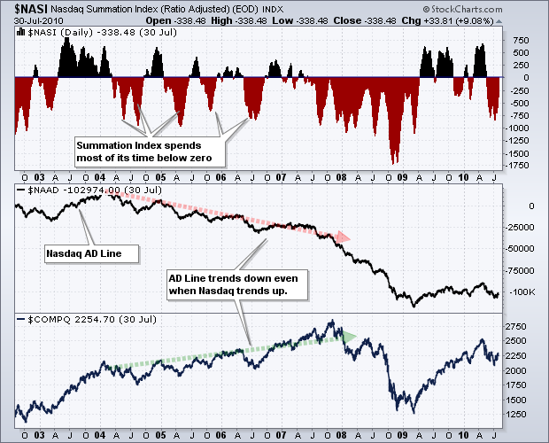
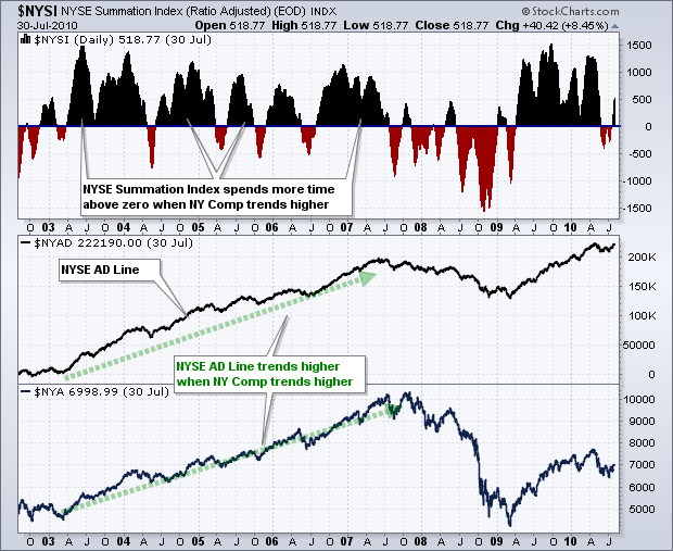
This negative bias does not affect short-term or medium-term movements, but it is clearly visible on long-term charts. The charts above show the Nasdaq Summation Index ($NASI) and the NYSE Summation Index ($NYSI) from August 2002 until August 2010 (eight years). Notice how the Nasdaq moved higher from 2003 until 2007. Despite a multi-year uptrend in the Nasdaq, the Nasdaq Summation Index spent more time in negative territory and the Nasdaq AD Line trended lower. The NY Composite also moved higher from 2003 until 2007. In contrast to the Nasdaq version, the NYSE Summation Index spent more time in positive territory and the NYSE AD Line trended higher the entire time (green trend line).
Positive vs. Negative
Like many momentum oscillators, the Summation Index provides a bullish or bearish bias when it is above or below its center line (zero). This is logical because the glass is half full when positive and half empty when negative. The Summation Index will be positive when the McClellan Oscillator has been largely positive for an extended period of time. It takes more than one positive/negative reading to push the Summation Index into positive/negative territory. In fact, it usually takes several positive readings to push the Summation Index into positive territory and keep it in positive territory. This is why the Summation Index is better suited for medium-term or long-term analysis.
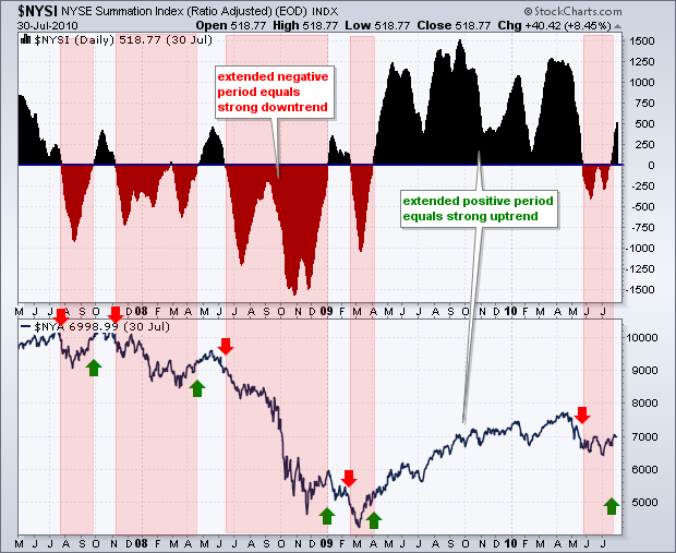
The chart below shows the NYSE Summation Index with the NY Composite. The red highlights show when the indicator moved into negative territory and remained negative. Sustained negative values from June to December 2008 coincided with an extended downtrend in the NY Composite. Conversely, extended positive values from April to May 2009 coincided with a sustained uptrend in the NY Composite. Like ALL indicators, the Summation Index is not perfect. There will be whipsaws or periods when zero line crossovers do not last long.
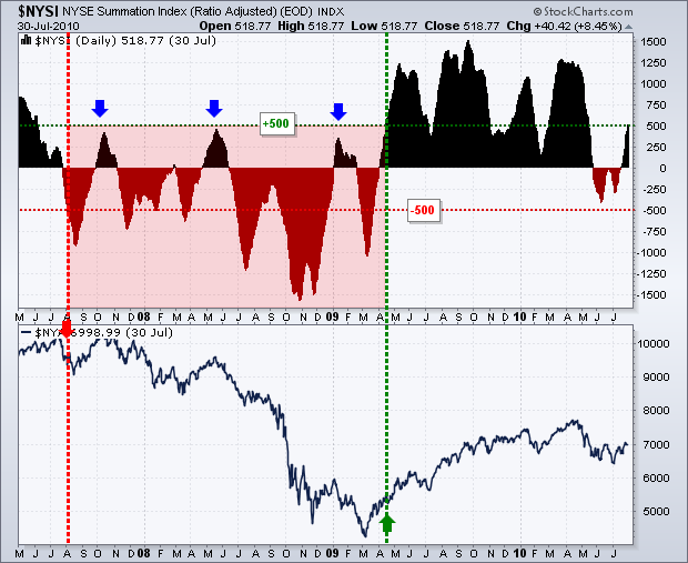
Chartists can also tweak the positive and negative values required for a bullish or bearish bias. The next chart shows the same time period for the NYSE Summation Index and NY Composite. Instead of the zero line, the bullish threshold is set at +500 and the bearish threshold is set at -500. A long-term bull signal is triggered when the Summation Index moves above +500 and remains valid until the index moves below -500. Similarly, a long-term bear signal is triggered when the Summation Index moves below -500 and remains valid until the index moves above +500. Instead of 10 signals in three years using the zero cross, there were only two signals using the +500/-500 cross. The Summation Index captured the long downtrend from August 2008 until April 2009 and the long uptrend from April 2009 until July 2010 (and counting). Notice how the area between 300 and 500 acted as resistance in 2007 and 2008 (blue arrows). Similarly, the -300 to -500 area acted as support in June 2010.
Directional Movement
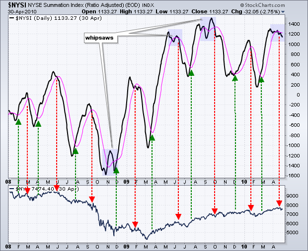
A moving average can be applied to the Summation Index to identify upturns and downturns. The length of the moving average depends on your trading or investing style and timeframe. A short moving average (5-days) will generate quicker signals, but there will be more whipsaws. A longer moving average (20-days) will lag a bit and there will be fewer whipsaws. It is the eternal tradeoff in technical analysis. More speed means more whipsaws. Less speed reduces whipsaws at the expense of later entries.
The chart below shows the NYSE Summation Index with a 20-day SMA (pink). Even with this medium-term moving average, there are still plenty of signals and turns. Some signals were great, some were not and some produced whipsaws. The orange areas highlight whipsaws when there were three moving average crosses within a relatively short timeframe.
Divergences
Bullish and bearish divergences in the Summation Index can help foreshadow reversals in the underlying index. However, not all divergences result in reversals or extended moves. The key, as always, is to separate robust divergences from weak divergences. A bullish divergence occurs when the Summation Index forms a higher low and the index forms a lower low. Even though the underlying index moved to new lows, the higher low in the Summation Index shows improving breadth. A bearish divergence forms when the Summation Index records a lower high and the index forges a higher high. Even though the underlying index moved to a new high, the Summation Index failed to exceed its prior high and showed deteriorating breadth.
Chartists should attempt to differentiate between small insignificant divergences and larger robust divergences. In addition, bearish divergences in a strong uptrend are more likely to fail - as are bullish divergences in a strong downtrend. Shallow divergences that form over a few weeks are more suspect than steep divergences that form over 1-4 months.
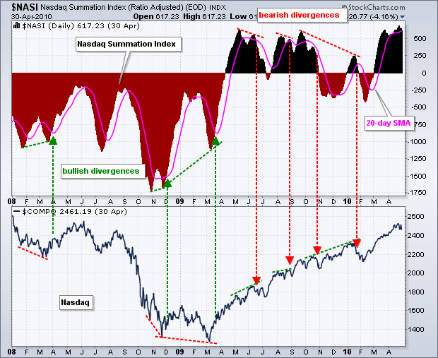
The chart below shows the Nasdaq Summation Index with the Nasdaq. There were three bullish divergences in the first half of the chart and four bearish divergences in the second half. A 20-day SMA was added to confirm a subsequent movement in the direction of the divergences. For example, the vertical green lines show the Summation Index moving above the 20-day SMA after a bullish divergence. Except for the last bullish divergence, the bearish divergences were steeper and covered longer timeframes. Also, notice that the bullish divergences occurred during a strong uptrend. These divergences did hint at short pullbacks within this uptrend, but they did not foreshadow an extended decline or a major reversal.
Conclusions
While the McClellan Oscillator puts a little momentum into the AD Line, the Summation Index takes a little out by slowing down the oscillator. The Summation Index is also quite a few steps removed from the original indicator, which is Net Advances. In other words, it takes three separate calculations to produce Summation Index values. The first derivatives (steps) are the 19-day EMA of Net Advances and 39-day EMA of Net Advances. The second derivative is the McClellan Oscillator, which is the 19-day EMA of Net Advances less the 39-day EMA of Net Advances. The third derivative is the Summation Index, which is a cumulative McClellan Oscillator. Each additional calculation changes Net Advances from its original form. This is not always bad, but chartists should keep this in mind when comparing the Summation Index with the corresponding index, the Nasdaq or the NY Composite. As with all indicators, Summation Index signals should be confirmed with other indicators or technical analysis techniques.
SharpCharts
SharpCharts users can plot the Ratio-Adjusted Summation Index for the NYSE ($NYSI) or the Nasdaq ($NASI). The traditional (unadjusted) Summation Index symbols are $NYSIT and $NASIT, respectively. These indicators can be shown in the main chart window or in indicator windows above and below. The example below shows the Summation Index as a “line” plot in the main chart window with the underlying index behind it. This makes it easy to compare turns in the indicator with turns in the index. A 20-day SMA was added to the Summation Index to identify turns. Click here for a live example.
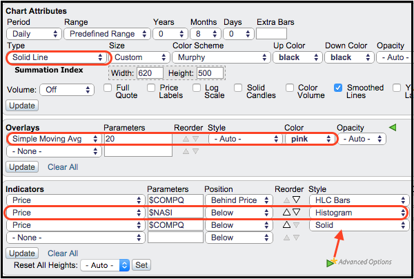
The Summation Index was also added as an indicator using the “Histogram” format. This makes it easy to identify crosses above and below the zero line. The underlying index (Nasdaq) is also shown in the lower window for comparison.
Outline


 |


