Apple's iOS 7 icons are ugly and a step backwards
I'll be blunt - the icons in iOS 7 are ugly. If Apple wanted to ensure that Samsung would never copy it again, it succeeded.
By Yoni Heisler on Sun, 06/16/13 - 5:32pm.
networkworld.com

I'll be blunt - the icons in iOS 7 are ugly. If Apple wanted to ensure that Samsung would never copy it again, it succeeded.
While everyone is heaping praise upon Apple for implementing an entirely refreshed mobile OS design, the new icons that accompany said design are embarrassingly horrible.
Now, if Apple wants to move away from skeuomorphic design and lean towards a flatter aesthetic, by all means. But in the company's zeal to move in an entirely new direction, they, pardon the cliche, threw the baby out with the bathwater.
Apple-designed icons are often works of art in and of themselves. The icons in iOS 7, however, look like something a 10th grader might put together for a school project. The color palette is hideous, and the overall look of the homescreen is unbalanced, cartoonish, confusing, and again, ugly.
At the same time, Apple, along with others who curiously are on board with Apple's new icons, can easily come up with flowery prose and ostensibly interesting diagrams that attempt to justify curious design choices. For instance, Apple writes on its iOS 7 webpage:
With iOS 7, every detail warranted the same rigor toward design. Like refining the typography down to the pixel. Redrawing every icon around a new grid system. And sticking to a precise color palette. On their own, these may not be details you consciously demand or even expect. But they all work together to create a more harmonious relationship between individual elements. And a better, more delightful experience overall.
That may sound nice, but it doesn't rescue users from the visceral and negative reaction that many people experienced upon first laying eyes upon iOS 7's new icon set.
As twitter user Kontra noted last week, "We shouldn't have to care by what department/theory/grid system/time pressure/etc iOS 7 icons were designed. They're confidence deflating."
iOS 7 represents Apple's first new iOS design without Scott Forstall and as Kontra noted in another tweet," icons should have been the easiest wins in the iOS 7 design overhaul. But since they're the most visible, the disappointment is amplified."
But enough talk, let's let the icons speak for themselves on an app-by-app basis. Below are some of Apple's more curious icon choices.
Camera

The camera icon from previous iterations of iOS was elegant, sophisticated, and, not too sound too much like Jony Ive, simple yet complex. Its replacement is just, well, simple. A boring image of a camera that looks like it would feel more at home in a collection of old-fashioned clip art.
Notes

I personally never found anything objectionable about the old, tried-and-true Notes app. But OK, Apple wants to change things up. I get that. But did they have to use such a putrid shade of yellow? What's more, when coupled with plain-old white loose-leaf, the new Notes app looks like drab epitomized. It's boring. It has no soul. It's mildly less skeuomorphic than its predecessor, but it's overwhelmingly dull. And while I'll save a look into the actual UIs of these apps for a later date, I couldn't help but post this photo comparing life in the new notes app vs life in the old notes app.
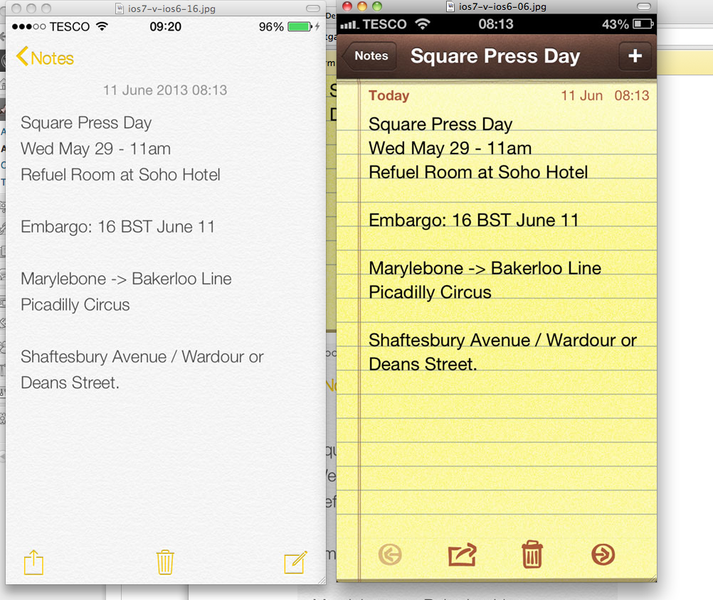
If I may harness Will Ferrell's character from Zoolander, am I on crazy pills here? In what universe could anyone possibly think the new Notes app is better than the old implementation. The image on the left looks like an unfinished mock-up of what a Notes app could look like with just a little bit more care.
Calculator

Moving on, we have Apple's new Calculator icon. OK, sure, there's not much you can do if you're going to stick with an orange-dominated color scheme, but at least the gloss and depth Apple used on the previous Calculator icon made it somewhat approachable. Contrast that with the new Calculator icon, which looks like an icon you might have found on Windows circa 1994. Somehow, with all of its design prowess, Apple chose the most blah shade of 70s-inspired orange it could find.
Game Center

Wait a minute, wasn't Apple trying to move towards flat icon design across the board? Say what you will about the old Game Center icon, but the new one is just mind-numbingly confusing. Spheres? Bubbles? Balloons? Just what exactly is this icon supposed to convey? There is no shortage of visual cues to suggest that games lurk beneath this icon. A joystick, a game board, a video game controller. The possibilities are endless. Instead, we're given something that looks like the balloons from the movie UP.
Newsstand

It's frustrating when people broadly paint skeuomorphism as a horrible design choice when, in many instances, it actually serves a useful purpose. As John Maeda recently wrote in Wired:
Design, like many disciplines, is about a diversity of approaches as soft solutions rather than hard truths. It’s a spectrum, not an either-or decision about whether to skeu or not to skeu.
That said, the Newsstand design in iOS really worked - a bookshelf where you might find newspapers and magazines. It was sleek. And then, on the other hand, there is Apple's new Newsstand, icon which looks like a collection of generic magazines that one might find in the background of a 1960's comic book. I'd even go so far as to say that someone completely unfamiliar with iOS might look at the new Newsstand icon and assume that it's a portal to the web. After all, where else would one go to get daily updates of news, sports, travel, and art information if not the Internet?
Contacts

Again, there has to be something in between skeuomorphic and this. Some sort of balanced icon design must exist between these two extremes!
Photos

With the new Photos icon, Apple exchanged a flower for a flowery geometric design. I can see where Apple is going with this, but did they have to choose such a muted color palette?
Maps

And speaking of muted, we now have Apple's new Maps app to get used to. The old Maps icon in iOS 6 was pretty solid, but with Apple blindly choosing to make everything flat, we're left with something that leaves oh so very much to be desired. The iOS 6 icon, with a touch of gloss and 3D perspective, is aesthetically pleasing. Contrast that to the new Maps icon where Apple, yet again, went with a putrid shade of yellow and utterly lifeless shades of blue and green. The Maps icon in iOS 6 just looks more alive. Perhaps this icon by itself wouldn't be so objectionable, but when put together with the rest of the lot, it's just another example in a long string of curiously bad icon design choices.
So did Apple get any icons right in iOS 7?
Well sure, there are a few exceptions. The weather and mail icons come to mind.


OK, back to some more questionable icon design choices. Are the icon updates below really improvements?


And then, of course, we also have Apple's new Settings icon, which is just beyond words.

When taking a look at Apple's iOS 7 icons altogether, their inconsistency jumps off the page. Indeed, everything seems either too loud and vibrant (see the top row) or too bland, dull, creative and lifeless (see the bottom row).

There is no shortage of user-designed icons for iOS 7 that eclipse what Apple was able to do. Take a look at the example below. While not every icon in the example below (and on the right) is an improvement, there's more balance. The 3D effect on the Game Center icon is less pronounced, the aesthetic on the Notes and Reminders app look better with a more toned-down effect. Also, icons for the iTunes Store and App Store seem more centered and balanced.

Put simply, flat design doesn't necessarily have to equal ugly design.
Should we give Apple the benefit of the doubt?
While I still think Apple could have done a much better job on its icon design, there are a few reasons why they might deserve a tiny bit of slack. First and foremost, remember that Scott Forstall hasn't even been out of the picture for a full year and that Jony Ive has only been manning the iOS aesthetic for about 8 months now. To that end, perhaps Jony Ive is just getting warmed up. Also, it's worth pointing out that the first iteration of iOS didn't have the prettiest icon set either. But over the next few years, Apple slowly and methodically improved the icon set into something that was pretty great, save for a few exceptions. Here's what one user on Reddit put together highlighting this.

But what really gives me great hope is a recent article from The Next Web suggesting that Jony Ive delegated iOS 7's icon design to Apple's print and web marketing design team, as opposed to Apple's app design team. The theory is that Ive wanted iOS 7 to start completely anew, and so he tasked the print and web marketing design team to get things rolling. In other words, the talented folks responsible for Apple's previous iOS icons did not have a hand in iOS 7's icon development.
We’ve also been hearing that there wasn’t a whole lot of communication between the various teams behind say, Mail and Safari. And that there were multiple teams inside each group that were competing with various designs, leading to what some see as inconsistencies in icon design. Those may well be hammered out in days ahead.
The thought process appears relatively easy to divine here. Apple needed a stylistic and psychological break with the design language of its past, and Ive used ‘new’ blood to create that break.
The result is a strikingly different, if divisive, take on a new set of iconography for iOS 7. Though the designs of the apps are also very important, the icons are iOS 7’s first impression and calling card. That’s why it was important to have them trend downward in age and upwards in vibrance.
That being the case, the icons, the report notes, may be subject to change. Indeed, the report claims the iOS 7 that was debuted last week was a "'mid stride' snapshot" and that of all the new changes and designs in iOS 7, the icons are most likely to be adjusted.
Of the various aspects of iOS 7, the design of its icons and other visual cues are the most in flux at the moment. There are still refinements and conversations going on around them. I don’t know but would expect there to be a lot of fixes for the inconsistency we’re seeing in things like gradients and design language on the home screen.
Now that's some great news for anyone who can't help but wonder just what in the world Apple was thinking with its new icon set.
1 2 3 next › last » |


