Damian Dinning Discusses the 808 PureView Pro approach v the Lumia 1020: Intro (part 2 of 3) ...
Image/video Quality:
Let’s start with the easy one (well at least relatively): video. There’s no contest in video performance, the addition of optical image stabilisation makes a massive difference which frankly has to be experienced first-hand to be fully appreciated. Video is all about smoothness and Nokia’s OIS creates beautiful smooth flowing video.
Regardless of the improvements OIS brings to still image quality as well as extending the range of situations you can record in where others are simply unable to record an image e.g. low light, its addition to video can easily be underestimated! When I’ve previously used the Lumia 920 and now the 1020, it blows me away how smooth video can be. Panning can look as if you’re using a Steadicam, it’s that good!
There are a couple of areas which warrant attention though. Without doubt, the first of these is focus during video, not being able to use touch focus during video shooting can be a significant restriction in what and how you can record the action. I can imagine Nokia are already aware of this and working to hopefully bring it in a future update. I also have to admit a little disappointment the 808’s slide zoom (with pre-framing) didn’t make it.
Still image quality:
I’ve read a lot of commentary around the 1020’s still image quality. Whilst the majority would seem to be extremely positive, I’m very much aware that there have been a number of negative comments. Those seem to be centred on noise, sharpening and colour saturation or as a summary some may say, ‘over-processed’. Especially when making comparisons with the 808 which made a reputation for itself based on its unprocessed images, something no other competing device today can emulate.
Over the last few weeks I’ve been studying images from both the 808 and 1020 and pondered which one is better and why.
Before Nokia introduced the 808 we had learnt that there were a growing group of people who appreciated vibrant and sharp images viewed full-screen.
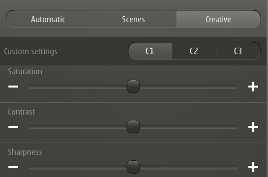
The 808 was equipped with both saturation and sharpness settings in its creative mode. Furthermore, it also provided different colour saturation depending on the mode in use. Automatic provided slightly more vivid colour whilst the intent for Creative was to provide more neutral colour, in a bid to cater for a wider range of subjective preferences towards colour.
Having worked for a few years at Kodak, I had been exposed (pardon the poor pun) to a lot research and insight in to subjective preferences relating to colour reproduction.
Colour is perhaps the hardest aspect of digital imaging to get right in the first place across a wide range of scenarios and colours, but it becomes significantly more complex as you throw in subjective preferences.
Before digital there was film – remember film? Before working in Kodak’s digital & applied imaging group I had spent 10 years at Minolta (prior to the Konica Minolta merger and the eventual sell off of most imaging assets to Sony). In those days it was somewhat easier, the two main (but not only) choices in terms of colour preference were provided courtesy of Kodak and Fuji.
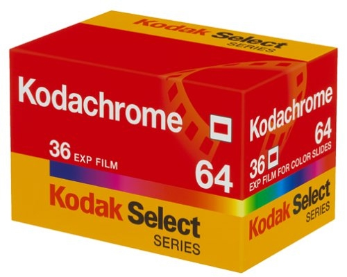
Kodak typically provided more vivid and vibrant colour whilst Fuji was better known for its more natural reproduction. In fact depending on the film from each brand, the vibrancy of colour could be slightly different e.g. Kodachrome vs. Ektachrome.
Both of these specific were targeted more to the enthusiast/professional, especially Kodachrome. Whilst for the mass market, Kodak provided films such as Kodak Gold which provided strong punchy reds, yellows and blues, but was considered to be weaker in greens than Fuji.
It won’t be a surprise to you as to which of these brands I had a personal colour preference towards ;)
In the days of film there were a few tricks which photographers would use to increase the vibrancy of colour. The first being to reduce the exposure level slightly. Many photographers did this by changing the ISO setting so as to provide an exposure which was very slightly under exposed, typically minus 1/3 EV. Adjusting the effective ISO meant it easy to use exposure compensation on top of this ‘calibration’ if required in certain situations.
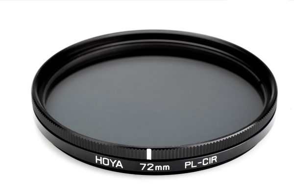
The other trick was the use of a polarizing filter. Apart from being very useful to reduce reflections on glass and water, this also served to improve the vividness of colours, often used to increase the strength of blue skies beyond what they were originally. This was more about creativity than any desire to reproduce colours exactly as they were.
Kodak’s colour science was to effectively attempt to reproduce colour as your ‘mind’s eye’ remembered it. The theory being, as I have often explained in this example: A red rose photographed on a cloudy day is remembered as being far more vivid than it actually was. Kodak strived to reproduce colours in this way. Whilst at Kodak I would often debate this approach, fuelled by my own colour preferences :). However, it was only when I joined Nokia and saw the research and evaluation first hand that I was able to better understand Kodak’s approach.
Nokia benchmark image/video quality by capturing images/videos in a variety of conditions with a range of devices which all reproduce colour (as well as other image attributes) slightly differently. These images are then evaluated in fixed controlled and repeatable conditions. A number of people are invited to closely evaluate these images for different aspects of image quality, for example sharpness and colour. The exercise is repeated regularly with different products to ensure Nokia’s own products are fully optimised to provide images/videos which are subjectively considered to be the best.
When Apple introduced their first real effort at a camera in an iPhone with the iPhone 4, the colours were often commented on as being over saturated. I don’t know for sure but in my own experience it seemed this was dialled back at some point through one of their sw updates and with the introduction of the 4s improved upon further.
Both of these products seemingly prioritised sharpness and colour over noise. Broadly comparable products available at the time had significantly less noise, but perhaps not such high levels of ‘perceived’ or even in some cases actual sharpness.
It was interesting to note in various forums, reviews and comments against those reviews the subjective opinions of those people writing comments.
When the Lumia 920 was introduced, this collective feedback was considered in the image optimisation process, and again (as I understand it having chatted with ex-colleagues) in the optimisation process of the Lumia 1020. Only this time Nokia were introducing new and more advanced colour algorithms.
I am of the belief that there are two core user groups which need to be considered here. The first I would summarise as the more involved photographer, especially those that spend time using applications such as Adobe’s Photoshop. Typically preferring images to be as untouched or free of enhancements from the manufacturer as possible, so they are left free to optimise the images according to their own specific preferences. These individuals are important because they can potentially influence many others.
The second group is far greater in size but less influential. Typically the preferences here are towards vivid colour (as long as it looks right, according to the ‘mind’s eye’). In terms of subjective image quality they can be influenced by relatively high levels of sharpening as they tend not to be ‘pixel peepers’ and so never look at images at such high magnification to see sharpening artefacts. High levels of sharpening can create the perception of far more detail in an image when viewed at full screen on a laptop or tablet for example.
Apple appears to do very well against this second group, whilst traditionally Nokia, especially with products such as the N8 and 808 are highly appreciated amongst the former group. Of course I’m generalising here, before you start filling the comments section up on this point – it’s not exclusive.
So having little exposure to what Nokia actually did behind the scenes with the Lumia 1020, I would guess they were more influenced by the feedback from reviews, evaluation etc. pointing them towards optimisation of colour and sharpness more in-line with the preferences of the larger second group summarised above.
So what about my own personal experience?
Compared against the 808, there is a clear difference in pretty much all situations. In some cases it may be argued the 808 can be too pale in its colour reproduction whilst for some the 1020 oversaturated.
Personally, when looking at my images captured with both, I was in most cases drawn more to the images from the 1020 as opposed to those captured with the 808, even though I know they may not be exactly as the original scene or subject appeared.
It was when I pondered should Nokia change this and why, that I recalled the background I shared earlier, especially how film photographers would often purposefully aim to boost colour through under exposing and/or the use of polarizers.
Yes, there are some situations (Marc already did an excellent post on this a few weeks back which outlined this issue very clearly here), where the 1020 seems to reproduce colour which is too yellow or golden. I believe this is a specific issue Nokia need to better understand with a view to fixing. I noted it in my own evaluation from time to time but was often overcome by capturing a second image and thankfully didn’t appear to be too common occurrence in practice.

Outside of this specific example I must say I do like the colour reproduction. However, I believe that a relatively small reduction in colour saturation may improve its overall performance, given in some cases it does appear to be slightly oversaturated even amongst those that prefer vibrant colours.
Given the number of comments from those expressing a clear preference towards natural colour I would recommend Nokia introduce an additional setting of some form or another to allow such photographers to select this as a preferred way of reproducing colour.
I suspect it will need to be more sophisticated than simply a colour saturation control as colour reproduction doesn’t behave in such a linear manner across a variety of scenes and subjects. So I don’t expect this to be easy, it will be highly involved to get what essentially may prove to be another set of optimisations.
However, I would perhaps argue that in low light the current colour optimisation seemed to be an improvement over the 808. The 808 can more often than I would have liked be considered too pale. Such a setting would need to be persistent so it can be set once, until purposely changed again by the photographer.
Continued: Part 3 of 3 follows in next post.
- Eric - |


