Recessions are best identified in the rear view mirror. RtS
Big Four Economic Indicators Show Possible Rollover
financialsense.com
Note from dshort: With this morning's release of the Consumer Price Index for September, we can now calculate Real Retail Sales for last month.
Official recession calls are the responsibility of the NBER Business Cycle Dating Committee, which is understandably vague about the specific indicators on which they base their decisions. This committee statement is about as close as they get to identifying their method.
There is, however, a general belief that there are four big indicators that the committee weighs heavily in their cycle identification process. They are:
Industrial ProductionReal Personal Income (excluding Transfer Payments)Nonfarm EmploymentReal Retail Sales The Latest Indicator Data
With this morning’s release of the September Consumer Price Index, we can now calculate Real Retail Sales. I reported the nominal Advance Retail Sales last week, which showed September at -0.3% (-0.32% at two decimals) month-over-month, down from 0.6% in August. That was much worse that the mainstream forecasts. When we adjust for inflation, September sales came in even worse at a -0.41%. The chart below illustrates the series since 2009 with a linear regression to help us analyze the trend.

The contraction in sales attributed to an unusually severe winter is clearly evident. April through July performed below trend. August saw a positive bounce that put us back to trend, but September appears to have reverted to the substandard summer growth.
The Census Bureau's Retail Sales series is, as I've pointed out elsewhere, subject to substantial revisions, to the latest month shouldn't be taken too seriously.
The Generic Big Four
The chart and table below illustrate the performance of the generic Big Four with an overlay of a simple average of the four since the end of the Great Recession. The data points show the cumulative percent change from a zero starting point for June 2009. We now have the three indicator updates for the 61th month following the recession. The Big Four Average is (gray line below).
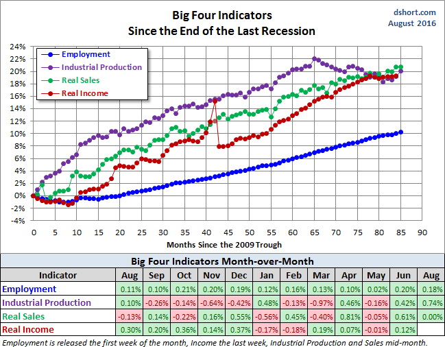
Current Assessment and Outlook
The overall picture of the US economy had been one of slow recovery from the Great Recession with a clearly documented contraction during the winter, as reflected in Q1 GDP. Data for Q2 supported the consensus view that severe winter weather was responsible for the Q1 contraction -- that it was not the beginnings of a business cycle decline. However, the average of these indicators in recent months suggests that, despite the Q2 rebound in GDP, the economy remains near stall speed. We'll need some near-term improvement to avoid rolling over.

The next update of the Big Four be the month-end Real Personal Income less Transfer Payments.
Background Analysis: The Big Four Indicators and Recessions
The charts above don't show us the individual behavior of the Big Four leading up to the 2007 recession. To achieve that goal, I've plotted the same data using a "percent off high" technique. In other words, I show successive new highs as zero and the cumulative percent declines of months that aren't new highs. The advantage of this approach is that it helps us visualize declines more clearly and to compare the depth of declines for each indicator and across time (e.g., the short 2001 recession versus the Great Recession). Here is my own four-pack showing the indicators with this technique.

Now let's examine the behavior of these indicators across time. The first chart below graphs the period from 2000 to the present, thereby showing us the behavior of the four indicators before and after the two most recent recessions. Rather than having four separate charts, I've created an overlay to help us evaluate the relative behavior of the indicators at the cycle peaks and troughs. (See my note below on recession boundaries).

Click for a larger image
The chart above is an excellent starting point for evaluating the relevance of the four indicators in the context of two very different recessions. In both cases, the bounce in Industrial Production matches the NBER trough while Employment and Personal Incomes lagged in their respective reversals.
As for the start of these two 21st century recessions, the indicator declines are less uniform in their behavior. We can see, however, that Employment and Personal Income were laggards in the declines.
Now let's look at the 1972-1985 period, which included three recessions -- the savage 16-month Oil Embargo recession of 1973-1975 and the double dip of 1980 and 1981-1982 (6-months and 16-months, respectively).

Click for a larger image
And finally, for sharp-eyed readers who can don't mind squinting at a lot of data, here's a cluttered chart from 1959 to the present. That is the earliest date for which all four indicators are available. The main lesson of this chart is the diverse patterns and volatility across time for these indicators. For example, retail sales and industrial production are far more volatile than employment and income.

Click for a larger image
History tells us the brief periods of contraction are not uncommon, as we can see in this big picture since 1959, the same chart as the one above, but showing the average of the four rather than the individual indicators.

Click for a larger image
The chart clearly illustrates the savagery of the last recession. It was much deeper than the closest contender in this timeframe, the 1973-1975 Oil Embargo recession. While we've yet to set new highs, the trend has collectively been upward, although we have that strange anomaly caused by the late 2012 tax-planning strategy that impacted the Personal Income.
Here is a close-up of the average since 2000.

Click for a larger image
Appendix: Chart Gallery with Notes
Each of the four major indicators discussed in this article are illustrated below in three different data manipulations:
- A log scale plotting of the data series to ensure that distances on the vertical axis reflect true relative growth. This adjustment is particularly important for data series that have changed significantly over time.
- A year-over-year representation to help, among other things, identify broader trends over the years.
- A percent-off-high manipulation, which is particularly useful for identifying trend behavior and secular volatility.
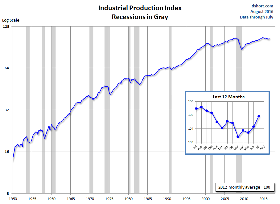
Industrial Production
The US Industrial Production Index ( INDPRO) is the oldest of the four indicators, stretching back to 1919, although I've dropped the earlier decades and started in 1950.
Click for a larger image

Click for a larger image

Click for a larger image
Real Personal Income Less Transfer Payments
This data series is computed as by taking Personal Income ( PI) less Personal Current Transfer Receipts ( PCTR) and deflated using the Personal Consumption Expenditure Price Index ( PCEPI). I've chained the data to the latest price index value.
The "Tax Planning Strategies" annotation refers to shifting income into the current year to avoid a real or expected tax increase.

Click for a larger image

Click for a larger image

Click for a larger image
Transfer Payments largely consist of retirement and disability insurance benefits, medical benefits, income maintenance benefits (more here).
The chart below shows the Transfer Payment portion of Personal Income. I've included recessions to help illustrate the impact of the business cycle on this metric.

Total Nonfarm Employees
There are many ways to plot employment. The one referenced by the Federal Reserve researchers as one of the NBER indicators is Total Nonfarm Employees ( PAYEMS).

Click for a larger image

Click for a larger image

Click for a larger image
Real Retail Sales
This indicator is a splicing of the discontinued retail sales series ( RETAIL, discontinued in April 2001) with the Retail and Food Services Sales ( RSAFS) and deflated by the seasonally adjusted Consumer Price Index ( CPIAUCSL). I used a splice point of January 1995 because that date was mentioned in the FRED notes. My experiments with other splice techniques (e.g., 1992, 2001 or using an average of the overlapping years) didn't make a meaningful difference in the behavior of the indicator in proximity to recessions. I've chained the data to the latest CPI value.

Click for a larger image

Click for a larger image

Click for a larger image
Note: I represent recessions as the peak month through the month preceding the trough to highlight the recessions in the charts above. For example, the NBER dates the last cycle peak as December 2007, the trough as June 2009 and the duration as 18 months. The "Peak through the Period preceding the Trough" series is the one FRED uses in its monthly charts, as explained in the FRED FAQs illustrated in this Industrial Production chart. |


