Since you didn't remember the short version,
December 1, 2014 "Hello, This is not one of our graphs and I’m not exactly sure where this data was recorded. The official coop station Yosemite Park Headquarters began collecting temperature data in 1907 and this graph began in 1900. There are several issues with this graph - spelling for starters, we would also reference the WRCC so others could contact us if there was a question and these numbers are off. Looking at the data, these numbers and years are not correct. For example, the average annual max temperature occurred in 1926, not 1930-something as the graph displays.. I’m sorry, I cannot help you. I’ve tried to find this graph but no luck. I can tell you this is not our graph nor is the data correct." ? signed by the Service Climatologist, Western Regional Climate Center
Message 29838260
here's the full post
mystery temp graph? W.U.W.T.?
Tuesday, December 2, 2014
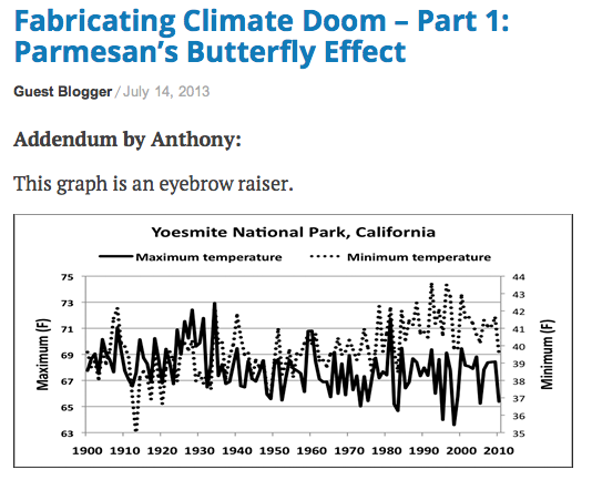
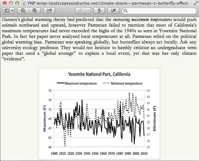
There's a temperature graph going around the blogosphere claiming to represent the temperature trend in Yosemite National Park since 1900. Climate science denialist types love this graph because it seems to indicate no warming in Yosemite, as if that represents the whole state or something.
Besides, consider Yosemite National Park, it comprises some 1,169 square miles - (3,027 km2) with an elevation range from 2,127 to 13,114 feet (648 to 3,997 m) on both sides of the Sierra Nevada mountain divide. Vegetation zones start with chaparral oakwoodland, lower montane forest, upper montane forest, subalpine zone, all the way up to alpine. Seemed odd that anyone would claim a single graph from YNP as some definitive statement on the situation within the park, let alone beyond.
Yet Mr. Steele claims it, and does so on many occasions. Including this recent video ( 12:10) which I'm in the process of reviewing. He never tells us where this data came from, nor who compiled the graph, we're supposed to accept the authority of his word on it -
I thought they rejected appeals to authority?
Unfortunately, I've learned to be skeptical of Mr. Steele's claims and I tried finding its origin. No luck on the internet. Finally I sent an email to the Western Regional Climate Center to see if they could offer any insight and they certainly did.
I share their response:
{I added paragraph breaks for clarity}
WRCC Data < wrcc@dri.edu> December 1, 2014 "Hello, This is not one of our graphs and I’m not exactly sure where this data was recorded. The official coop station Yosemite Park Headquarters began collecting temperature data in 1907 and this graph began in 1900. There are several issues with this graph - spelling for starters, we would also reference the WRCC so others could contact us if there was a question and these numbers are off. Looking at the data, these numbers and years are not correct. For example, the average annual max temperature occurred in 1926, not 1930-something as the graph displays.. I’m sorry, I cannot help you. I’ve tried to find this graph but no luck. I can tell you this is not our graph nor is the data correct." ? signed by the Service Climatologist, Western Regional Climate Center
The mystery graph
Screen shot from What'sUpWithThat:
At Landscapesandcycles blog:
And from his recent video series:
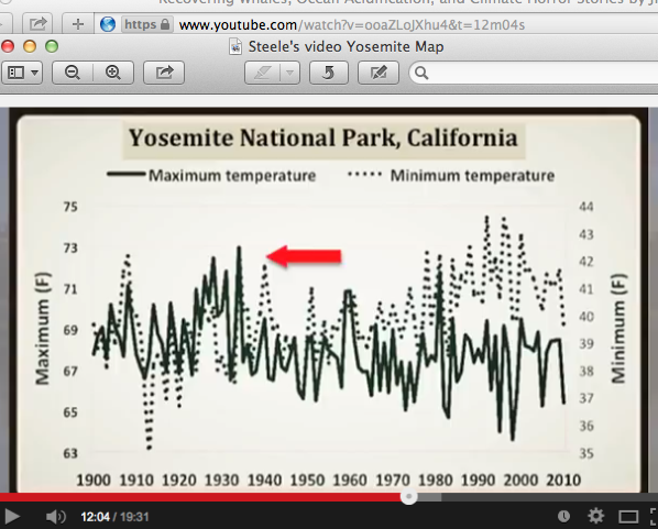
In the video Steele never offers a source or citation
11:40 Steele says: "Yet, she was blaming global warming. That didn't make any sense to me. She also said this was consistent with the global warming theory. Again she used this top down global average to explain a local event. But if you look at Yosemite data, it's very similar to what I had in Tahoe City. If you look at what the 30s were, they were much warmer than we see now. So how do you blame global warming."
In the footnotes of Steele's Landscapesandcycles blog he does cite one temperature related study, but not in relation to the mystery graph:
"She (Dr. Parmesan) had blamed “global” warming even though most maximum temperatures in California had not risen significantly.[3]"
[3] Cordero, E., et al., (2011) The identification of distinct patterns in California temperature trends. Climate Change"
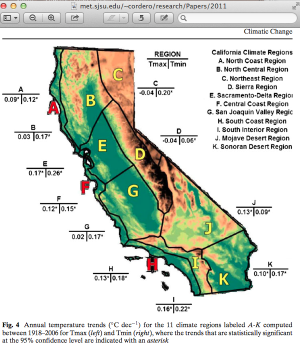
I found the paper and it tells a different story:
http://www.met.sjsu.edu/~cordero/research/Papers/2011-Corderoetal-climchange.pdf
~ ~ ~
Jim Steele claimed: "even though most maximum temperatures in California had not risen significantly.[3]"
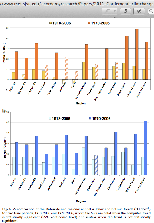
But, here's the tally:
California Tmax trend average broken into 11 regionals.
2/11 -0.04°
1/11 +0.02°
1/11 +0.03°
1/11 +0.09°
1/11 +0.10°
1/11 +0.12°
2/11 +0.13°
1/11 +0.16°
1/11 +0.17°
And that's from 1918 to 2006,
the scary part is 1970 to 2006 . . . and beyond.
Check out the study:
~ ~ ~ ~ ~ ~ ~
http://www.met.sjsu.edu/~cordero/research/Papers/2011-Corderoetal-climchange.pdf
The identification of distinct patterns in California temperature trends
Eugene C. Cordero · Wittaya Kessomkiat · John Abatzoglou · Steven A. Mauget
Received: 28 August 2009 / Accepted: 4 November 2010 © Springer Science+Business Media B.V. 2011
4.2 Comparison of annual trends: 1918–2006 with 1970–2006
It is understood that forcings (i.e., natural and anthropogenic) may interact in a nonlinear fashion, thus affecting temperatures across different time and spatial scales. To evaluate this, we compared annual trends across different regions for two different time periods, 1918–2006 and 1970–2006.
The most prominent feature in this comparison (Fig. 5) was accelerated warming trends from 1970–2006. Statewide Tmax trends between 1970–2006 (+0.27?C dec-1) were more than three times as large as the trend between 1918–2006 (+0.07?C dec-1), while Tmin trends between 1970–2006 (+0.31?C dec-1) were almost twice as large as trends between 1918– 2006 (+0.17?C dec-1). (my highlights)
The finding that trends for Tmin were larger than Tmax for the entire period, while trends in Tmin were nearly the same as Tmax since 1970 is qualitatively similar to results observed for global temperature (Vose et al. 2005).
Although statewide trends in temperature for Tmin and Tmax were about the same since 1970, there were distinct regional differences. …"
Department of Meteorology and Climate Science
San Jose State University, College of Science
met.sjsu.edu
whatsupwiththatwatts.blogspot.com |


