SI
SI
discoversearch

We've detected that you're using an ad content blocking browser plug-in or feature. Ads provide a critical source of revenue to the continued operation of Silicon Investor.  We ask that you disable ad blocking while on Silicon Investor in the best interests of our community.  If you are not using an ad blocker but are still receiving this message, make sure your browser's tracking protection is set to the 'standard' level.
Politics : Formerly About Advanced Micro Devices -- Ignore unavailable to you. Want to Upgrade?


To: Bill who wrote (998283)2/2/2017 6:33:44 PM
From: J_F_Shepard  Respond to of 1573718
 
I said you needed a tutorial on the topic and gave you a nice one.......let me pick one page at a time....

Page 3a: A short history of measuring temperature: look ma, no thermometer

Throughout most of history, there were no thermometers to measure temperature. This graph starts in the year 1000 – at this point in time, Europeans weren’t even using soap, Muslim philosophers were exploring astronomy and medicine, and the Chinese were inventing gunpowder. Nobody was terribly concerned with measuring air temperature.

So, how do we know how warm or cold it was back then??? Well, the first thing to notice is that the gray area, which represents uncertainty (get it – the gray area?) is much larger before the 1600s. Although there are ways of estimating temperature, they are not as exact as modern technology. Secondly, what scientists have done is to go back and look at how fast things grew – this is a proxy for temperature. It is not a perfect fit, and hence the large gray area.

In order to do this, we need organisms that are long-lived and that show evidence of growth every year …. like trees. Give it a try, using the sample tree trunk below:
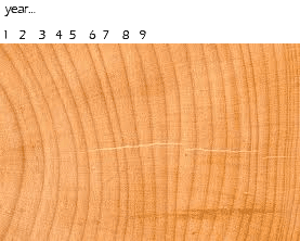

What were the 2 warmest years?


...and...


What was the coolest year?


Of course other factors are important as well. For example, a hot dry summer would probably result in little growth, and soil nutrients and pH would also affect growth. Clearly an entire temperature record based on one tree, or even trees worldwide, would be very shaky.

However, there are other long-lived organisms that we can use – most importantly, coral. Since coral lives in the ocean, it would not be affected by rainfall on land, or by soil pH or nutrients. So, if the temperature record from trees matched up with the record from corals, it would provide much stronger estimates of world temperature.


Various other historical records can also provide evidence, including records of crop harvests and treelines. All of these different records provide “ cross-validation” – that is, because they largely agree with each other, we can have some level of confidence in these early temperature estimates, despite the large uncertainty that still surrounds them.


Page 3b: A short history of measuring temperature: thermometers
One of the early scientists to start developing a way of measuring temperature was Galileo Galilei. These devices were called “thermoscopes” because they did not actually have a scale which measured temperature. However, records from this time period do allow scientists to reconstruct world temperatures much more accurately.


Looking at the hockey-stick graph, when do you think thermoscopes were developed?


Scientists very quickly decided to add a scale to their thermometers, but every scientist did it his own way. One used freezing and boiling points of water, another used freezing points of salt water and pure water, and still another made a scale where 0 degrees was ice melting and 12 degrees was human body temperature!

Eventually a German engineer named Fahrenheit, who was a thermometer manufacturer with a major market share, imposed his version on everyone else, and we got the Fahrenheit scale with 180 degrees between melting ice and boiling water. A few years later, a Swedish astronomer named Celsius proposed a different scale of 100 degrees, and we’re still arguing about which scale is better. (Well, actually, scientists know that celsius is best, but Americans are a stubborn lot...)

Nevertheless, as thermometer manufacture became more standardized, the temperature estimates become less uncertain, and eventually only thermometer measurements are used – the red data line.


Page 3c: The instrumental record
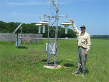
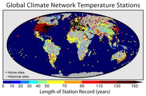
For temperature since about 1850, scientists can refer to the “instrumental record”. This is a world wide record based on standardized thermometer readings from thousands of meteorological stations around the world.


Looking at the map above, where are the oldest stations?
Pick an answer...

Africa
US and Europe
The Pacific Ocean


Because there are now thousands of weather stations, the uncertainty in temperature measurements is now much lower than before 1850. But that doesn’t mean it is simple to figure out the average world temperature! It turns out you can’t just take a regular average – instead, you need to account for the unevenness of the weather stations (lots in the US, few in Greenland or Africa, for example), urban heat island effects, and lots of other possible quirks.

In fact, computer software and advanced statistical techniques are needed to sort everything out, and as we’ll see later, not everyone comes up with the same answer. However, the different answers do tend to be similar enough to all be telling the same story – which we’ll get to in the next page…


Photo credits: Tree Rings | Thermometer | GCN


  • <
  • |
  • top
  • |


  • To: Bill who wrote (998283)2/2/2017 6:36:03 PM
    From: J_F_Shepard  Respond to of 1573718
     
    Page 2......

    Enough with thermometers and trees already!
    OK, let’s finally move on to the data itself, and let’s look at the black line, which is the overall trend.

    We know that this line is measuring the difference of temperature compared to the “good old days” of 1961 to 1990. Therefore, we would expect that the black line for 1961 to 1990 should be pretty close to zero – which it is.

    What’s more interesting is that all dates BEFORE this time have negative temperature differences. That means that it was colder back then. And dates AFTER the “good old days” are mostly warmer. This is one piece of evidence that the world is warming.

    Notice that temperature all through the 1000 years is VARIABLE – it goes up and down over time. (This is not the same as the gray “uncertainty” bars). Over the course of about 50 years, our best estimate of temperature increases by about 0.2 degrees, then falls again. If you were alive for those 50 years, it would seem like the weather got warmer for a while (about 25 years), then it got colder.


    To: Bill who wrote (998283)2/2/2017 6:37:32 PM
    From: J_F_Shepard  Respond to of 1573718
     
    Page 3 Tutorial....

    How big are the temperature differences?

    In fact, the general trend in the first part of this graph seems to be that temperatures rise and fall, but overall they decline a little. In fact, the 1500s to 1700s have sometimes been called the “Little Ice Age” in Europe.

    During the Little Ice Age, the growing season was shortened by as much as two months across Europe, grain yields fell, and rivers and canals froze over. Even artists began to pay attention to the weather, producing paintings full of snow, ice, and menacing weather.


    So, how big was this temperature difference ON AVERAGE? Less than one half of one degree.
    Does 0.2 or 0.3 degrees sound like a small difference? Tiny even?

    The differences we are talking about are not huge, but they are noticeable. Less than half a degree makes the difference between a normal winter and a winter filled with ice and snow. How can this be?

    First, remember that we are talking about degrees Celsius, which are about twice as big as Fahrenheit. So, if you are used to Fahrenheit, you need to adjust your perceptions.

    Secondly, remember that this is a WORLD average. During the Little Ice Age, Europe cooled down, but other parts of the world may have stayed the same. So a 0.5 degree Fahrenheit difference in WORLD average temperature could be 1 or 2 degrees in EUROPEAN average temperatures.

    Thirdly, remember that this is an ANNUAL average. Let’s say 3 months out of the year are much colder, but the rest of the year is the same. In that case, the EUROPEAN YEAR-ROUND average of 2 degrees becomes a EUROPEAN WINTER-TIME average difference of 8 degrees!!

    Finally, remember that what really defines a winter is not the average temperature, but the cold snaps, right? The average temperature may decrease by 8 degrees, but the cold snaps may be 15 or 20 degrees colder.

    Now we’re talking mini-ice-age material!

    Or, in summary, the differences you see on the hockey stick graph look small because

    • they are in Celsius
    • they are Northern Hemisphere averages
    • they are annual averages
    • they don’t really account for cold snaps / heat waves.
    In case you’re curious, the temperature decline during a full-blown, world-wide, mile-of-ice-over-your-head, 50-thousand-year-long glacial period is only about 8 degrees Celsius.


    Photo credits: Hockey Stick


    To: Bill who wrote (998283)2/2/2017 6:40:20 PM
    From: J_F_Shepard  Respond to of 1573718
     
    Page 4 Tutorial

    A warming world
    So we had a few centuries of colder-than-average weather. Does that mean our current warm weather is just some sort of rebound effect?


    Look at the Mann graph again – are the red temperatures representing the instrumental record a “return to normal”?
    I couldn't agree more, temperature in the last 50 years is really unprecedented
    yes
    no
    absolutely not


    So how much has temperature changed since about 1950? 1900-1950 -0.4 degrees (remember, this is compared to the 1960-1990 period)
    1950-2000 +0.3 to +0.7 degrees
    overall change increase of 0.7 to 1.1 degrees Celsius
    Again, remember that may seem like a small change … but we are talking about a half-the-world, year-round average, and just “normal” highs, not heat waves. Also remember that land mass heats up faster than water – so while 2/3 of our planet is covered with water, the temperature change is focused on the 1/3 that we live on.


    What does this graph predict about the future?
    yup, it was. This graph shows PAST OBSEVATIONS only. You know that because the x-axis stops at the year 2000.
    temperatures will go back to normal
    temperatures will continue to rise
    that was a trick question


    Photo credits: Hockey Stick


  • <
  • |
  • to


  • To: Bill who wrote (998283)2/2/2017 6:46:59 PM
    From: J_F_Shepard  Read Replies (1) | Respond to of 1573718
     
    Page 5 HOCKEY STICK CONTROVERSY!!!


    Hockey Stick controversy
    Mann and his group were basically the first to attempt such a broad-range reconstruction of temperature history, integrating data from many sources. This graph was hugely influential, both within and beyond the scientific community. In one fell graphical swoop, it solidified an argument for a warming world and dramatized the case. The IPCC chose this graph as its poster child to represent its findings, and climate change skeptics/deniers immediately started trying to tear it down.

    Numerous websites and a few published articles made a variety of arguments against Mann’s reconstructions, primarily

    1. they claimed that some specific tree ring data was shaky, and
    2. they disputed the methods used to combine temperatures from different sources.
    Eventually a Congressional Hearing was held and Congress asked the National Academy of Science to look into the matter. What did the National Academy of Science say???


    Mann et al.’s graph has been scrutinized from every possible angle. Yes, there are always mistakes and improvements, but the basic conclusions hold.

    Another myth is that Mann et al.’s graph has been “pulled” or “replaced” in the IPCC report. This is not true – instead, Mann et al. have been joined by a dozen or so new temperature reconstructions, sometimes called the Hockey “Team”. These reconstructions use a variety of sources, proxies, and statistical techniques, but they all point in the same direction. Take a look – each line represents a different published report, and MBH1999 is the granddaddy of them all – good old Mann et al.


    So …. improved YES, wrong or gone NO.


    Photo credits: Warming Flyer | NH Temperature Reconstructions


    To: Bill who wrote (998283)2/2/2017 6:52:14 PM
    From: J_F_Shepard  Respond to of 1573718
     
    Page 6 Tutorial

    Temperature variability revisited
    Here’s another way of looking at worldwide temperature for a single year. Each dot shows a comparison between actual temperature in 2010 and average temperature.


    The average temperature shift for LAND SURFACES in 2010 was 1.7 degrees, and for OCEANS was 0.9 degrees. You can see though that this warmly was unevenly distributed. Large red circles show places where the temperature was 4 or 5 degrees hotter than the base period – mainly Canada, Saharan Africa, and the Middle East. Blue dots show where the temperature was cooler, including Europe, part of Siberia, and the Eastern Pacific Ocean.


    To: Bill who wrote (998283)2/2/2017 6:54:41 PM
    From: J_F_Shepard  Read Replies (2) | Respond to of 1573718
     
    Page 7 The data from your age....... and if you paid attention, your questions are answered, you don't like the answers but that sucks for you.....

    Talking about my generation
    Here is a close-up of the instrumental record just for the last xx years.


    And some statistics:


    • Worldwide, 2010 and 2005 are tied as the 2 warmest years on record (beginning 1880)
    • The years from 1976 to 2010 have ALL been hotter than the 20th century average
    • The ten hottest years on record have all occurred since 1998
    By the way, one climate change denier claim is that “it hasn’t warmed since 1998.” What do you think?

    The existence and extent of a Little Ice Age from roughly 1500 to 1850 is supported by a wide variety of evidence including ice cores, tree rings, borehole temperatures, glacier length records, and historical documents.