Global DevelopmentsThis chart shows where the various central banks are in their monetary policy stance (on a relative basis).

Source: @JohnKicklighter
THE 10 YEAR WEEKLY CHART OF THE "BIG 3 " Global Bond Markets
The turn on a dime top in price --- bottom in Yield in the Big 3 Global Bond Markets

The 1 year chart of daily YIELD action amplifies the wild thrashing by Japan and Germany (the ECB)

------------------------------------------------------------------------------------------------------------------------------------
This is a VERY PROFOUND CHART...... In has Implications for Equity Prices, Commodity prices,
Interest Rate directions and also will be impacting the Major Currencies.
---------------------------------------------------------------
Here is the my Proprietary SPX JJP ATR cross of the Eur/JPY :$WTIC correlation chart. The methodology
reinforces the case that we experienced a bear market and has a very good track record. I explained how
the chart works in a post on 3/16/17 which I have re posted below the update chart, which has become even more bullish

---
this is my proprietary model that uses the EUR/JPY crossrate and then correlates it to WTIC.... so you
have 4 of the deepest largest markets in the world..... the Eur/JPY "RIsk On Risk Off" proxy then as a ratio
of the single most important global commodity input crude.
I have shown this 2 or 3 times this past 15 months............ but it's just esoteric enough that it does not
get traction in the layman and even the professional traders mind.
and it has had a very good record..... when the 14 week Average true range goes below the long term 200
week average true range with is calculated on the EUR/JPY Cross-rate and then divided as a ratio of
$WTIC.... what that calculation in KISS (KEEP it SIMPLE STUPID) is doing is showing when the relative
volatility of 3 of the worlds biggest pricing components stabilizes.... it creates the necessary price
stability in corporate planning models and in Global Macro Institutional Investor Models to expand risk
exposure...that is long US equity exposure.

To Clarify the signals are generated when the Blue 14 period ATR goes below the long term 200 period
Moving average.... and that generates a buy a the Average True Range of the EUR/JPY cross / by WTIC is
coming down.. what is nice about this model is that you can have signals that are in effect for 2 years or so
at a time.
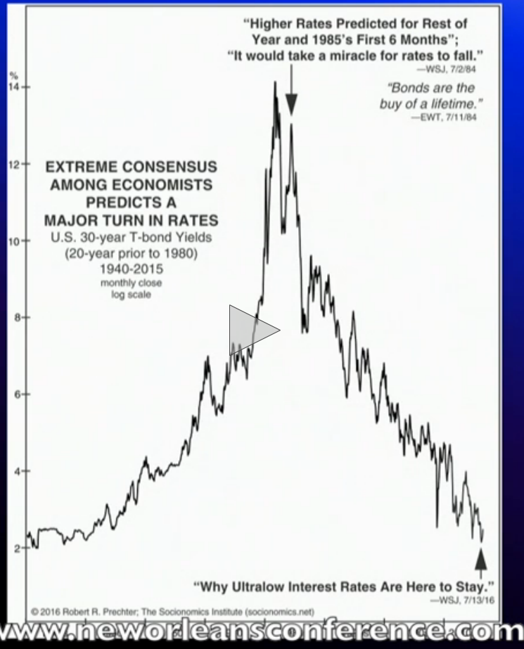
The 72 Year Master Cycle in the US Bond Market
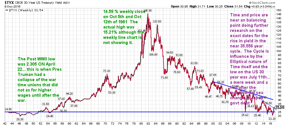
A chart from the Oct 2016 34th presentation at the New Orleans investment symposium
..
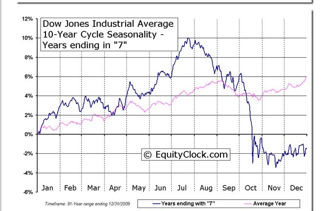
Since we are in the 7th year of long talked of Decennial Pattern we should expect pretty
serious pullback the last 6 weeks of Q3... and remember that October is often the month of
lows. Have some profits taken and some powder dry as you prepare for a real price check back.
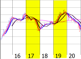
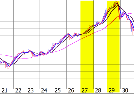
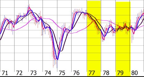
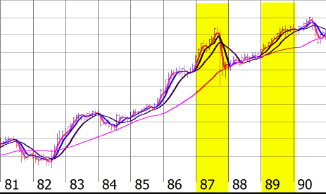
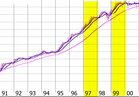
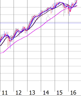
7th & 9th Years of the Decennial Pattern
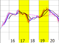

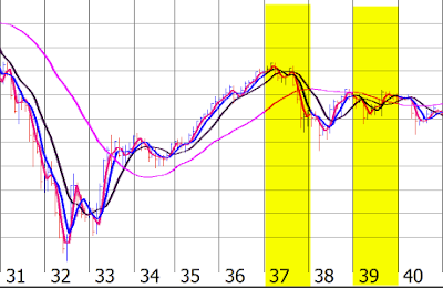
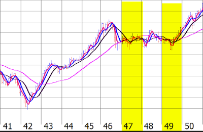
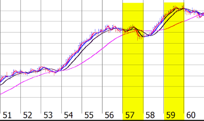
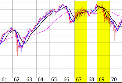
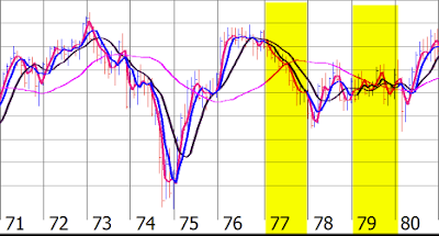
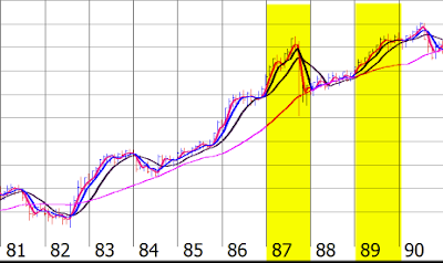
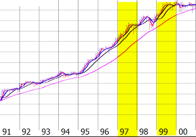

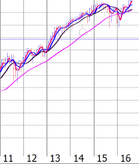
The above charts start from 1915 and go to 2016.
Each decade is shown separately. As you can see the 7th and 9th years have been highlighted in yellow.
The reason for this was to show that highs have been made in the 7th and 9th years of a decade.
In some cases a high was made in the 6th year as in 1916-17, 1946, 1956-57, 1966 and 1976-77.
Odds that we rally straight up from Here.... Sunday June 24th into November 2017 are statistically
very very low. So asset allocation models have you rebalancing as your outperforming areas should
get pruned back into what the true allocation should be ... do not get endlessly pulled into asset class
"drift" and for sectors that have dramatically outperformed.. do not get pulled into "sector drift"
--------------------------------------------------------------------------------------------------------------------------------------- |